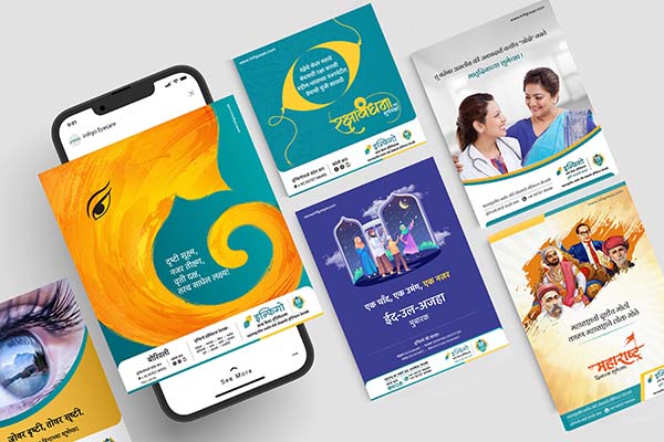
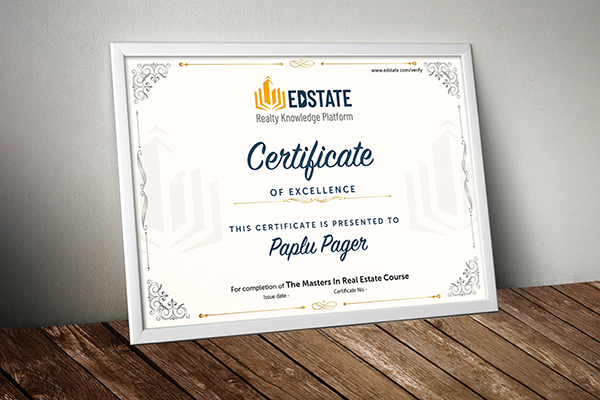
PRINTING
PRINTING
SOCIAL
SOCIAL
SOCIAL
SOCIAL
VIDEO
VIDEO
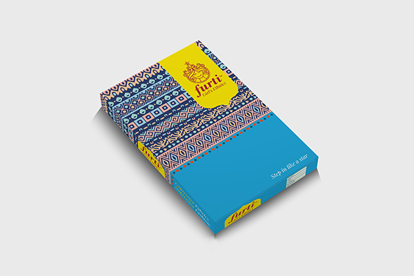
PRINTING
PRINTING
SOCIAL
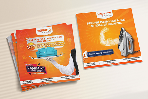
SOCIAL

SOCIAL
SOCIAL
SOCIAL
SOCIAL
SOCIAL
VIDEO
VIDEO
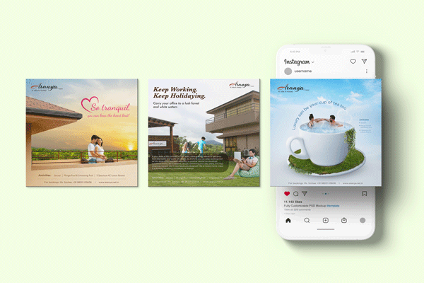
SOCIAL
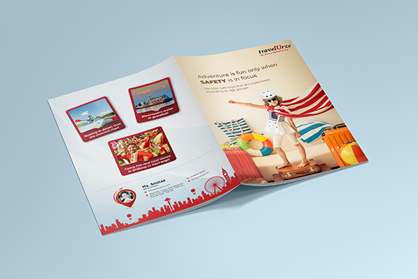
PRINTING
SOCIAL
IDENTITY
SOCIAL
SOCIAL
SOCIAL
SOCIAL
 copy-01.png)
SOCIAL
SOCIAL
SOCIAL
SOCIAL
SOCIAL
SOCIAL
.(20-05-22).png)
SOCIAL
SOCIAL
.png)
SOCIAL
SOCIAL
SOCIAL
SOCIAL
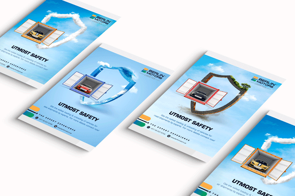
VIDEO
VIDEO
VIDEO
VIDEO
VIDEO
 23.06.21_Compressed.png)
VIDEO
VIDEO
VIDEO
VIDEO
VIDEO
VIDEO
VIDEO
VIDEO

VIDEO
VIDEO
PRINTING
PRINTING


PRINTING
PRINTING
PRINTING
PRINTING
PRINTING
PRINTING
About Us
Moulding and sculpting each brand with master precision
Every Company invests heavily in terms of tangible resources as well as intangible emotions into its products. However, the product has a neutral compatibility value in the mind map of the consumer unless it appeals or caters to a specific physical or emotional need, whether at an impulse level or on a planned scale.
The entire product-consumer relationship goes through an evolution the moment the product transforms into a Brand.
Most entrepreneurs feel that Brand building is an exercise for large companies or those with huge market footprints. But the reality is quite the opposite. At Clay Inc. we understand the process of moulding a product into a brand. Whether you are a large enterprise or an SME/MSME, we can add more value to your day-to-day marketing communication process by planning a brand evolution strategy. Our expertise in this arena can only be ascertained by perusing our case studies.
The philosophy behind our brand building approach
Businesses today are only as strong as their brands and often the intangible value of brand is much greater. Hence brands need to be designed from their core. It is deforming that ensures transformational development through inner values and outer forms. And hence our ideology — ‘Deform to Transform’.
We love the discipline and change it imposes on the brand and the relationship it creates with the customers to build higher brand value.
What happens when your Product becomes a Brand?
While a product can be physically touched, a Brand can only be experienced. A Brand offers an intangible value to the consumer which can never be replaced by any product. The trust and loyalty factors associated with a Brand make it unique and distinguishable. Once you have a Brand, it’s easier to expand the market footprint without much intervention in terms of marketing or financial resources. Also, you command more ROI and respect in the markets, making it easier for you to push other products that can piggyback on your main Brand.
Business Structure
Cumulation is a process of assembling intelligence in strategy, business objectives, operational parameters, consumer dynamics, competitive initiatives, and market trends (explored and distilled). In phase one we bring an independent perspective to bear on the existing knowledge accumulated through client organization and wider world.
Leverage Analysis brings in consumer demographics, insight, target profile, consumer experience and relevance. It offers comprehensive analysis towards creating and reasoning the leverage value of the idea.
Amplification starts with relevance. The apparent idea is cross-referenced with its audience and weighed within all the positive and negative parameters of its existence.
Yield Value - The idea is then considered for its yielding value; its measured and calculative response towards its audience, which decides its significance and weightage. Our contribution then focuses on three key areas i.e. concept enhancement, creative execution and maintaining sophistication until it reaches its end consumer.
Welcome to Clay Inc. where design plays an essential role in creating a deliberate brand differentiation and a higher perceptional value that matters the most to a consumer. Simply put,
‘WE DESIGN BRANDS.’
Clientele


Services
Identity Design
- Logo / Identity design
- Positioning
- Brand Language
- Brand Architecture
- Mascot design
- Iconography
- Brand identity Guidelines
Communication Design
- Catalogues
- Corporate Profile / PPT
- Product Brochure
- Flyers, Newsletters
- Magazine Design (Editorial)
- Press / Magazine Advertisements
- Hoardings, Bus Panels, Train Panels
- Bus stop panels / Railway Station Panels etc.
- Coffee Table Books
Event Design
- Pre-Event Deliverables
- Event logo
- Brochure (Real time updated)
- Emailers
- Social Media posts
- Online Marketing Advertisements / Banners
- Website
- On Venue Deliverables
- All Event Collaterals
- Post Event Deliverables
- Post Event Report
Website Design
- UI Design
- Backend Development
- SEO development
Social Media Marketing Design
- Facebook / Whats app posts
- Instagram / LinkedIn / Twitter Posts
- You Tube Channel Banners
Electronic Media
- Logo Loops
- Audio Visual
- White Board animation
Wall Communication
- Strategy Design and Concept
- Complete Execution (Logo Installation, Vinyl Wraps, Decals, Frosted Vinyl, Wall Papers, Printed Canvas etc. )
Printing
- Corporate Stationery
- Catalogues
- Flyers
- Newsletters
- Magazine
- Brochures
- Coffee Table Books
Photography
- Product
- Industrial
- Interiors
Contact Us
Want to say hello? Want to know more about us? Give us a call or drop us an email and we will get back to you as soon as we can.
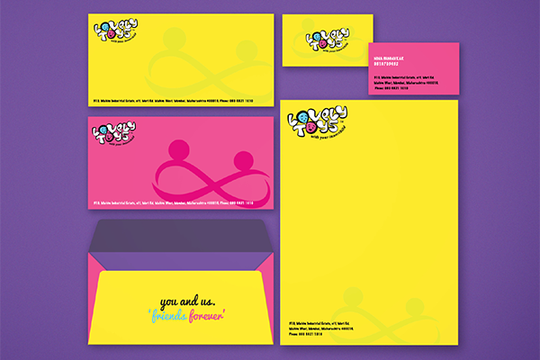
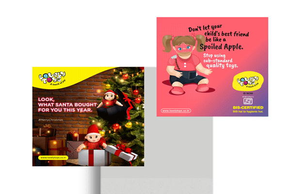
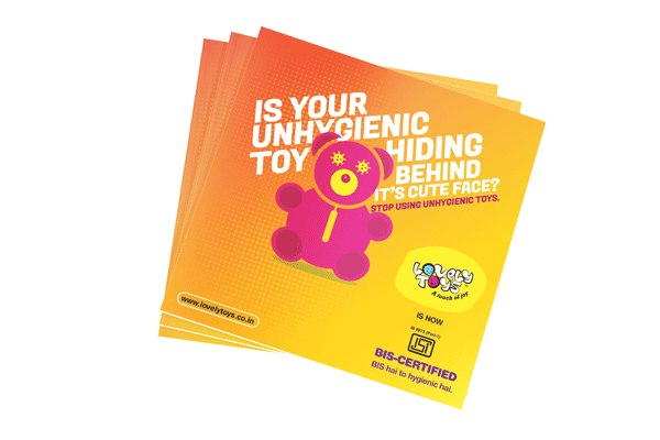
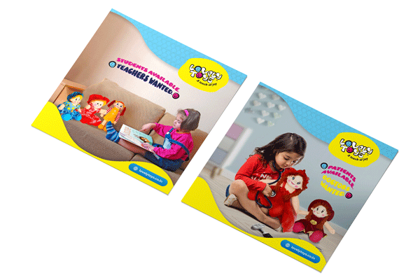
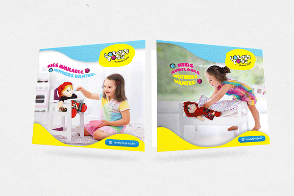
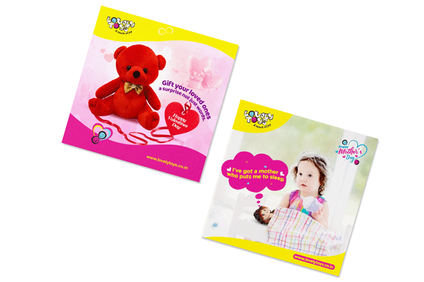
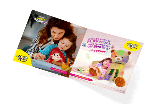
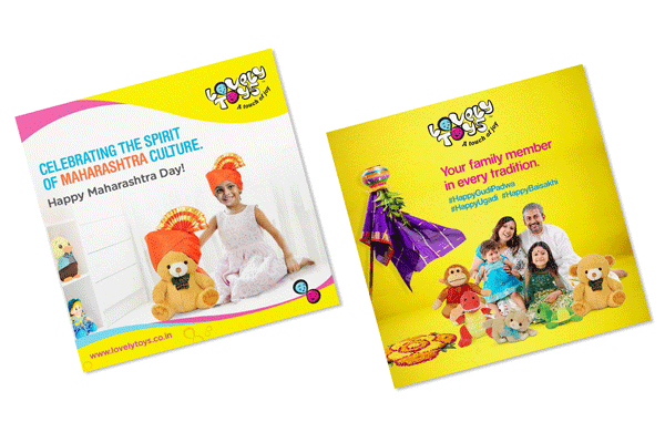
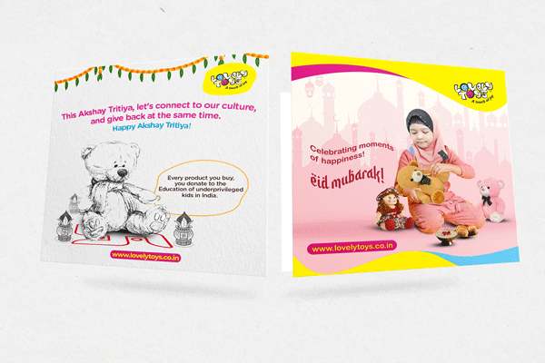
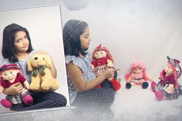
CASE STUDY 1 - LOVELY TOYS
Old Identity
Challenges:
- The brand was operating at a very big scale for 25 years yet the visual expression of the brand was very weak.
- The brand was visually unappealing and needed a major visual makeover.
- Brand design was consistent, weak, fragmented, and had no communication and design as well as little or no presence.
- Brand needed visibility on a professional level so that it looked like a 25-year-old brand.
- They has a hard time convincing traders and retailers to stock their products as they were not taken seriously by the traders.
Solution:
- The identity system was created that bred consistency and strong visual expression of the brand and looked visually very appealing to its audience.
- The identity system was expanded with its brand language in stationery, website, social media, and exhibition branding.
- Guidelines were created to ensure consistency, and precision in the design approach to get more clarity.
- The approach created more visibility among its vendors and the lovely toys enjoyed flooding enquiries due to its strong visual expression and consistent and new identity system.
A 25 + years old company started in a home setup by house wife, grew helping underprivileged women. Creating interesting toys and making kids happy was the objective. However, the branding, labelling, packaging and marketing methods were quite traditional. They has a hard time convincing traders and retailers to stock their products as they were not taken seriously by the traders.
New Identity
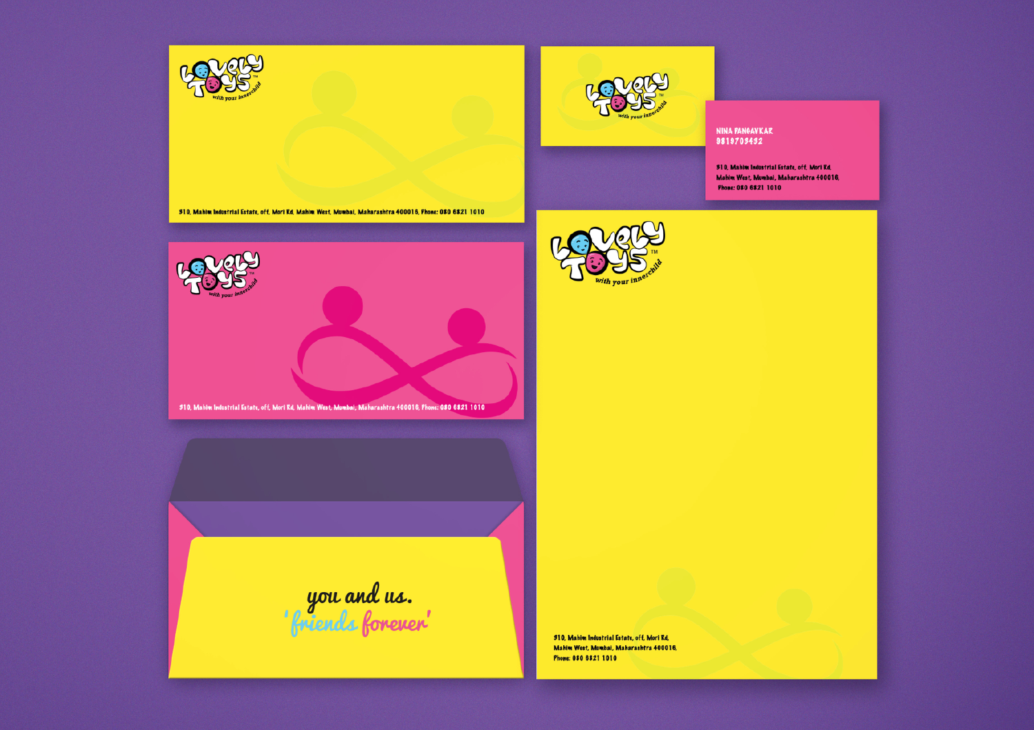
Clay Inc. revolutionised their entire branding and packaging. This began their process of brand creation. The products now appeared even more enticing.

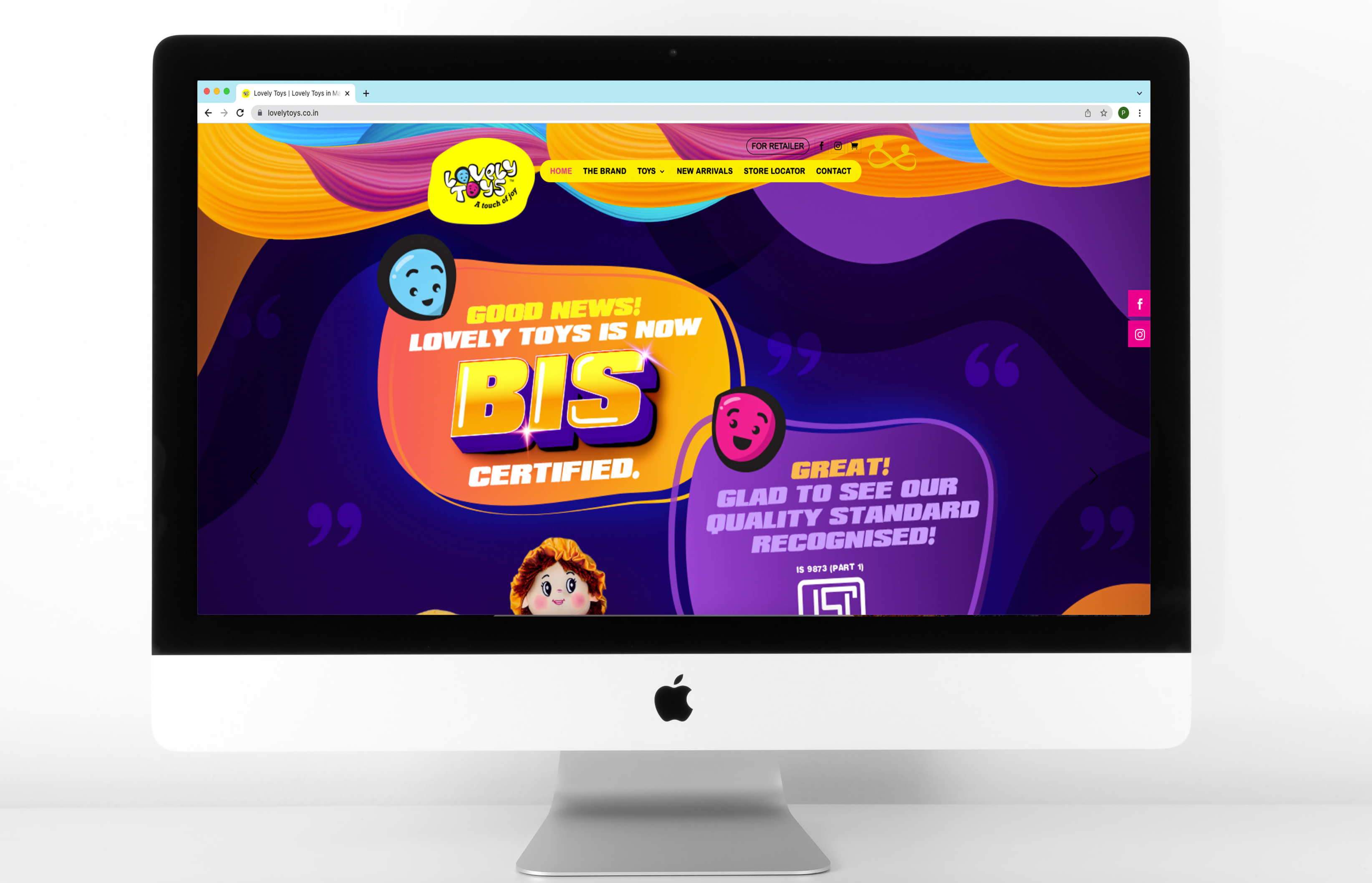
Web Design
We suggested that they participate in relevant trade fairs and expositions. This increased their brand presence and brand value. Soon, the trade began recognising the potential and started approaching them.


Today, Lovely Toys is being marketed at various leading outlets across multiple cities with their own branding and labels.

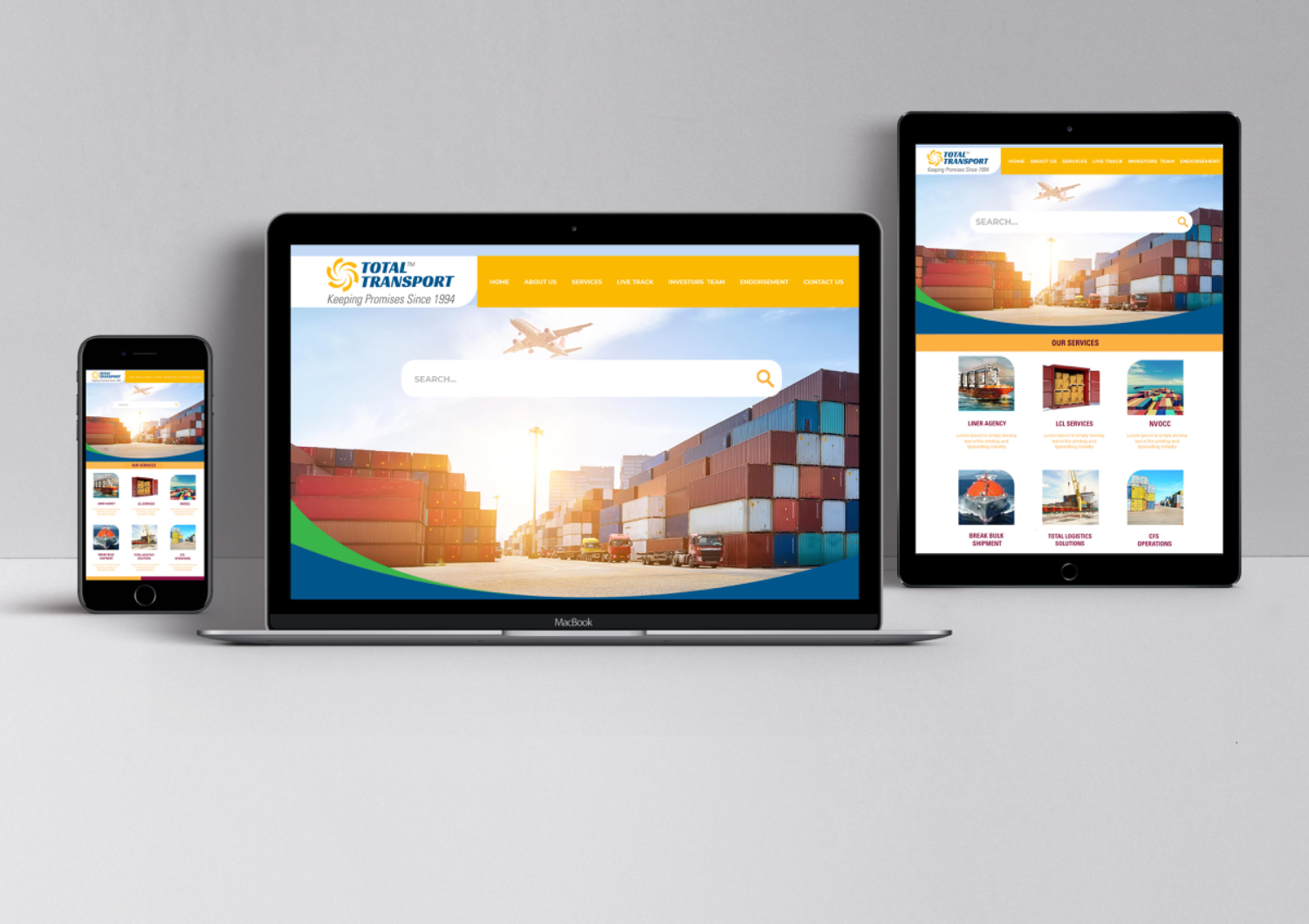
CASE STUDY 2 - TOTAL TRANSPORT
Old Identity
Challenges:
- The brand was operating at a very big scale and has been in the market for more than 2 decades yet the visual expression of the brand was very weak.
- The brand was visually unappealing and seemed rookie in front of its partners CP world and iCargo. It needed a major visual makeover.
- As a result, brand touchpoints such as website, social media, company profile, magazine ads, and exhibition creatives were inconsistent, weak, fragmented, and lacked bite in communication and design.
- Since no consistent norms of identity usage and design usage were laid out, the design at every office was seemingly inconsistent and looked different that one another. This created a problem of fragmentation.
- Brand needed a consistent design approach that communicated the right benefit everywhere along with neatly presented design.
Solution:
- The identity system was created that bred consistency and strong visual expression of the brand that walked head to head with its partner brands.
- The identity system was expanded with its brand language in stationery, website, social media, Print ads, office brandings, company credentials, and exhibition branding.
- Guidelines were created to ensure consistency, and precision in the design approach to get more clarity.
- The communication was based on the new offerings and benefits to the audience, and the reputation of the company, deeply rooted in keeping promises.
- As a result the brand got strong visibility in the marketplace and even enquiries based on the print ads done for them.
The key attribute of the organisation is trust. Whether it is trust amongst internal hierarchy, or the trustworthiness with clients, Total Transport has become synonymous with assurance. With this, Clay Inc. transformed the entire brand identity of the organisation and provided a solid, integrated look and feel to the cluttered brand character. A professional and futuristic appeal was created to take the brand into the next level of perception.
New Identity
Clay Inc. transformed the entire brand identity of the organisation and provided a solid, integrated look and feel to the cluttered brand character. A professional and futuristic appeal was created to take the brand into a next level of perception.

We have not only synergised their brand identity but also ensured that the product/service communication is in tandem with the new brand personality.


Web Design

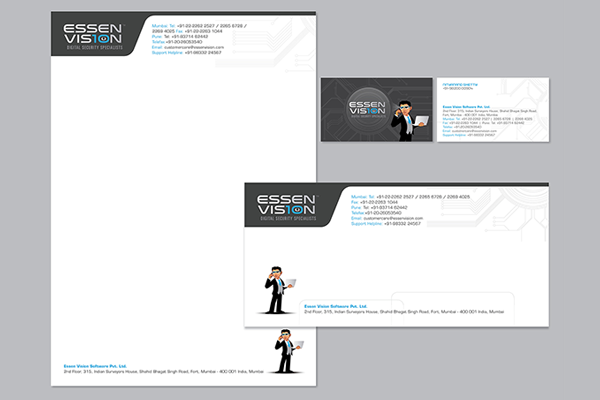
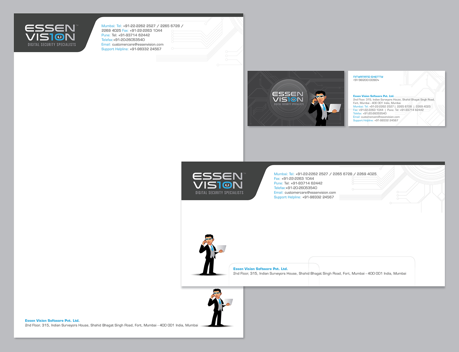
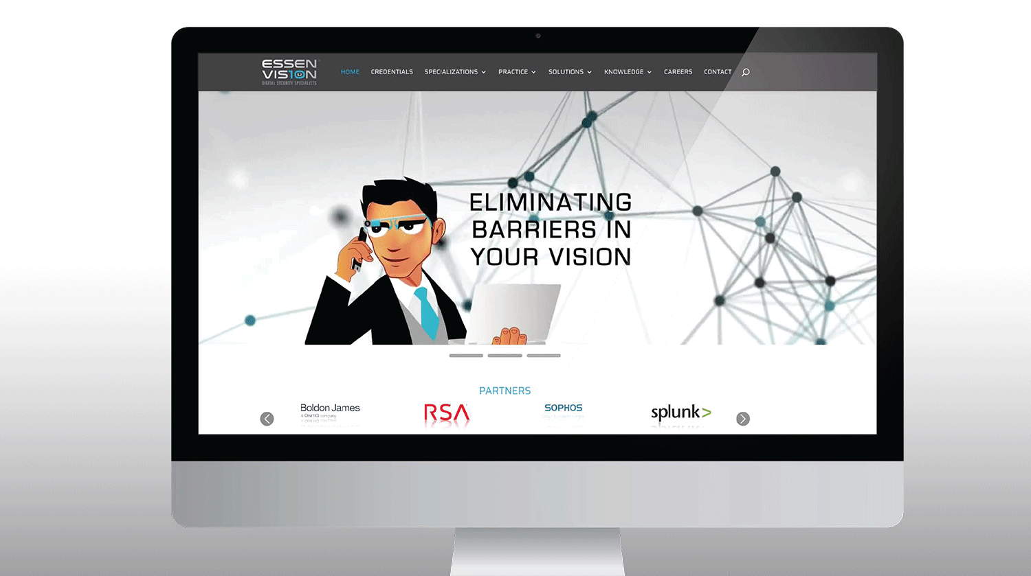
CASE STUDY 3 - ESSEN VISION
Old Identity
Challenges:
- The Company is in the business of Digital Security. However, the brand identity was mediocre and lacked the New Age feel.
- The entire brand outlook was aged and did into inspire ample confidence despite the fact that the Company was technologically far superior in terms of knowledge and performance compared to others in the market.
Solution:
- Infused new life into the brand identity (logo).
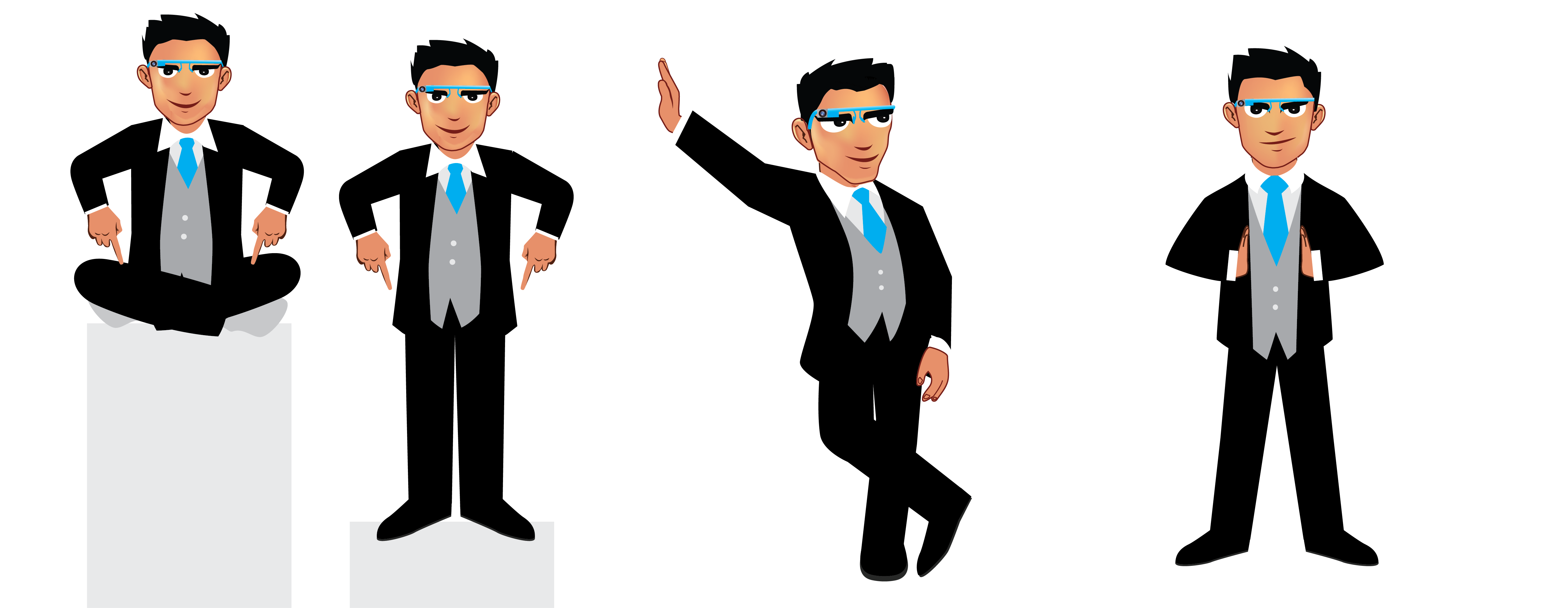
- Created a youthful and smart mascot to inspire confidence amongst the target group. It also helped as an anchor for communication.
- Standardised brand and mascot usage and ensured consistency through brand guidelines across all brand touchpoints.
- Built product promotion structure, structured product campaigns with created interesting stories around all the products, new followed by the old.
- Built required brand image effectively across mediums.
New Identity
Streamlined and synergised the logo design, making it relevant and appealing for the target customers

The brand was repositioned twice. Accordingly, the communication and designs were adapted. However, the overall look of the brand remained consistent and provided a corporate feel.
Promoted the brand effectively across the Social Media platforms using creative concepts and professional layouts. Focus was on greater visibility of the logo and messages.
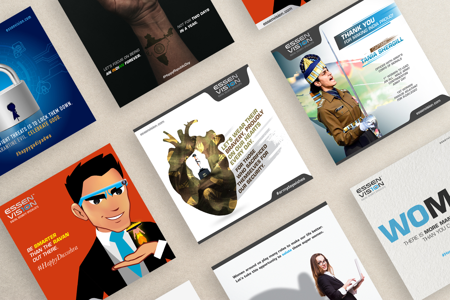
CAMPAIGN FOR INTERNAL TEAM - A strategic and creative approach was taken to inspire and motivate Team Essen. This was also promoted externally for the TG to get a feel of the Essen Experience.

Web Design
The website www.essenvision was redesigned in adherence with the brand guidelines. Although the main purpose was to disseminate information, we added liveliness to the entire look and feel. Responsiveness and ease of browsing were other key factors that guided the web design. There was positive feedback from clients and stakeholders across the globe.
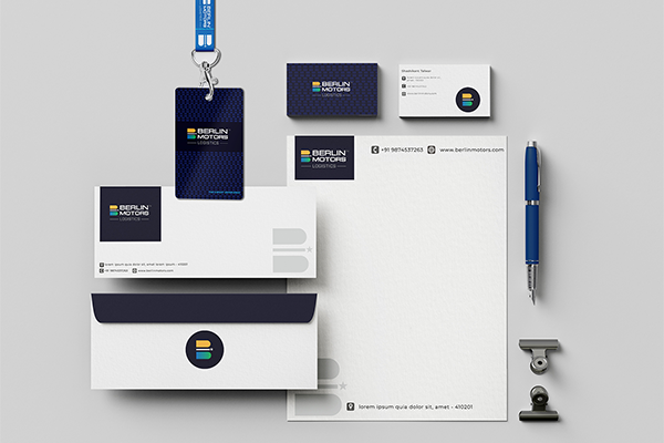
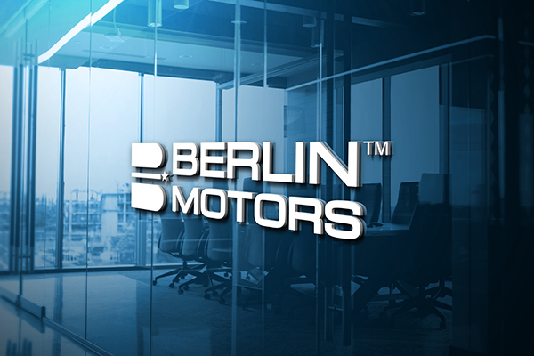
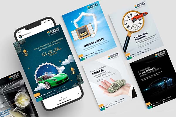
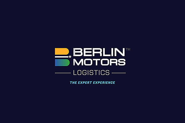
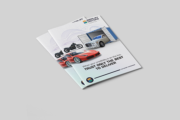
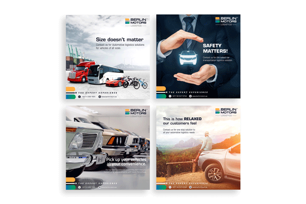
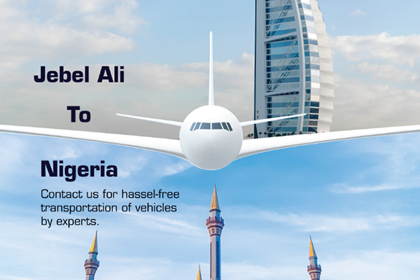
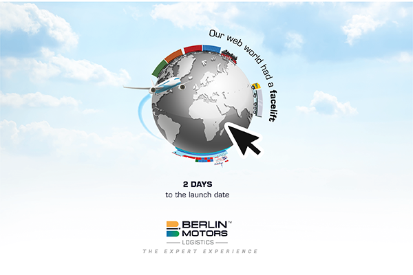
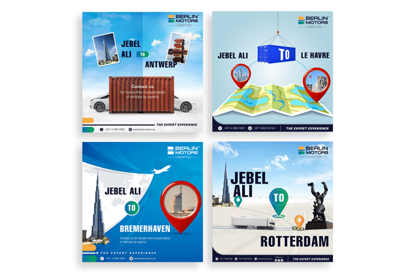
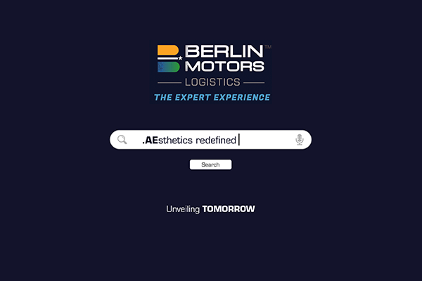
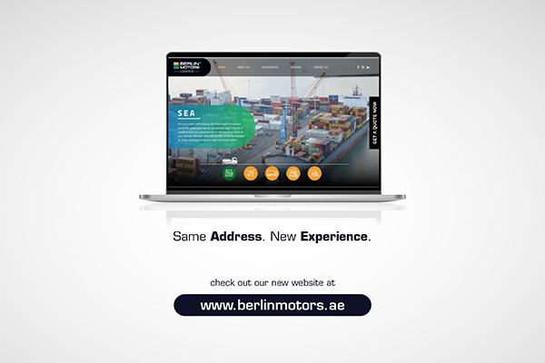
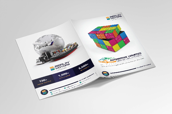
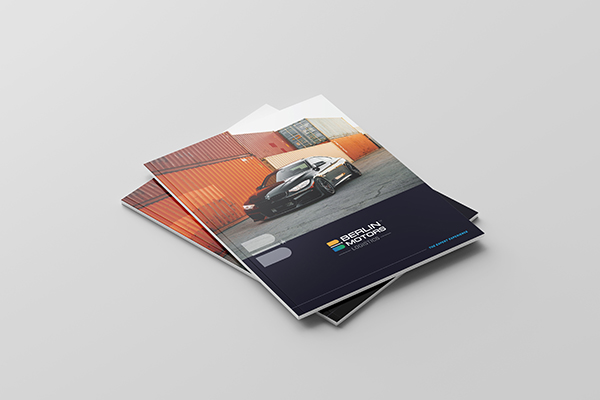
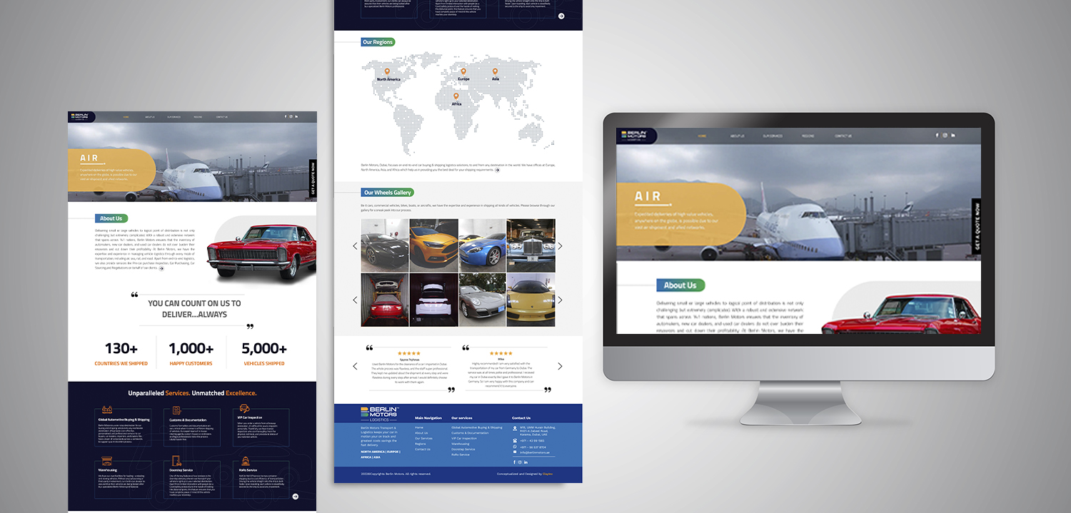
CASE STUDY 4 - BERLIN MOTORS
Old Identity
New Identity
Berlin Motors is one of the leading name in automotive logistics. This is a very niche area of business with very few players who can actually deliver. The Company was initially associated with Berlin Motors, USA, and as such it had the same brand identity. However, the Company commenced operations at Dubai independently.

Clay Inc. created a unique and discernible identity for Berlin Motors, Dubai. Although the focus previously was on cars, it was obvious that logistic services for other vehicles too would add more weight to their portfolio of services. A such the new logo was abstract yet communicating the core business of the organisation. It has a fresh and global appeal.


We also designed their global website and commenced their Social Media campaign simultaneously. This proved to be huge success and the Company began getting 10-12 enquiries per day - a mega achievement in this domain.

Web Design
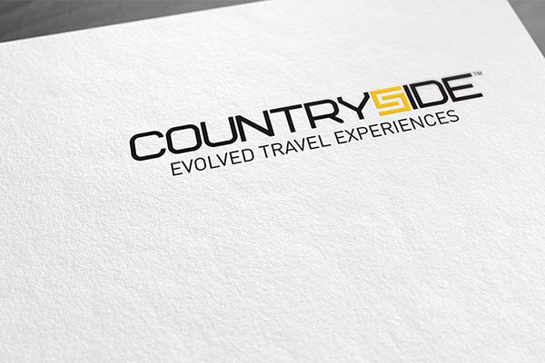
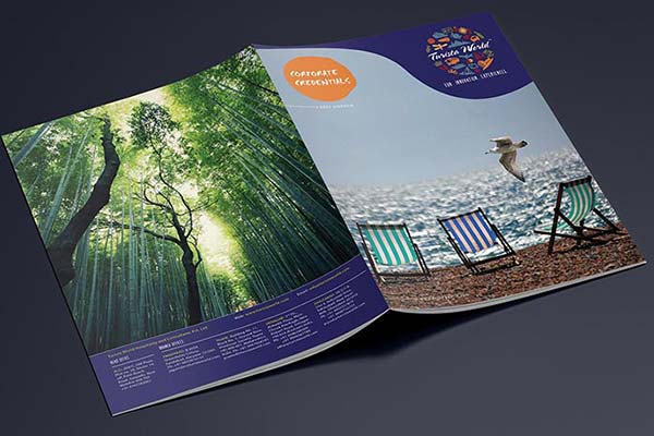
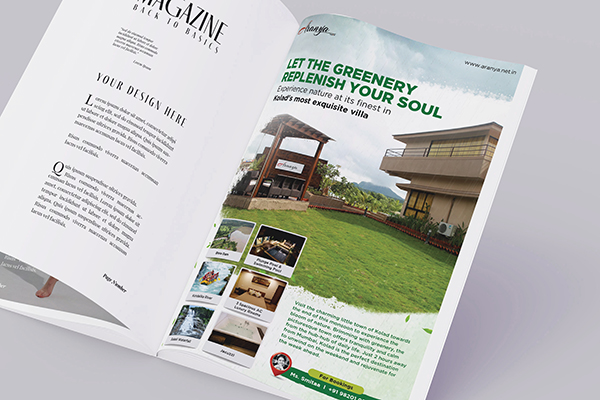
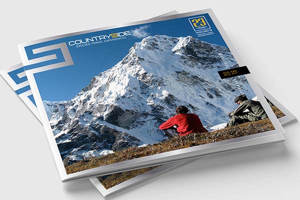
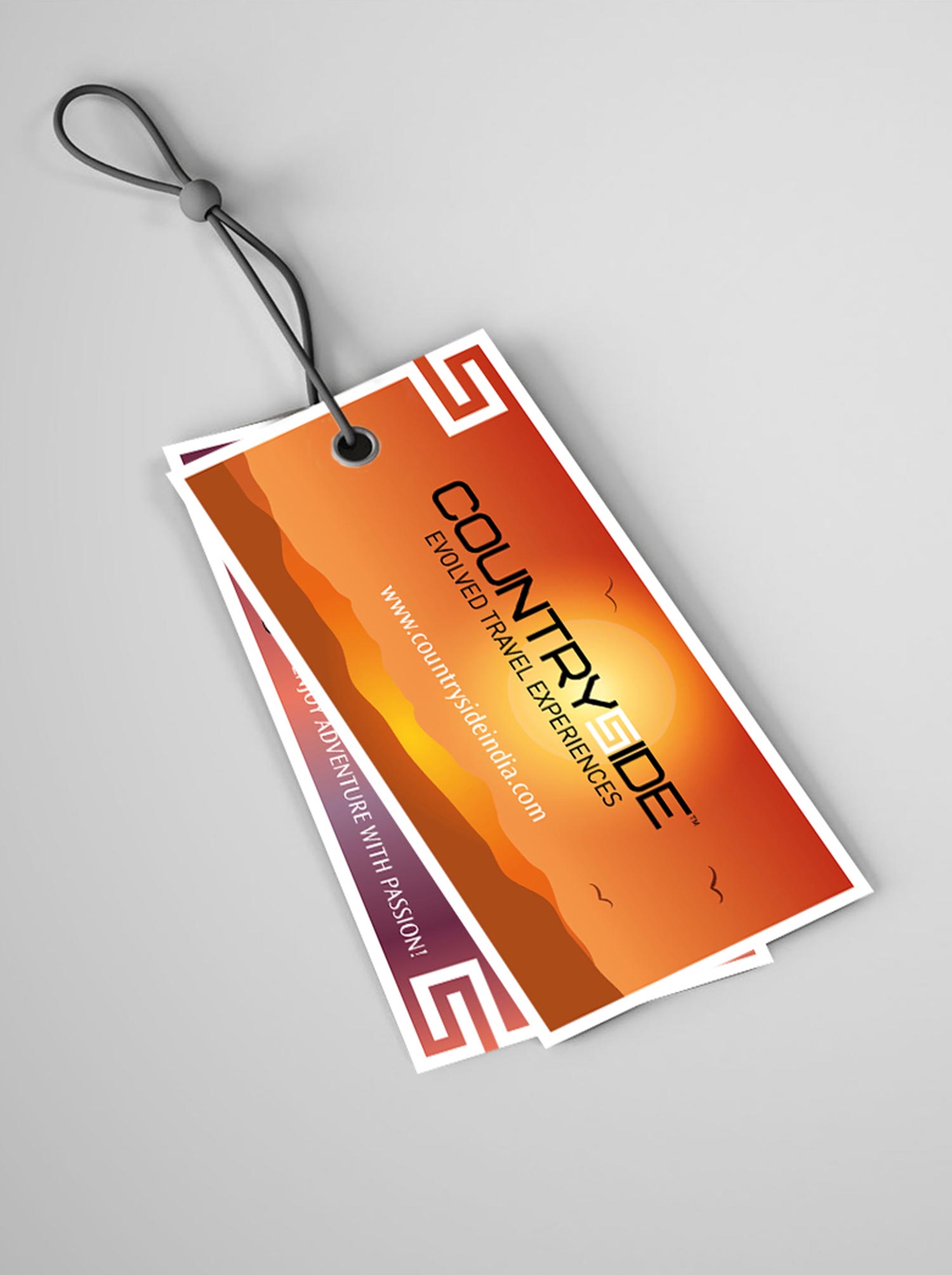
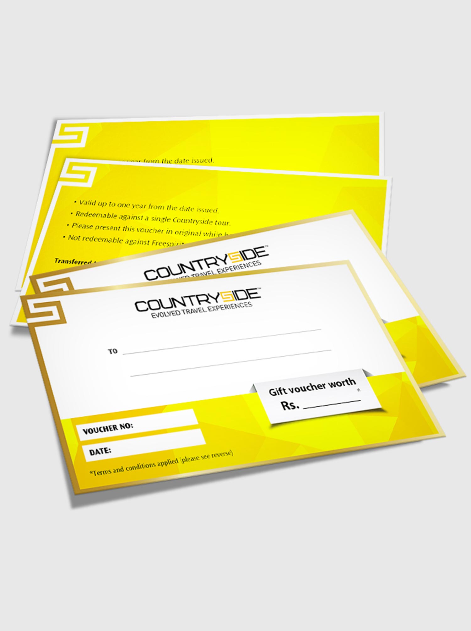
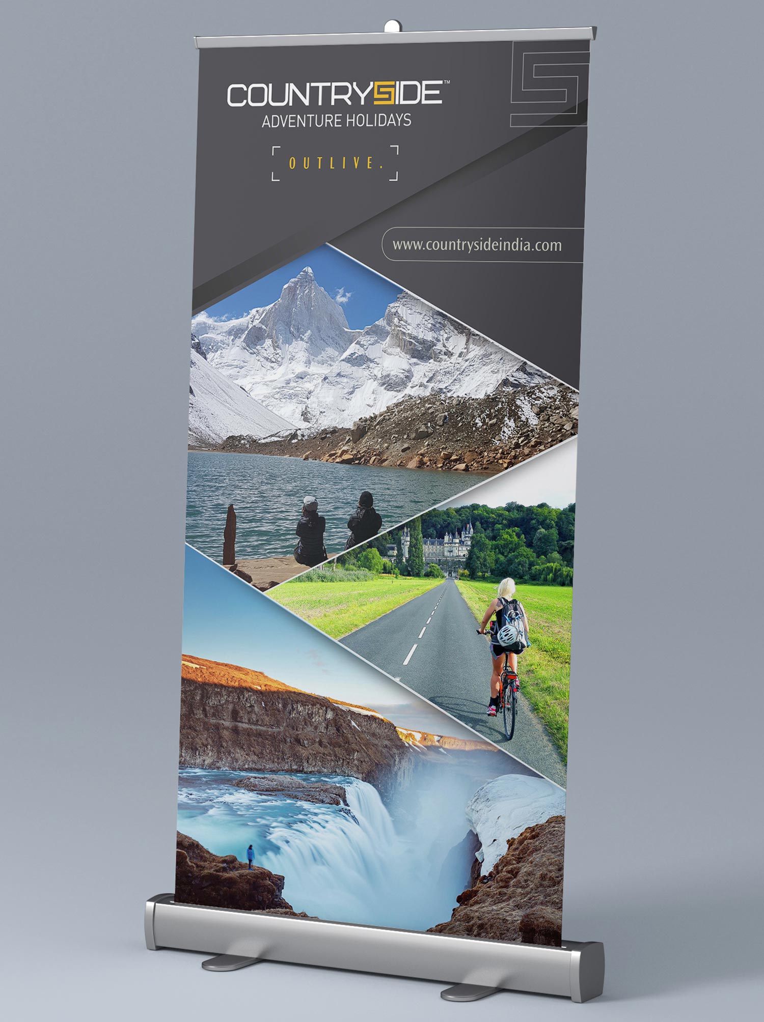
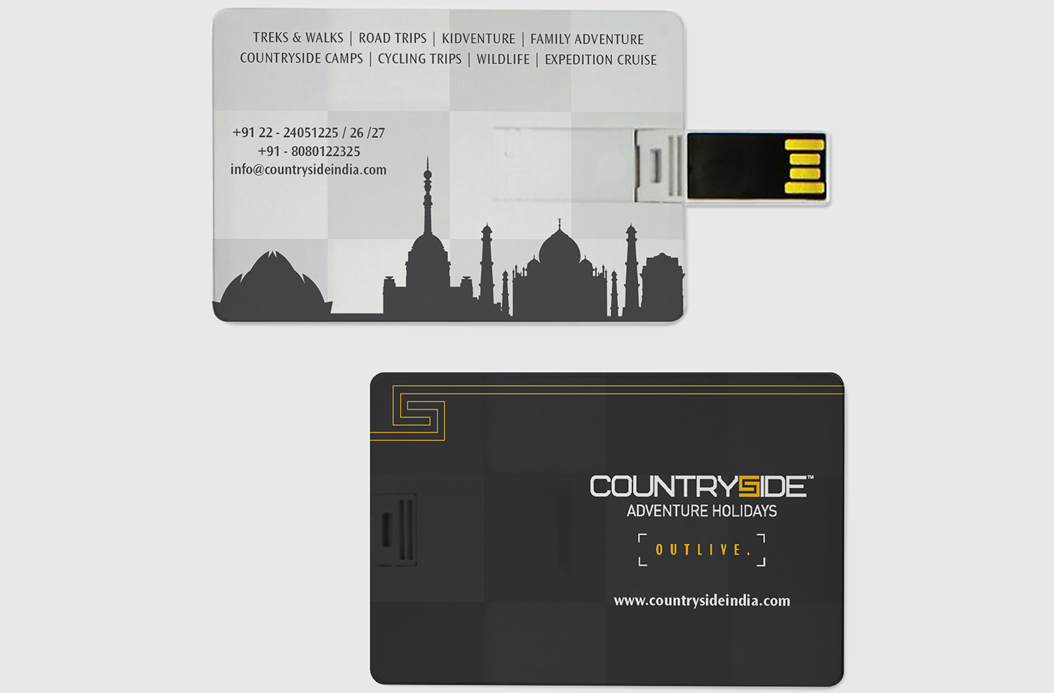
CASE STUDY 5 - COUNTRYSIDE
Old Identity
Challenges:
- Old identity was very complicated and difficult to replicate on various corporate materials.
- The brand was unable to communicate what brand stood for.
- We were commissioned to do whole identity system of the brand.
Solution:
- We formulated the brand vision on two fronts.
- People trusted CountrySide for its immaculate service.
- Customers loved CountrySide people for their warmth and hospitality.
hence we designed the identity by collating the initials 'C' for Country and 'S' for Side in such a way that the image looks like a hand locked in a hand depiciting Trust. Identity was simplified to be able to replicate on corporate materials solving the brand problem. CountrySide symbol used as a brand language accross corporate materials.
New Identity
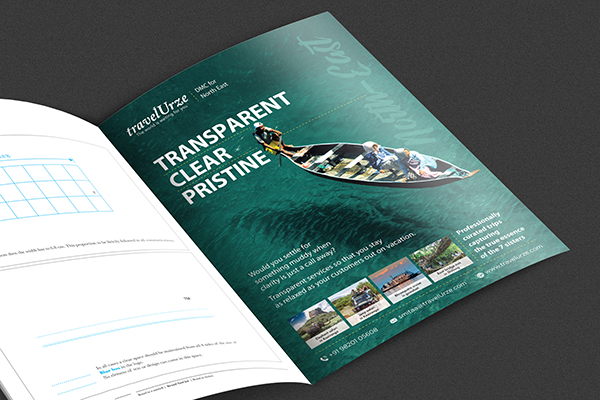
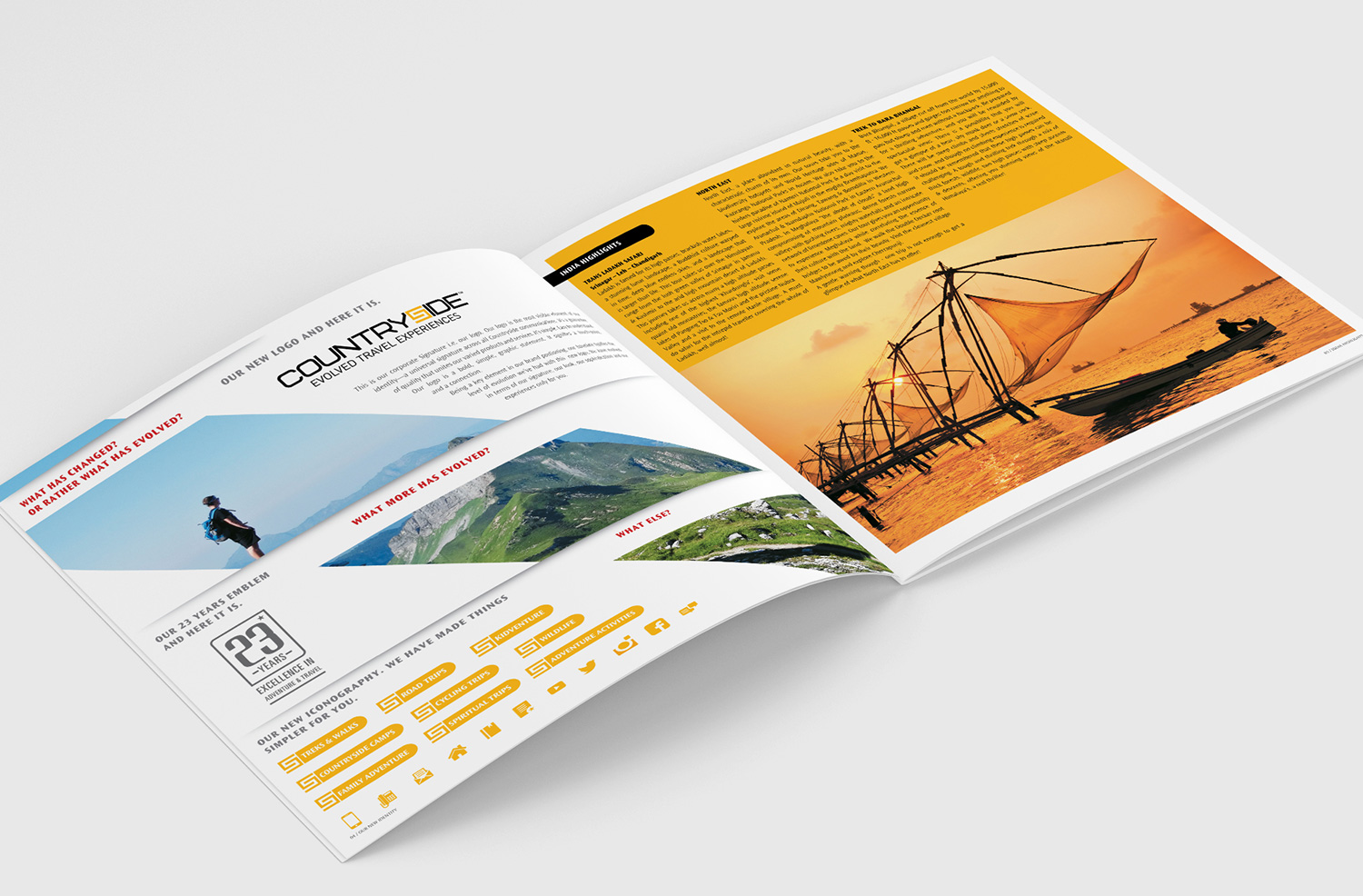
The identity was designed keeping in mind, the trust and bonding Countryside had with its customers for 23 years. We had a broader positioning for the brand to accompany their wider array of products collated under one unified voice ‘Evolved Travel Experiences’
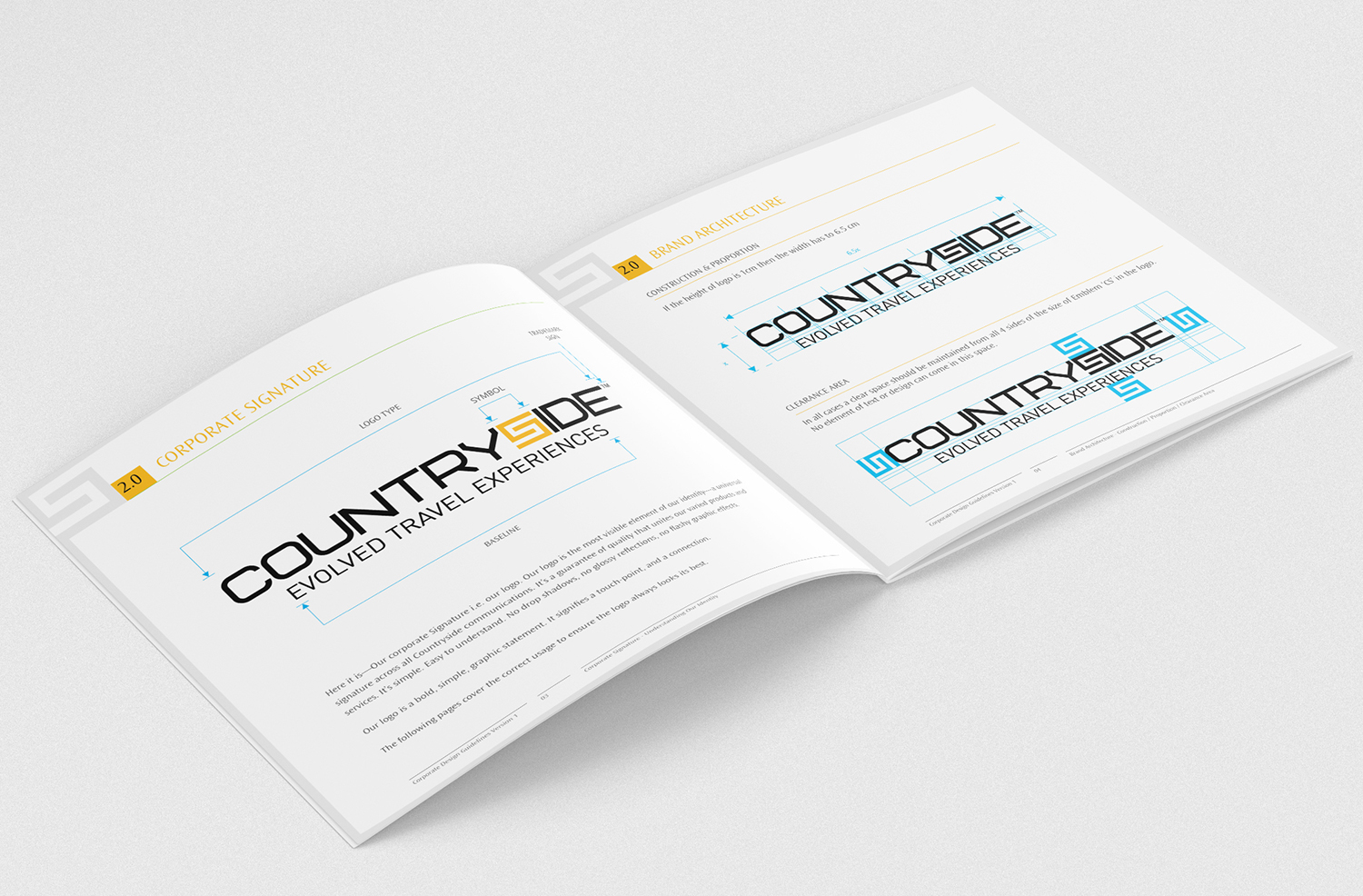
The components of brand identity were precisely measured and built keeping in mind brand touch points and their usage.
We developed a brand language ‘CS’ (symbol) based on uniqueness and relevance to Countryside identity.And we continued the same language across the spectrum.
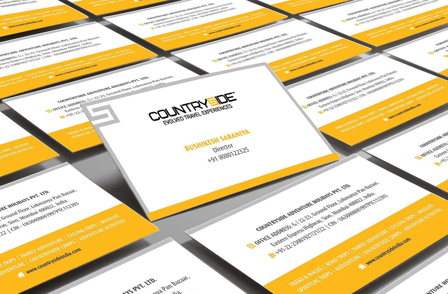
Brand language worked well as a result of which, its customers started recognising Countryside through its language and not just its identity.
Communication Design

We bettered the brand image and made the brochure more relevant and interesting. The result was a lot of compliments and enquiries from customers.


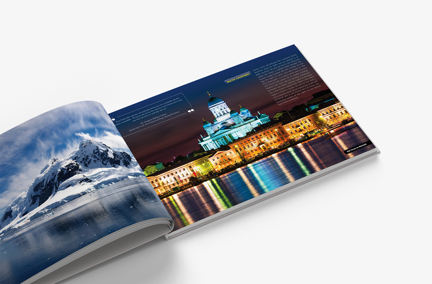
For the second-year brochure, we took customer experiences and testimonials and connected it to the brochure making it more relevant and communicative.


The brand language made an impact across all collaterals of Countryside achieving consistency yet coherence which was much needed by the brand.
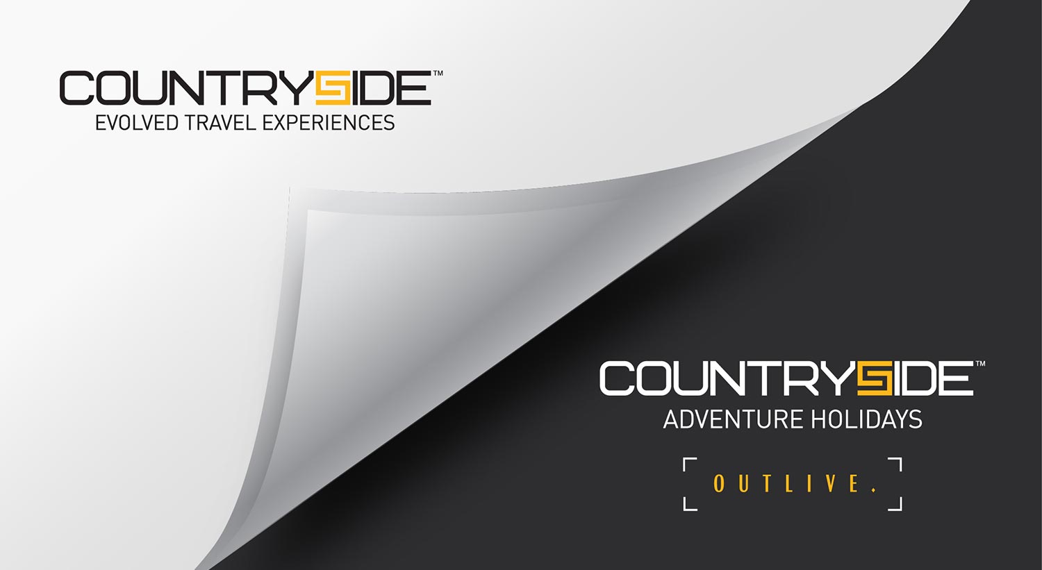
More and more international products were getting added to the brand’s kitty. As a result the brand positioning was elevated to ‘Outlive’ and the entire line of communication was channelised towards it.
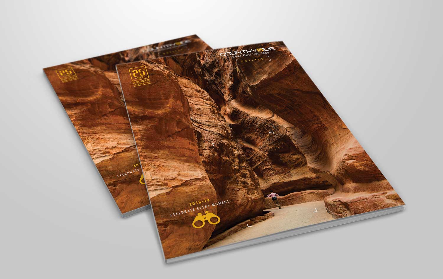
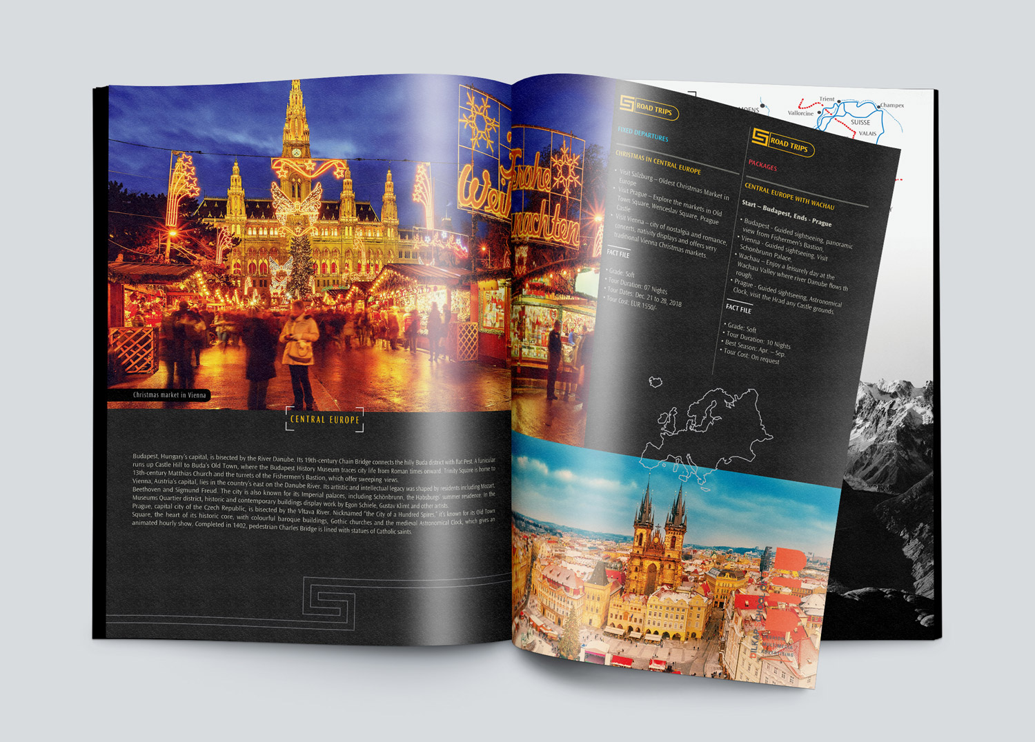
The look of the brochure was elevated and we focussed more on impactful images of international destinations that could interest the audience through its sheer image value.
We added more value to the emailers through refined insights that countryside had in its 20+ years expertise.


The three year ongoing work with Countryside has changed the perception value of the brand. The brand got featured in various media and TV interviews achieving high mileage and better sell value.
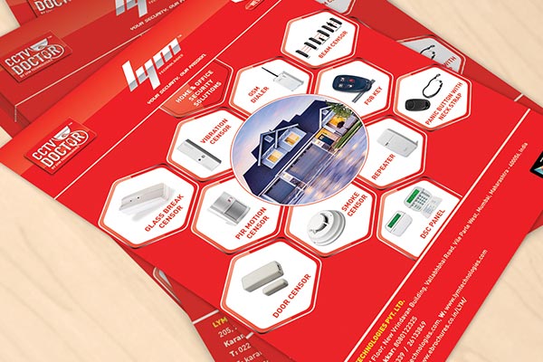
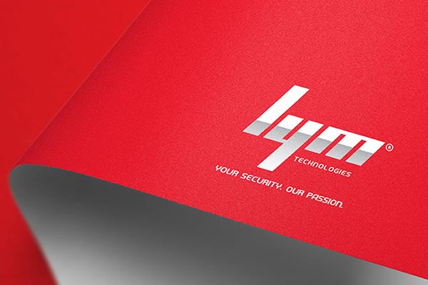
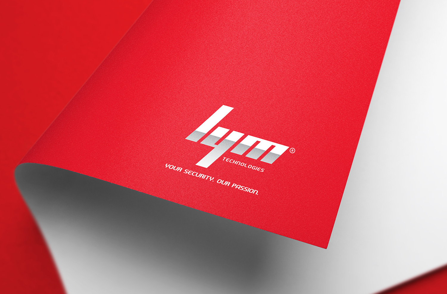
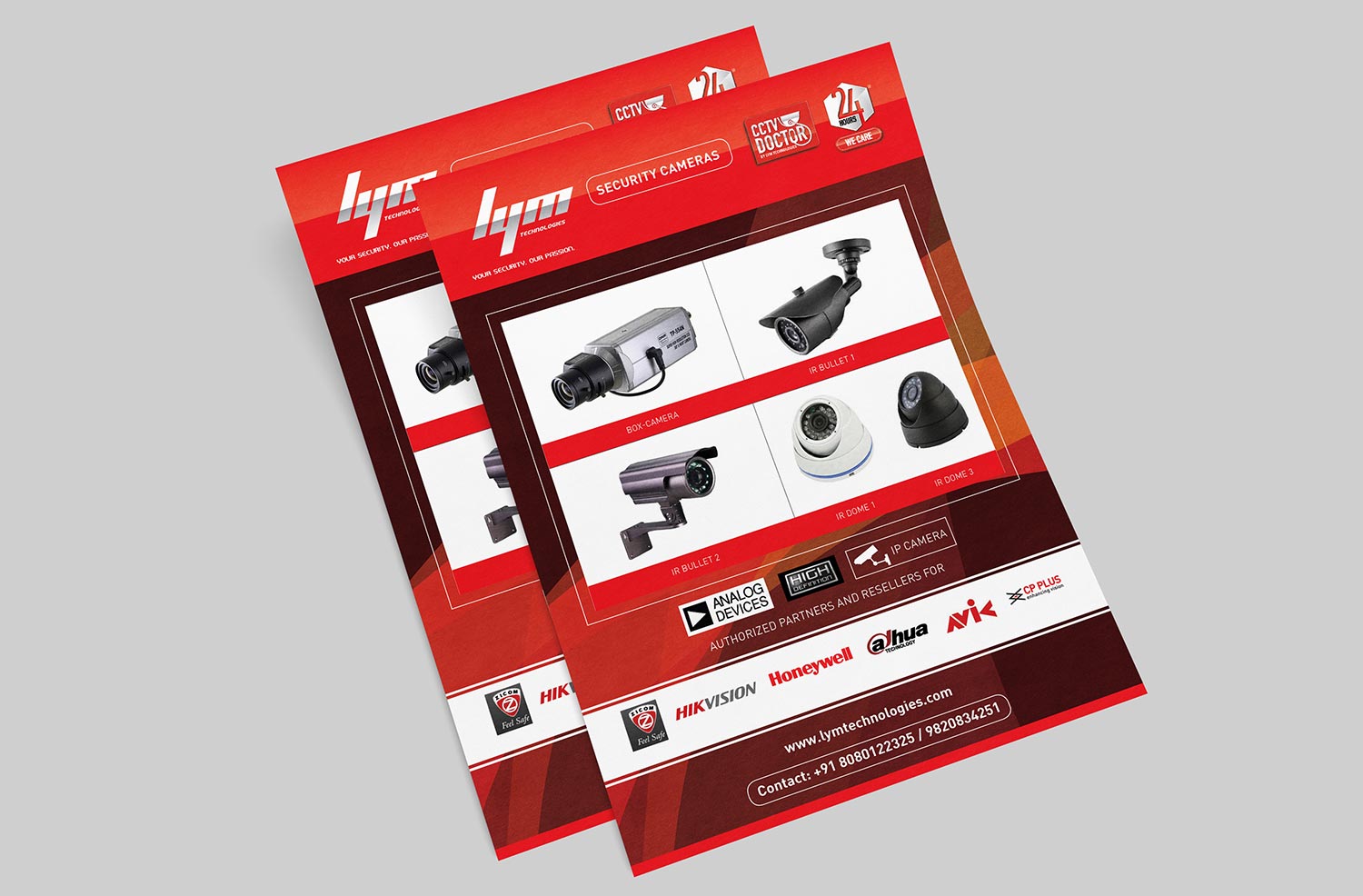
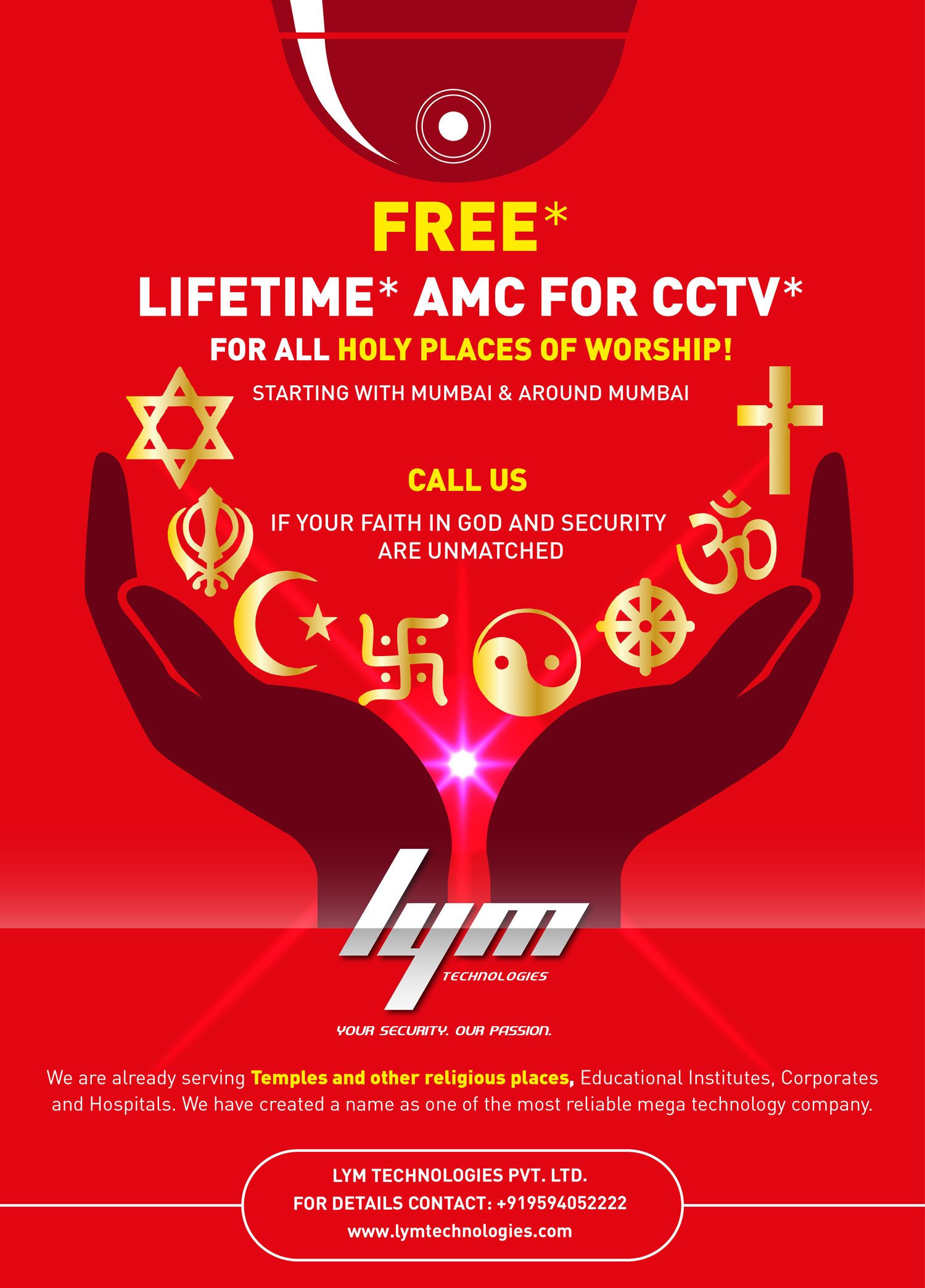
CASE STUDY 6 - LYM
Old Identity
Challenges:
- Non-impactful logo in front of the competition
- Absence of any sort of consistency or coherence of brand usage
- Non-impactful communications from the brand.
- Non-impactful first impression of the brand.
- Negligible perception value.
Solution:
- Lym was always about a dynamic personality named Mayank Thakker. We translated his dynamism into the brand and made it more vibrant and strong. As a result the colour selected was bright red. And graphics designed were very bold and contemporary. This changed the entire perception value and feel of the brand.
- The prior communication going out from Lym Technologies was very fragmented. We used the consistency of red colour and converted into a relevant brand language. The communications in the form of brochure, leaflets, profile, festive wishes, product emailers, standees all went out with one unified brand language and as a result, people now recognise Lym through its most famous red colour.
- We achieved the consistency and coherence which the brand was lacking and as a result in the next three years brand turnover recorded its all time high.
New Identity
Lym is the combination of initials. Even if this was the compulsion as a name, we tried to make it interesting by constructing the three letters in such a way, that the brand looked dynamic, fast, and energetic. We believed that for any individual to be able to talk about safety he himself must have that energy in himself to keep things safe. The same went for the brand. With this thought we created the brand called ‘Lym Technologies’.

The components of brand identity started from the construction of 3 letters to the sub-name line and finally the positioning, ‘Your security, our passion’.
We created the brand language with the infamous red colour, since that was the colour with energy, dynamism and spirit. The trick was in using red colour with a certain percentage along with white and grey. Accordingly we decided it should 80 / 10 /10.
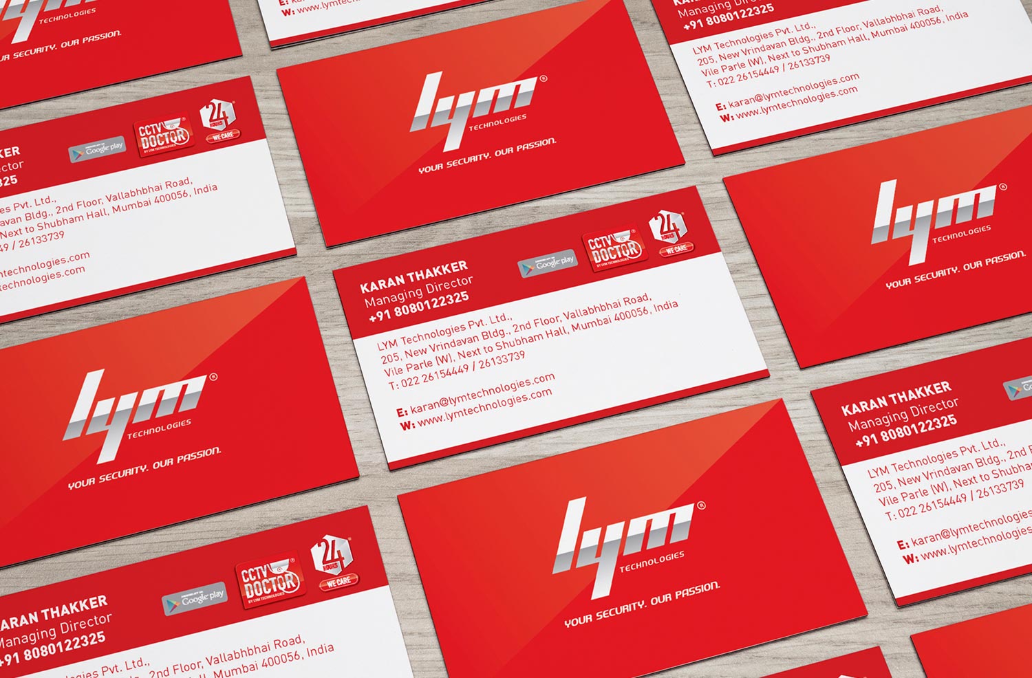
Brand language was carried across different mediums like stationery, e-mailers, social media posts, standees, flyers etc.
Communication Design


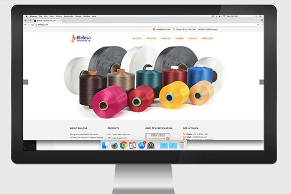
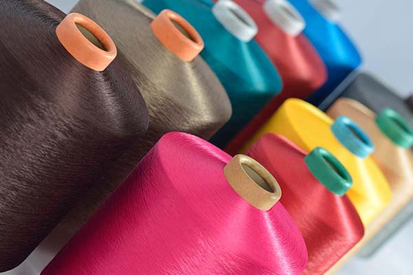
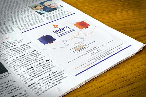
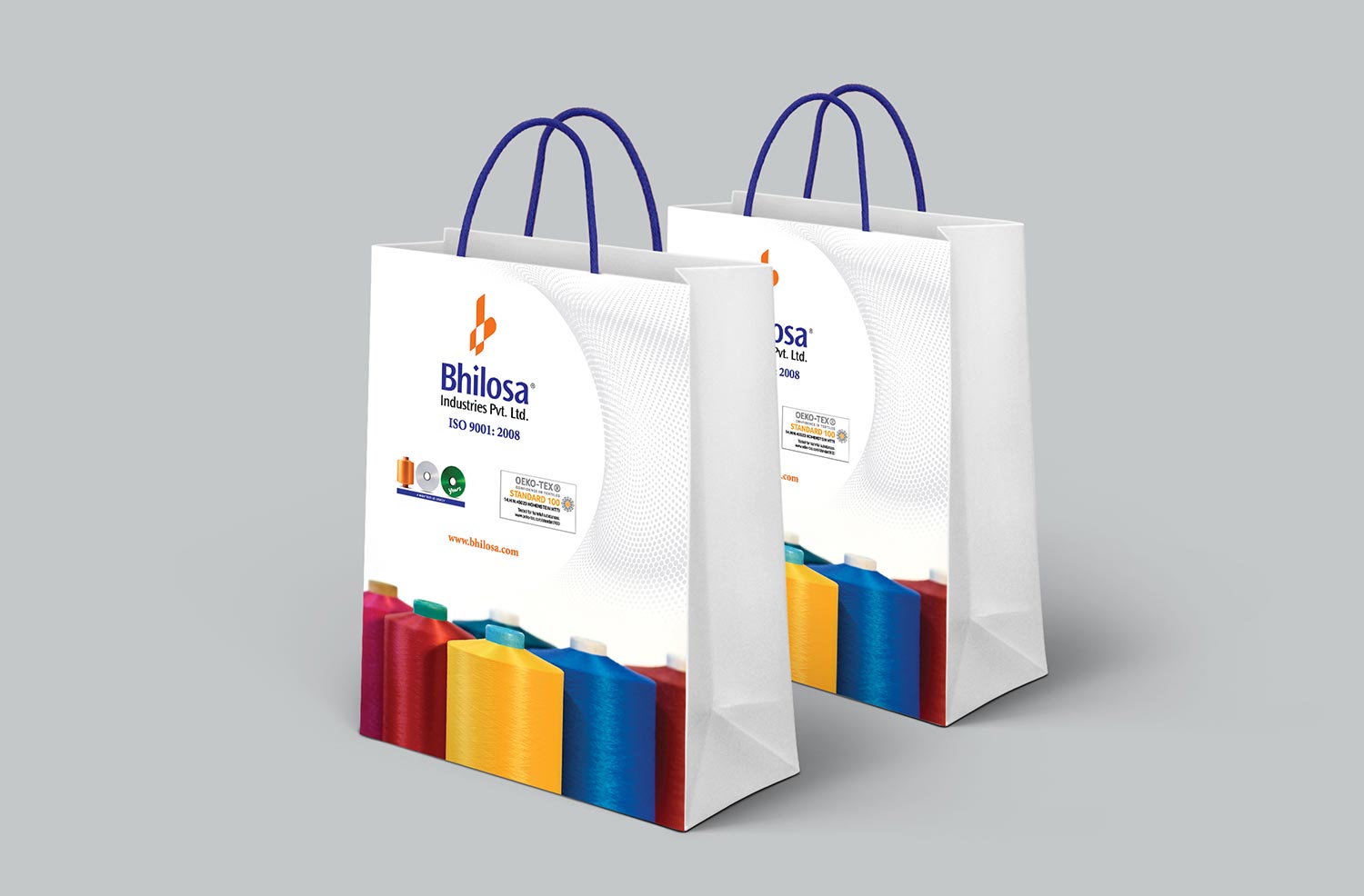
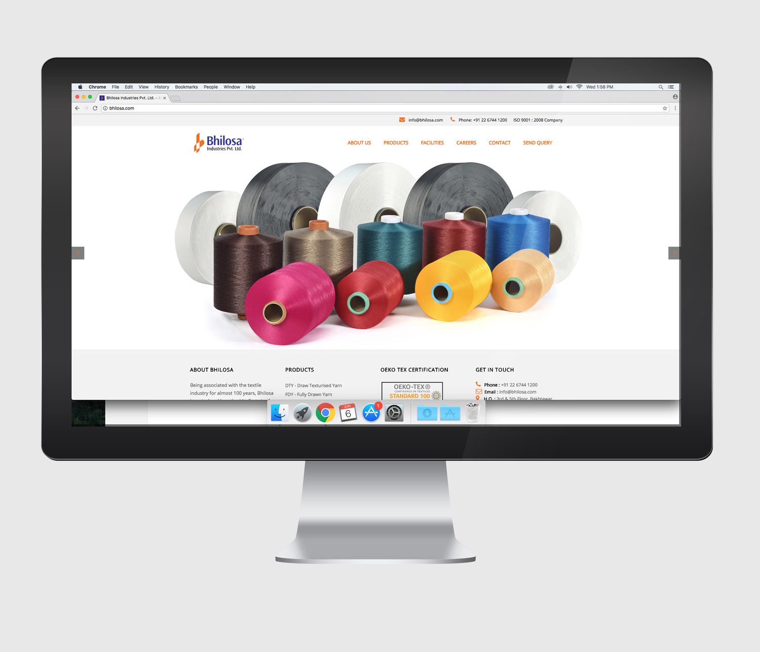
CASE STUDY 7 - BHILOSA
Old Identity
Challenges:
- Poor font selection, disorganised and badly constructed symbol was deteriorating brand image of Bhilosa.
- Our task was to resurrect the legacy that Bhilosa holds through its logo / identity by carefully constructing the elements of the logo.
- Bhilosa also needed to speak a language of a 100 year old brand and showcase its products at par with the competition.We were commissioned to do whole identity system of the brand.
Solution:
- We carefully reconstructed the key elements in the logo namely—typeface and the symbol and placed them in grids proportionately.
- We improved the product imagery and made it look state-of-the-art.
- We fixed the colour codes and finally proceeded towards communicating the right stories in the most sophisticated way.
New Identity
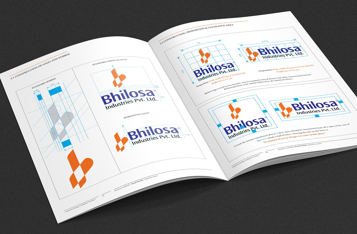
A carefully constructed logo made a huge impact on the brand image of Bhilosa.
Communication Design
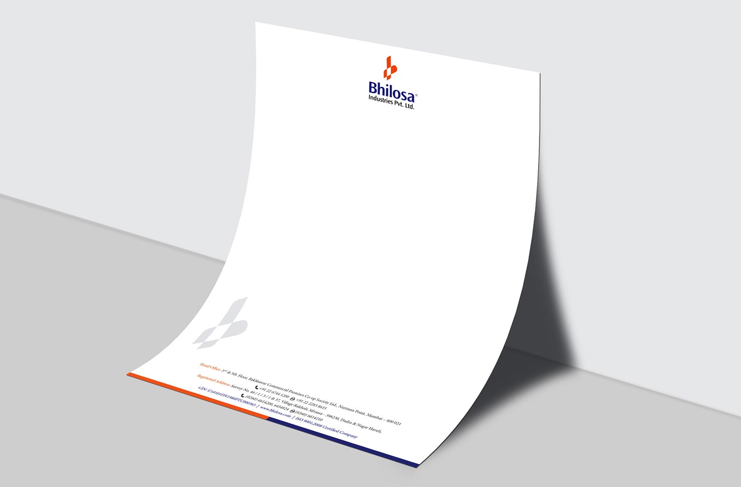
We carried the brand equity of two colours together and took the brand to the next level.
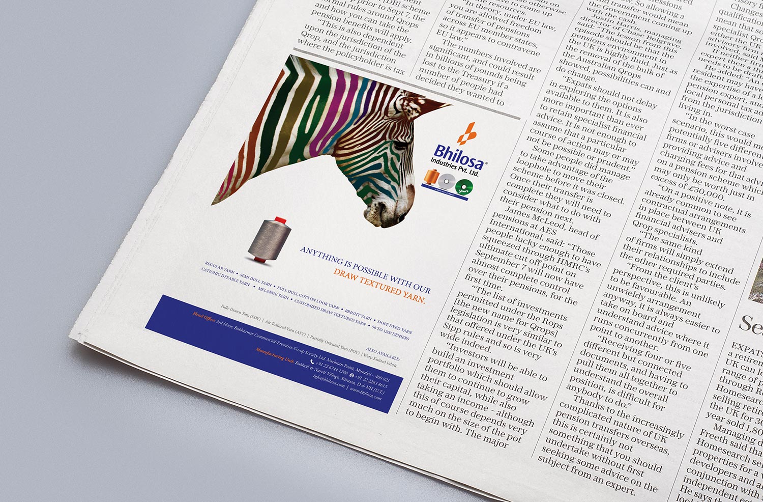
We made sure the right message was passed in the most exciting way and yet kept it subtle and corporate.

Web Design
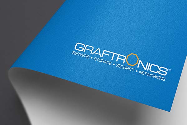
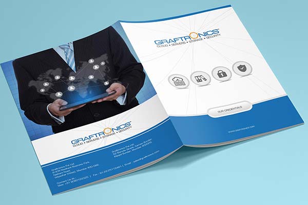
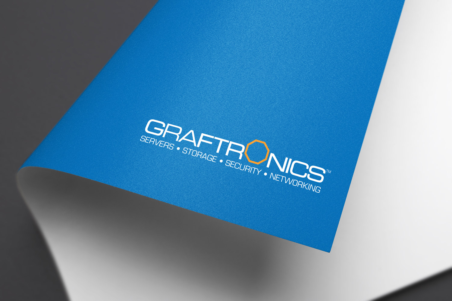
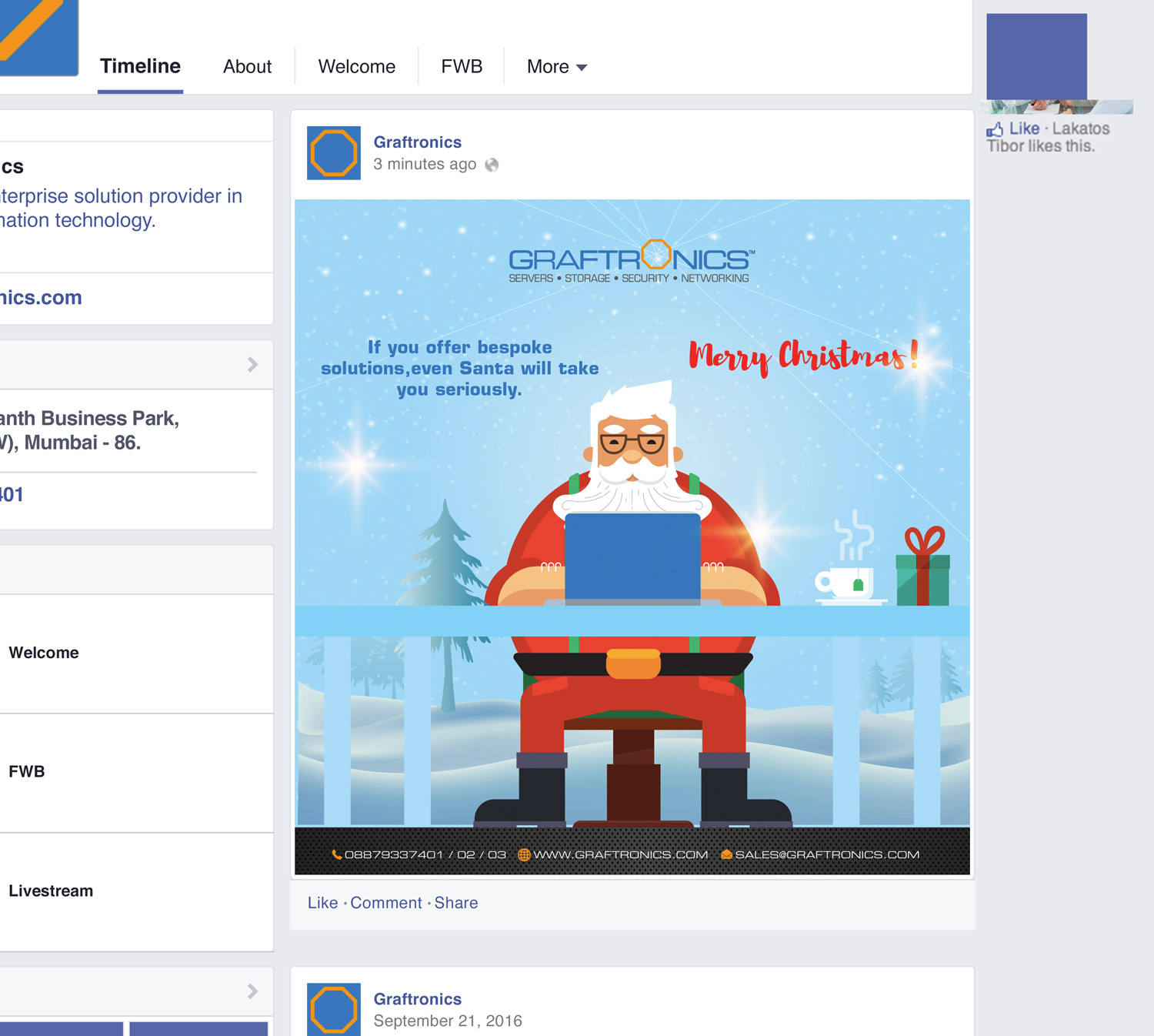
CASE STUDY 8 - GRAFTRONICS
Old Identity
Challenges:
- As a 25 year old brand, Graftronics logo / identity did not speak the language of new age Technology.
- Wrong choice of fonts as well as absence of uniqueness were the points that made the identity looked weak in comparison with the players Graftronics was in competition with.
- New offerings of the company needed to be communicated with a fresh face.
Solution:
- Idea came from the term 'Everything under one roof’ given by the client
- Communicate the vast range of product offerings in a more subtle way, making this as positioning and USP of the logo.
- A shape such as Octagon communicated its comprehensiveness through Eight corners (Eight directions) so every possible direction, brand could help its clients with professional services. Octagon also worked as a connecting element to each other relating more to network, IT services, servers etc.
- The new identity changed the face of the company drastically to achieve what we set out to. 'Creating better perception value that supports its products’.
New Identity
The octagon was a right shape to communicate the comprehensiveness of the offerings in all directions, hence it was designed as a symbol for the brand.
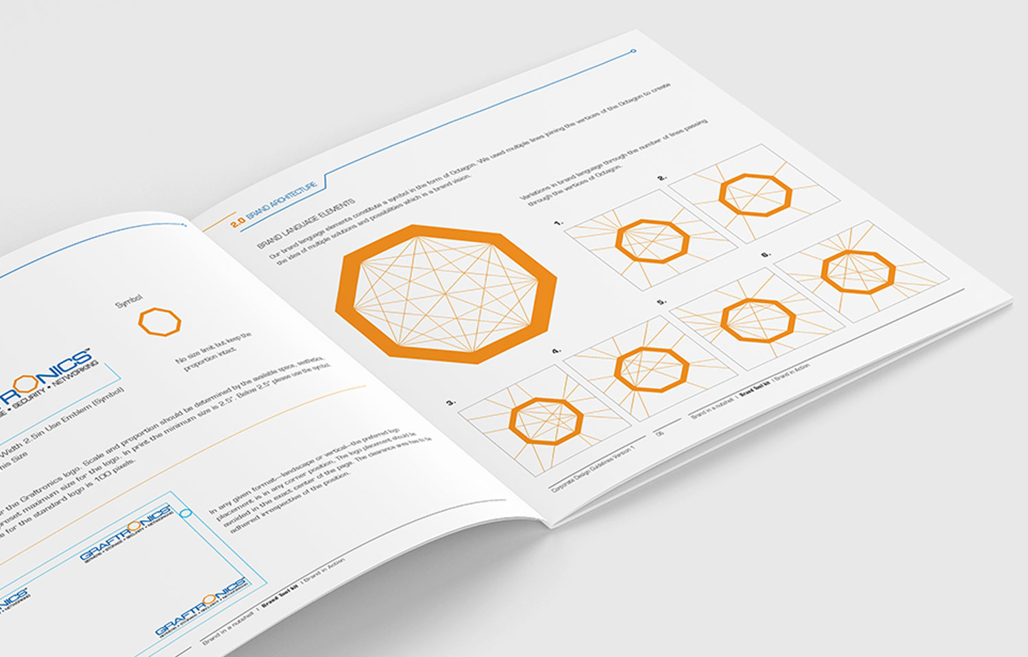
Taking the Octagon, we drew lines (radii) from the centre, to indicate the vast offerings that brand had. A lot of combination of lines could be made, just like lot of combinations of products could be made for the customer. Brand language—An octagon accompanied by lines drawn from its centre was carried everywhere along with the logo. Also we carried the brand equity of blue colour used in the old identity as a continuation point of the brand.
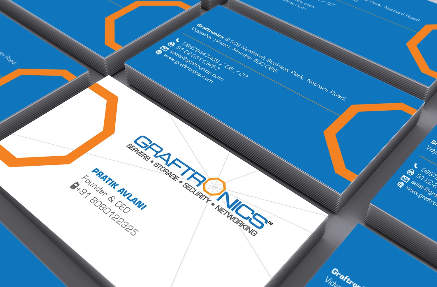
Communication Design

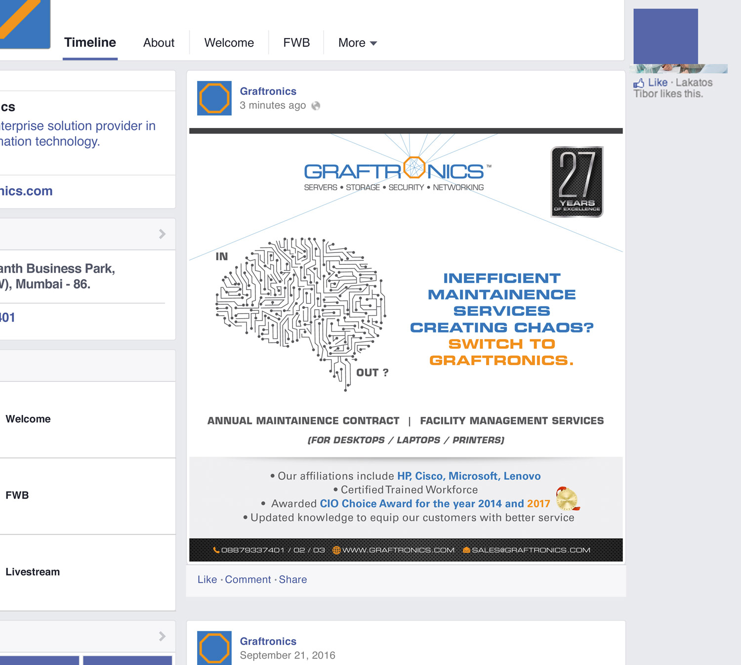
Company profile was designed with more infographics to be able to understand the product line faster, and look of the brochure was kept more contemporary.


Product brochures communicated the solution to the pre-existing problem with interesting visuals.

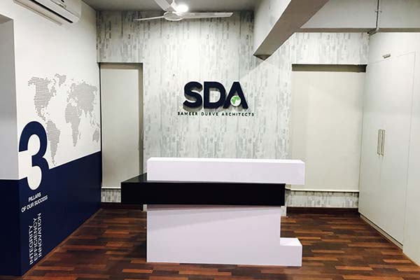
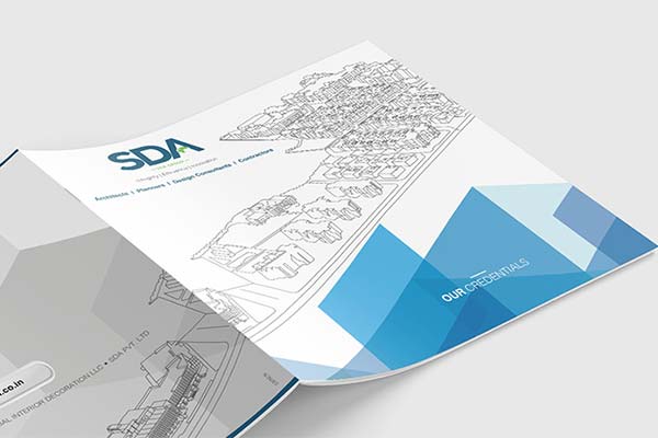
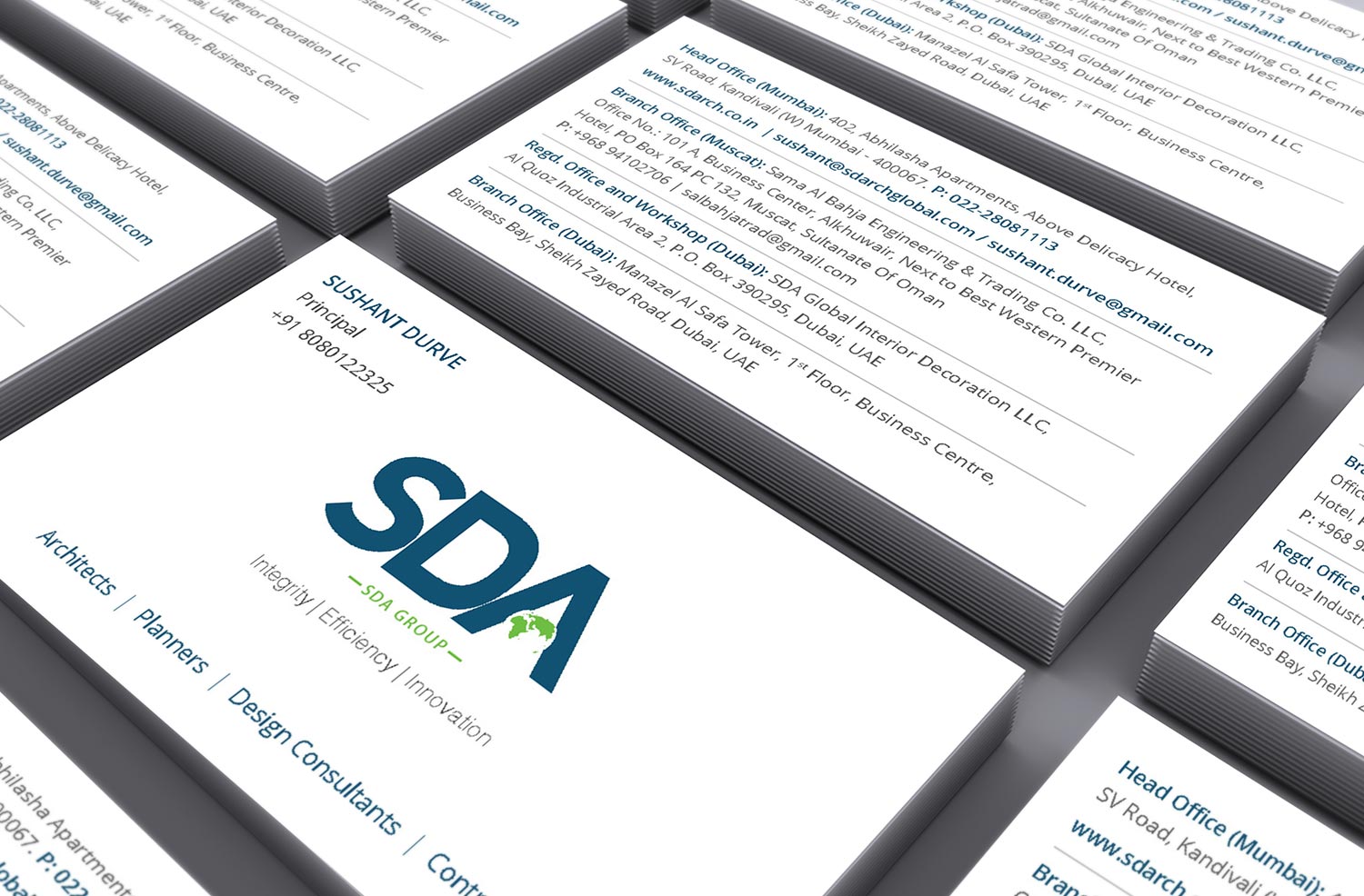
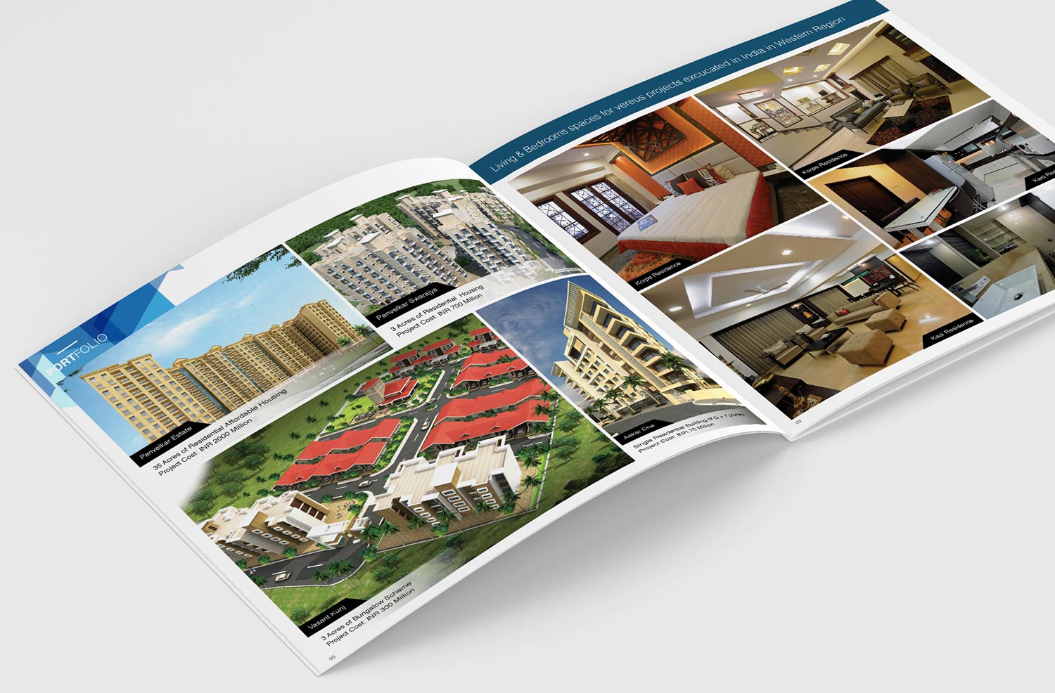
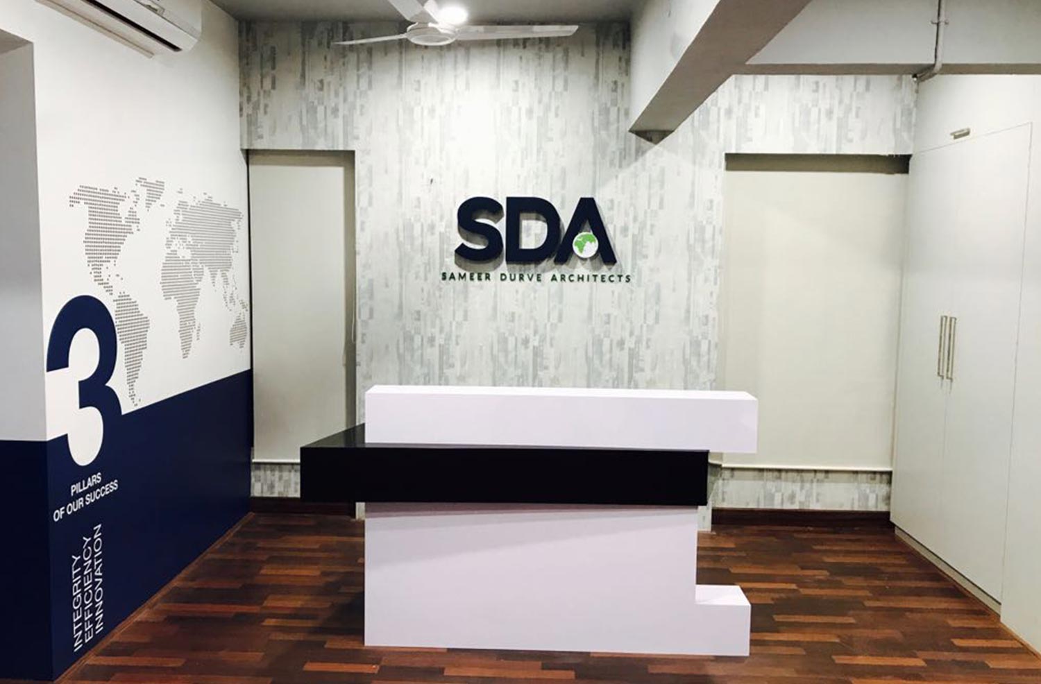
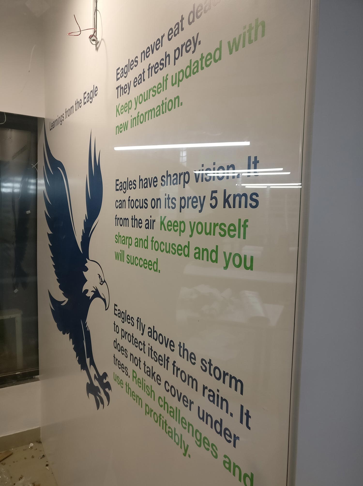
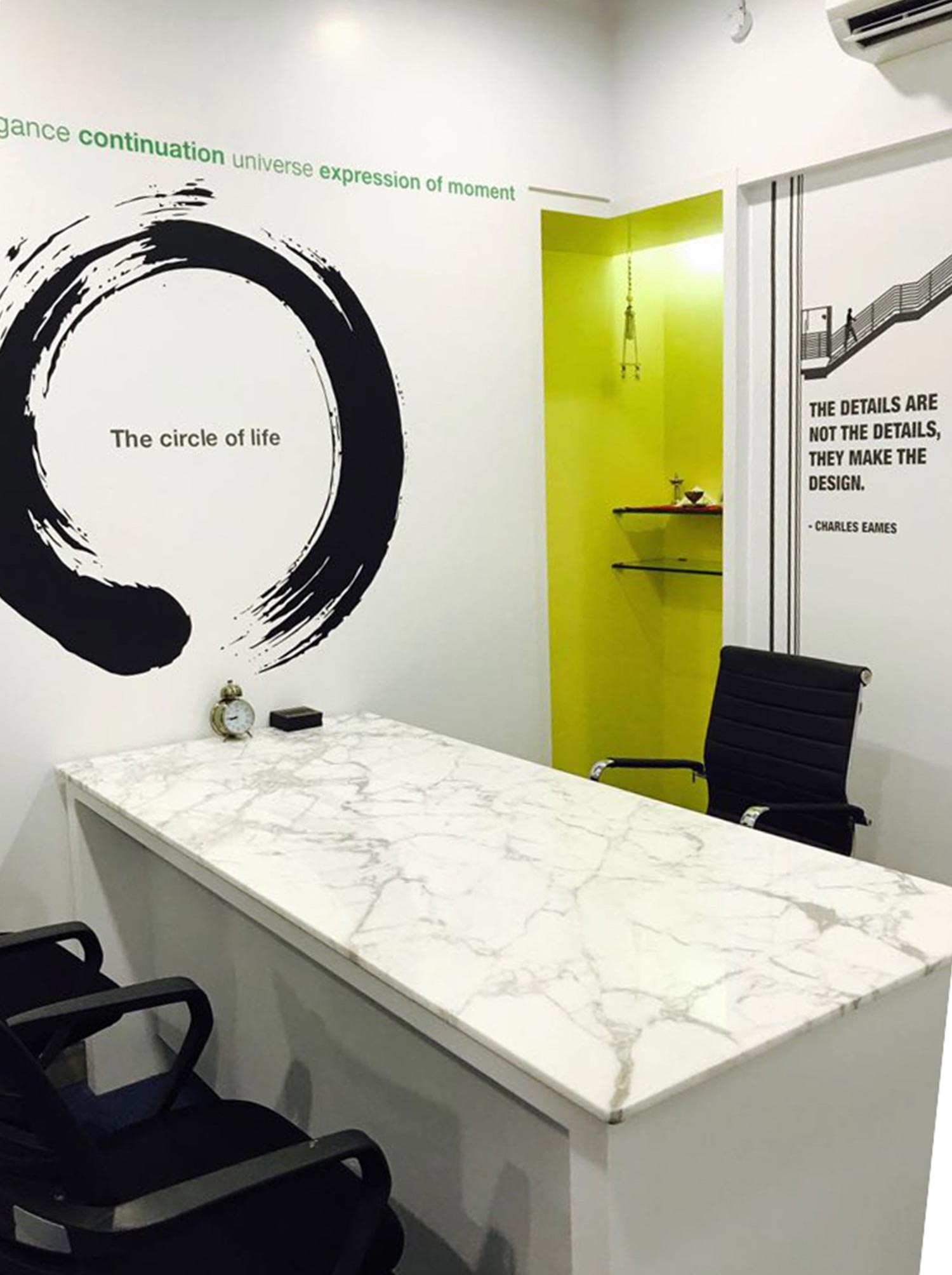
CASE STUDY 9 - SDA
Challenges:
- Client did not want to change the logo.
- The logo was not well constructed with proportions of spacing.
- Brand did not have any positioning.
- Perception value was not of international standards.
Solution:
- We started off with creating a very broader positioning for the brand so that it can accommodate a lot of ideas together.
- We then reconstructed the logo with proportionate spacing making it uniform across all collaterals.
- We created brand guidelines to regularise the logo and put its usage into much required discipline.
- We added a touch of International class to the brand perception by taking their projects and converting them into a very illustrative language of lines.
- We also worked on the environmental wall communications for their office to present a very international look to both their people as well as their clients.
Identity Design

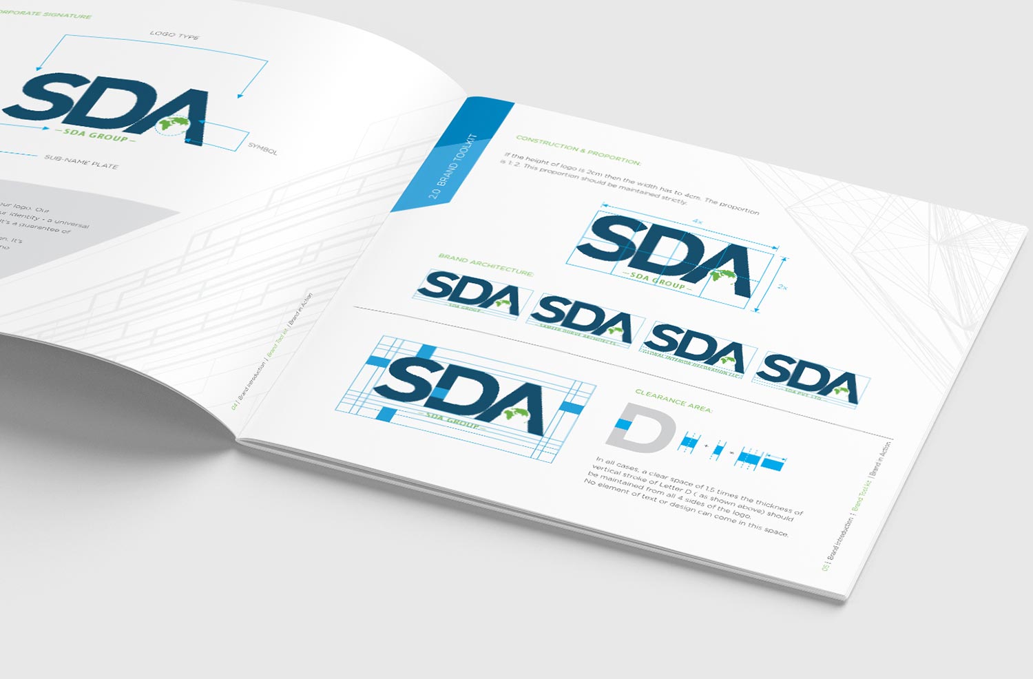
Logo was reconstructed with proportionate spacing keeping it readable even at small sizes. We added the positioning ‘Integrity | Efficiency | Innovation to the brand. We also built brand architecture for using the brand entity in different parts of the world.
Communication Design

Selective projects of SDA were converted into illustrative language of lines. This added a touch of class which the brand was lacking.
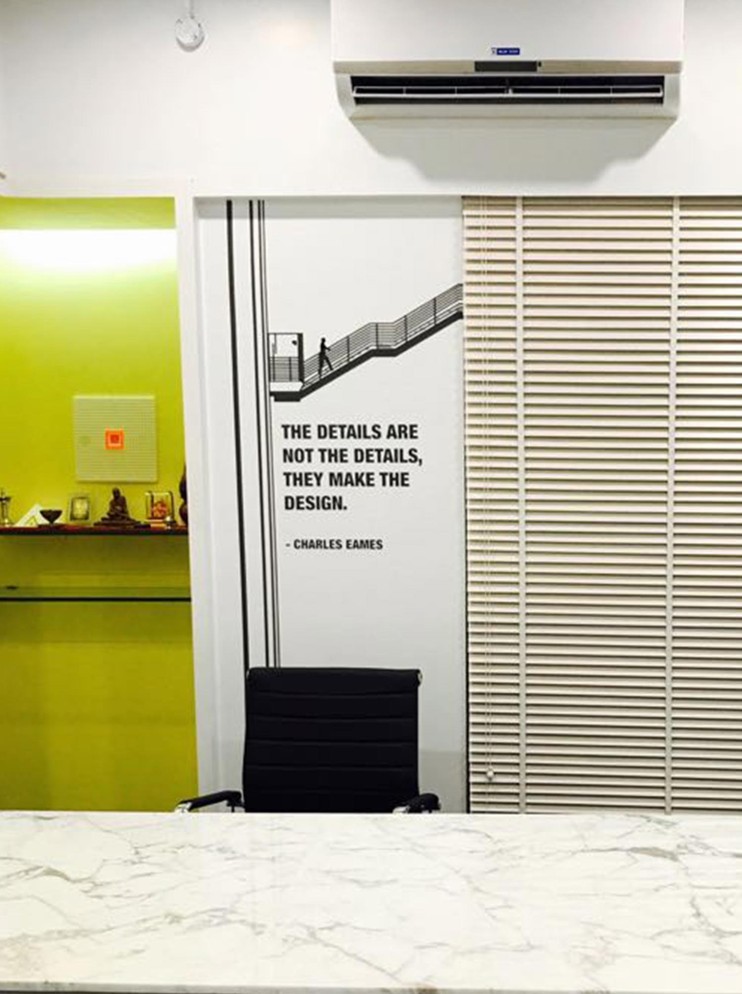
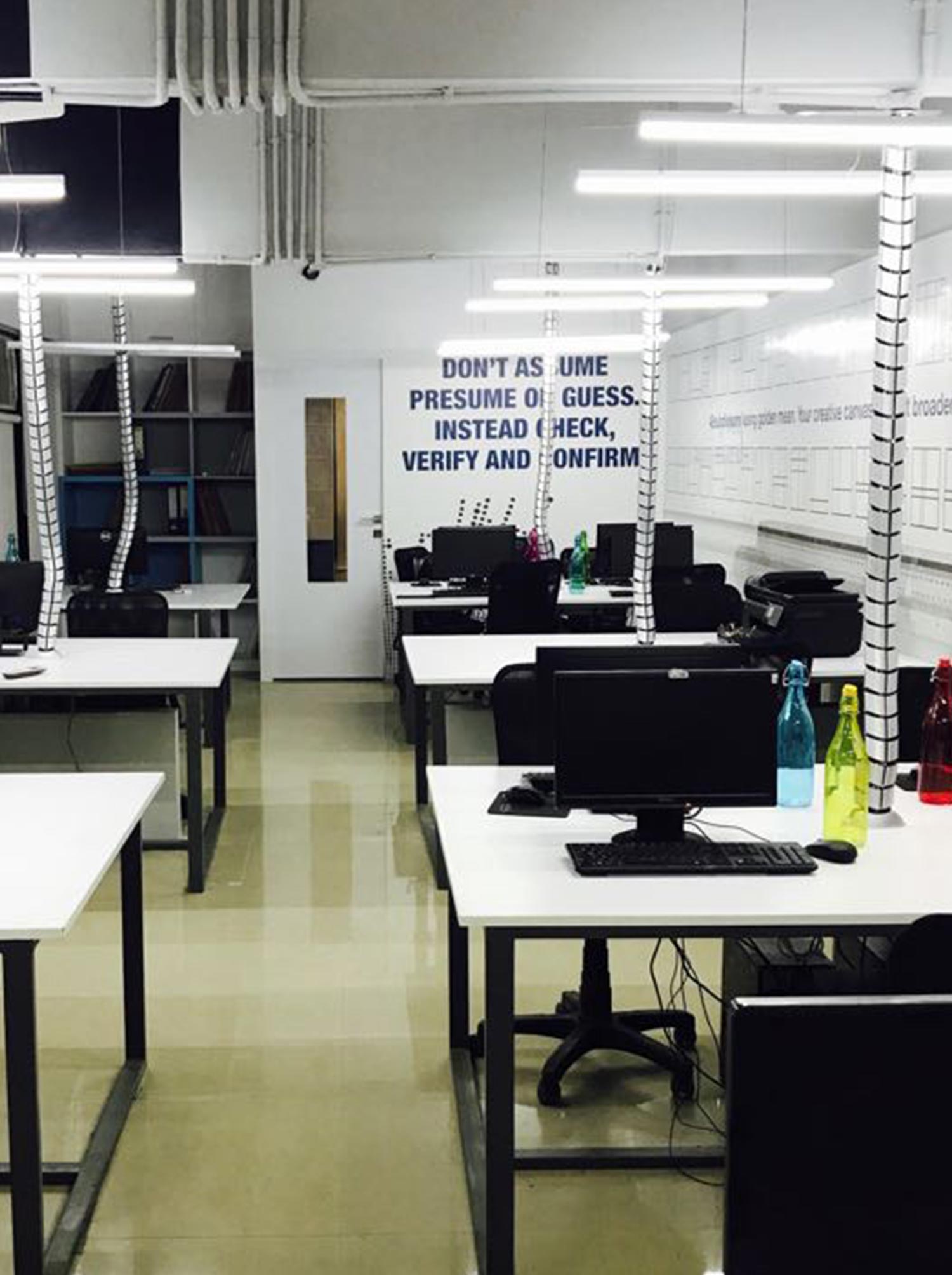
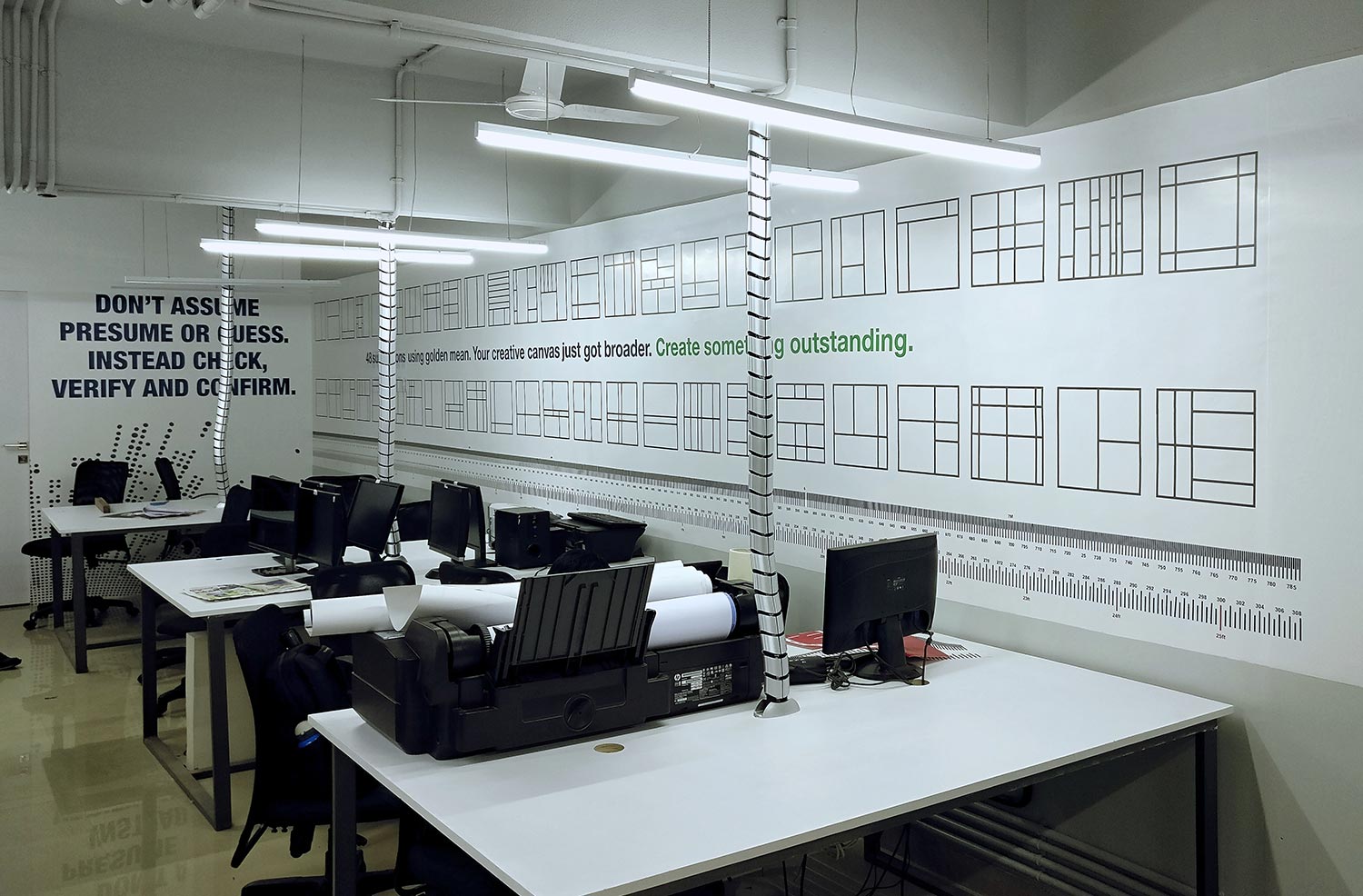
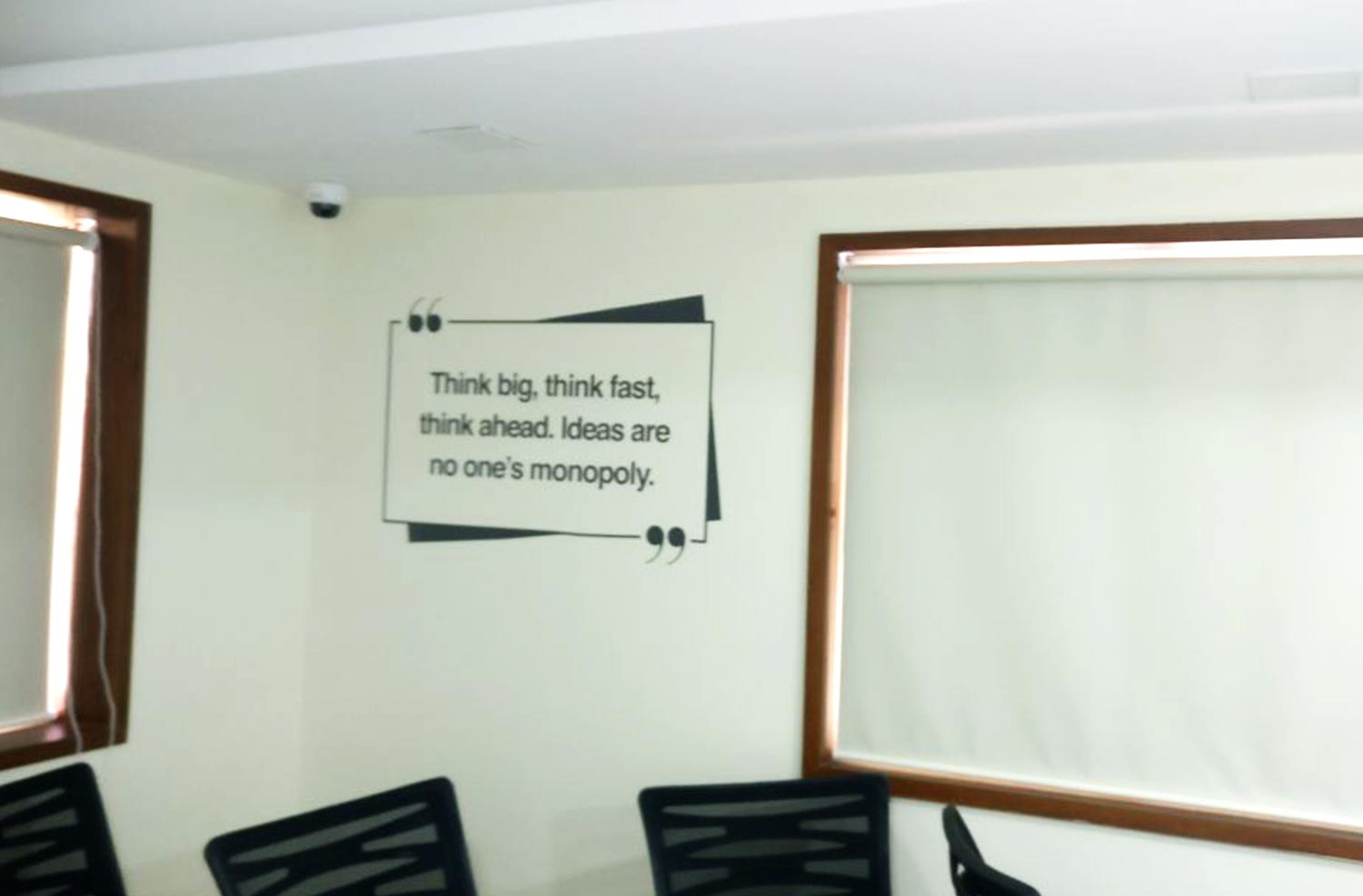
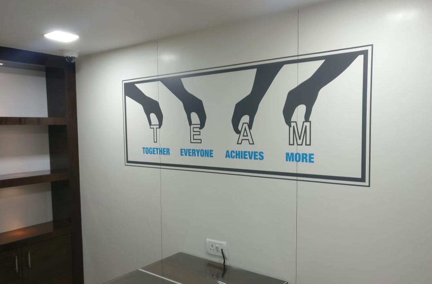
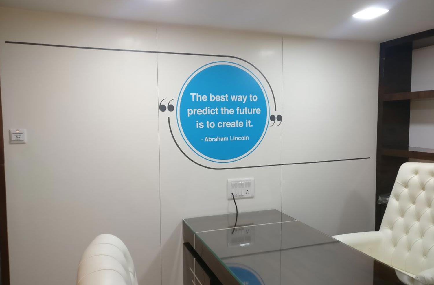
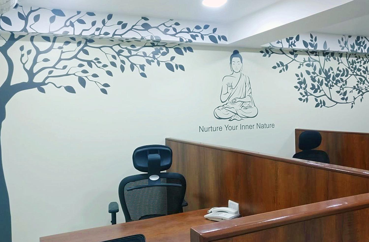
Wall Communication Design
Within the parameters of ‘Integrity | Efficiency | Innovation’ we devised a concept for SDA office where the idea for each space was designed as per the people occupying the space. So a work station space triggered ideas for architects, while Directors cabin talked about bigger ideas like ‘Circle of life’.


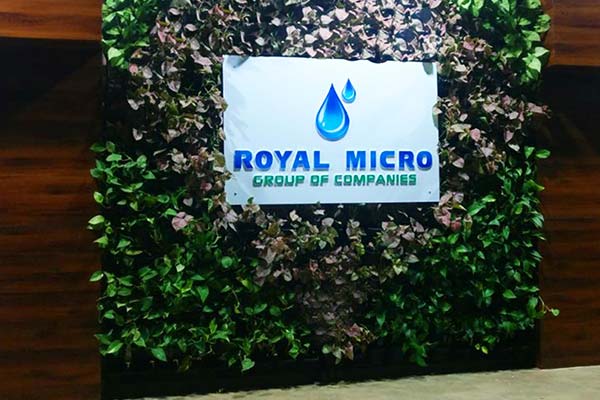
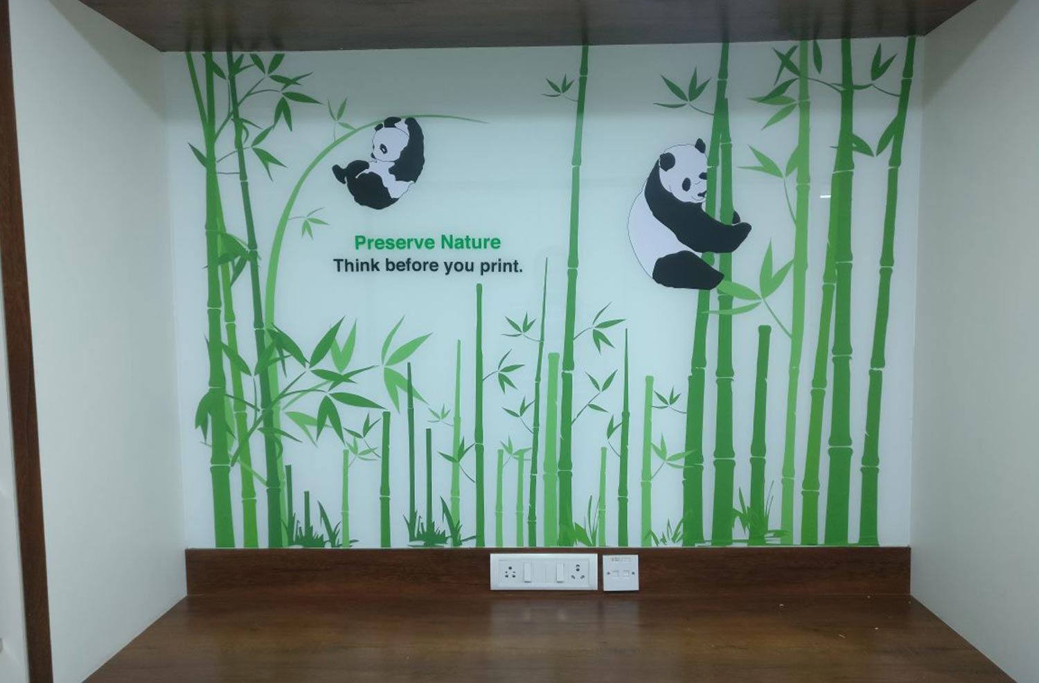
CASE STUDY 10 - ROYAL MICRO
Challenges:
- Client did not want to change the logo.
- We had to use the same logo and improvise on concept part to create a corporate brand image.
Solution:
- We realised that Royal Micro through its products was promoting water and nature conservation.
- We worked closely on water and nature conservation with a blue and green theme that was found in the logo.
- Every space spoke about two aspects separately—viz. water and nature conservation through quotes, graphics relevant to the people occupying the space.
Wall Communication Design


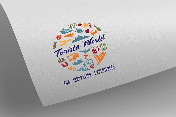
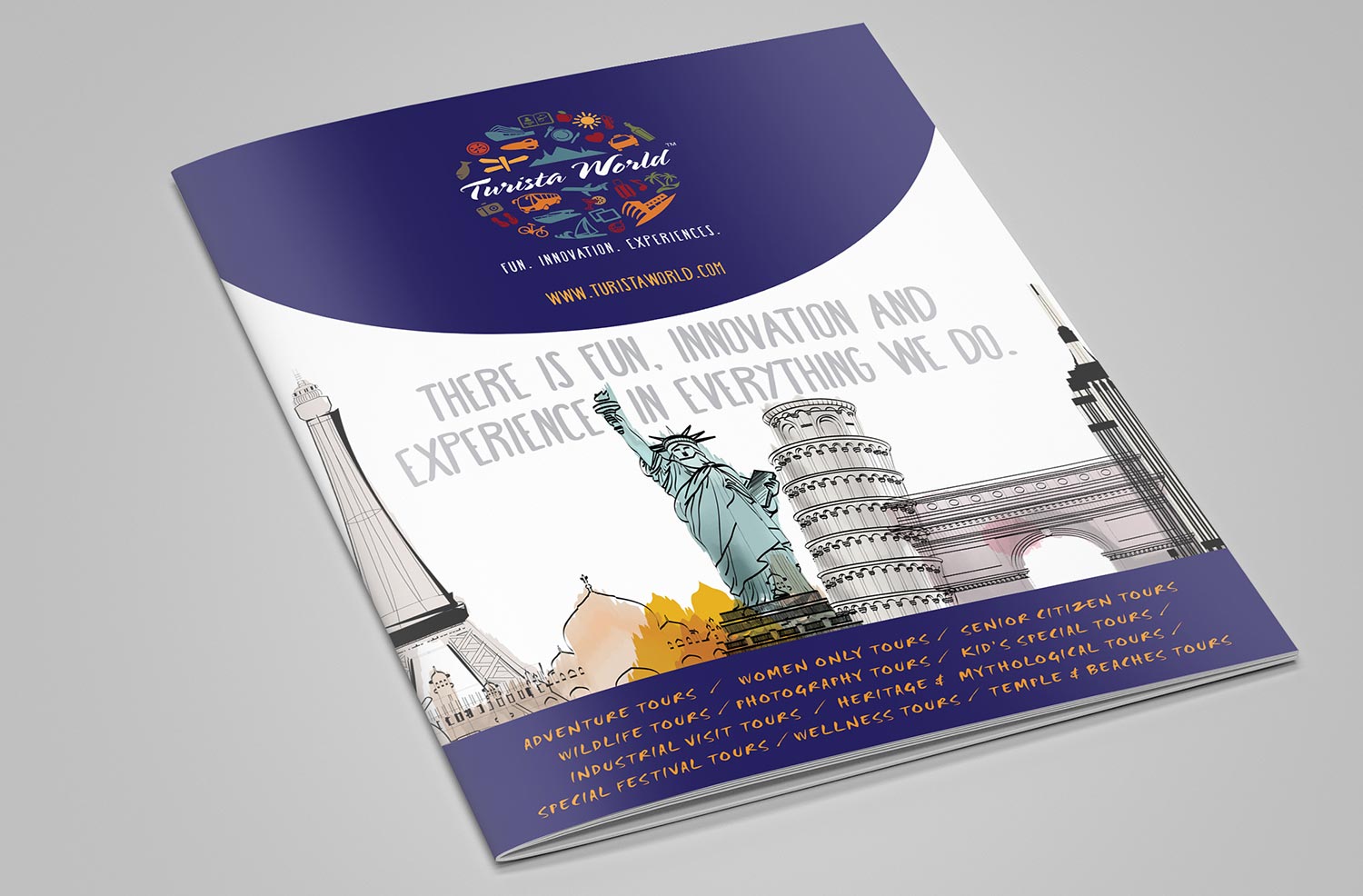
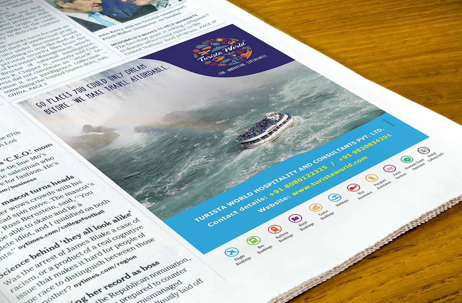
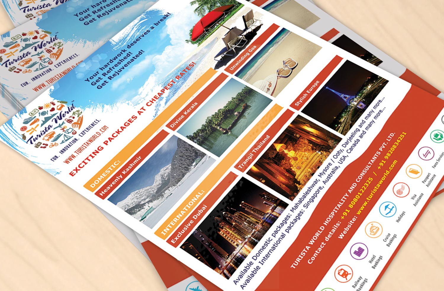
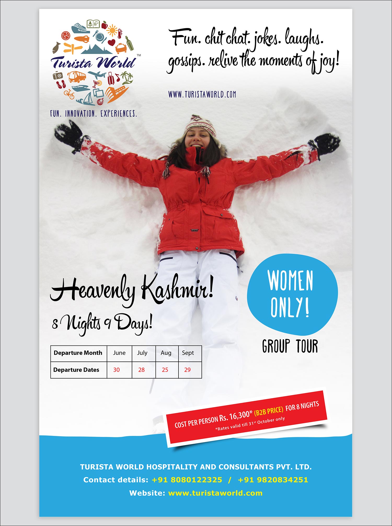
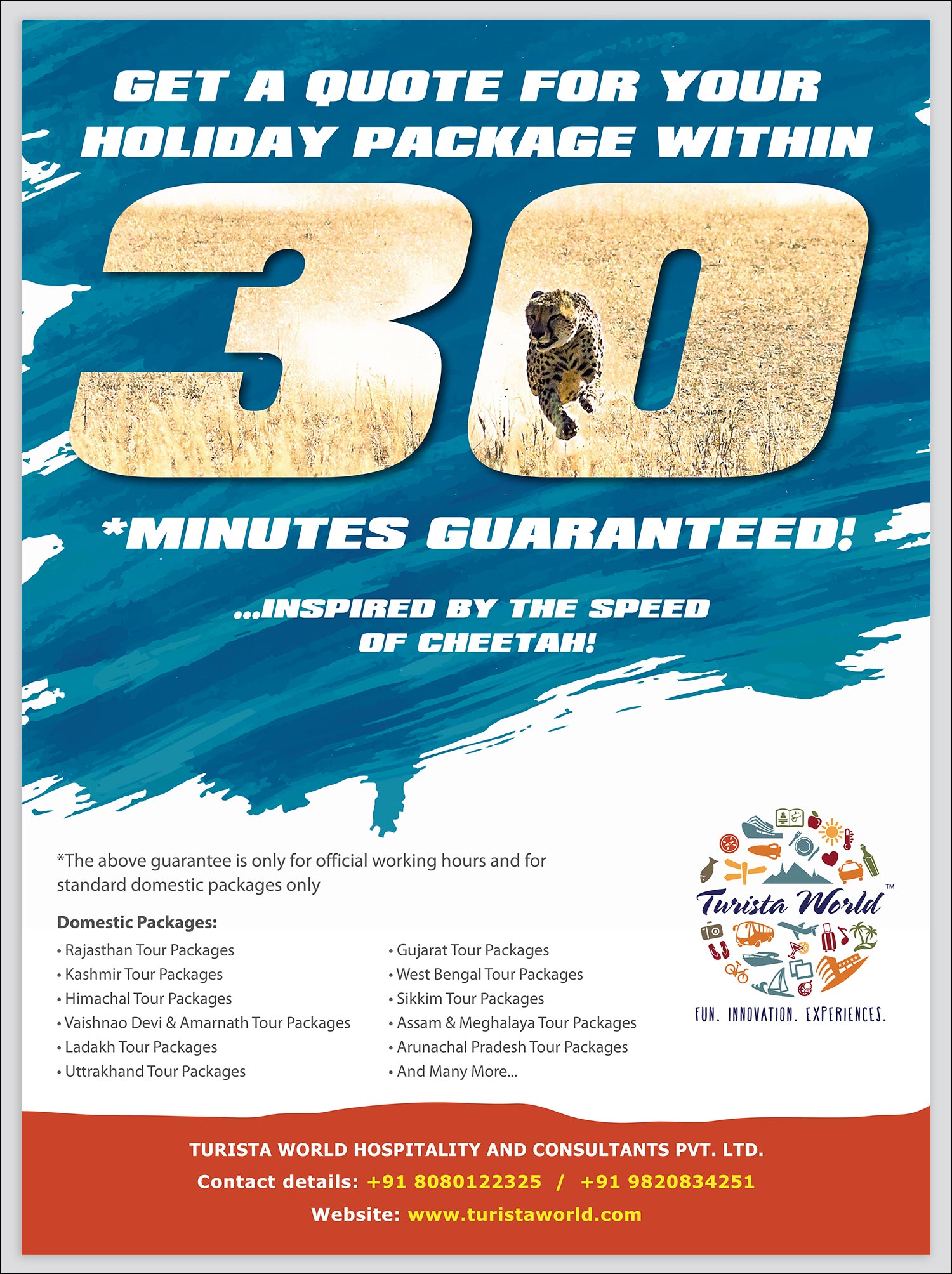
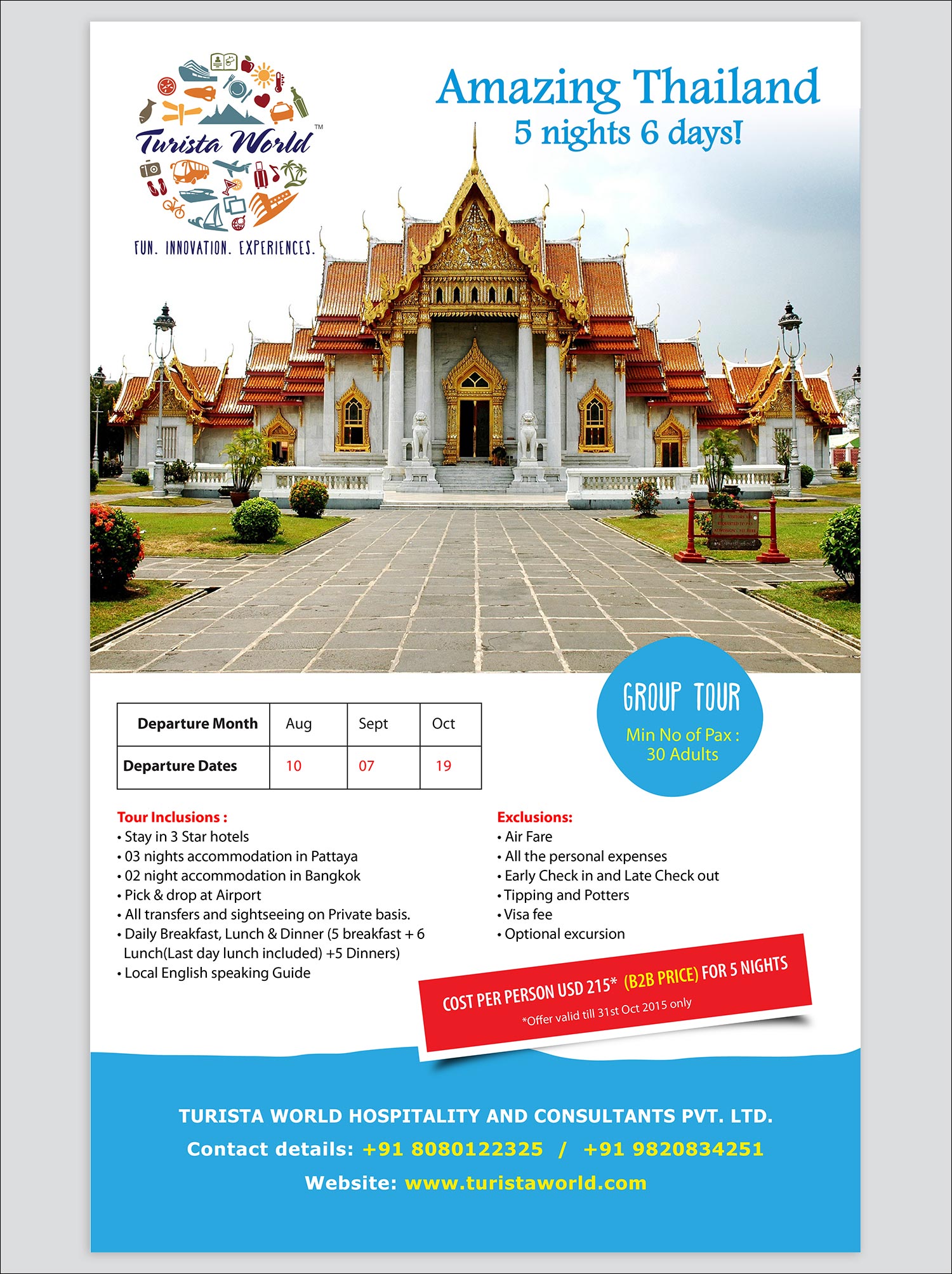
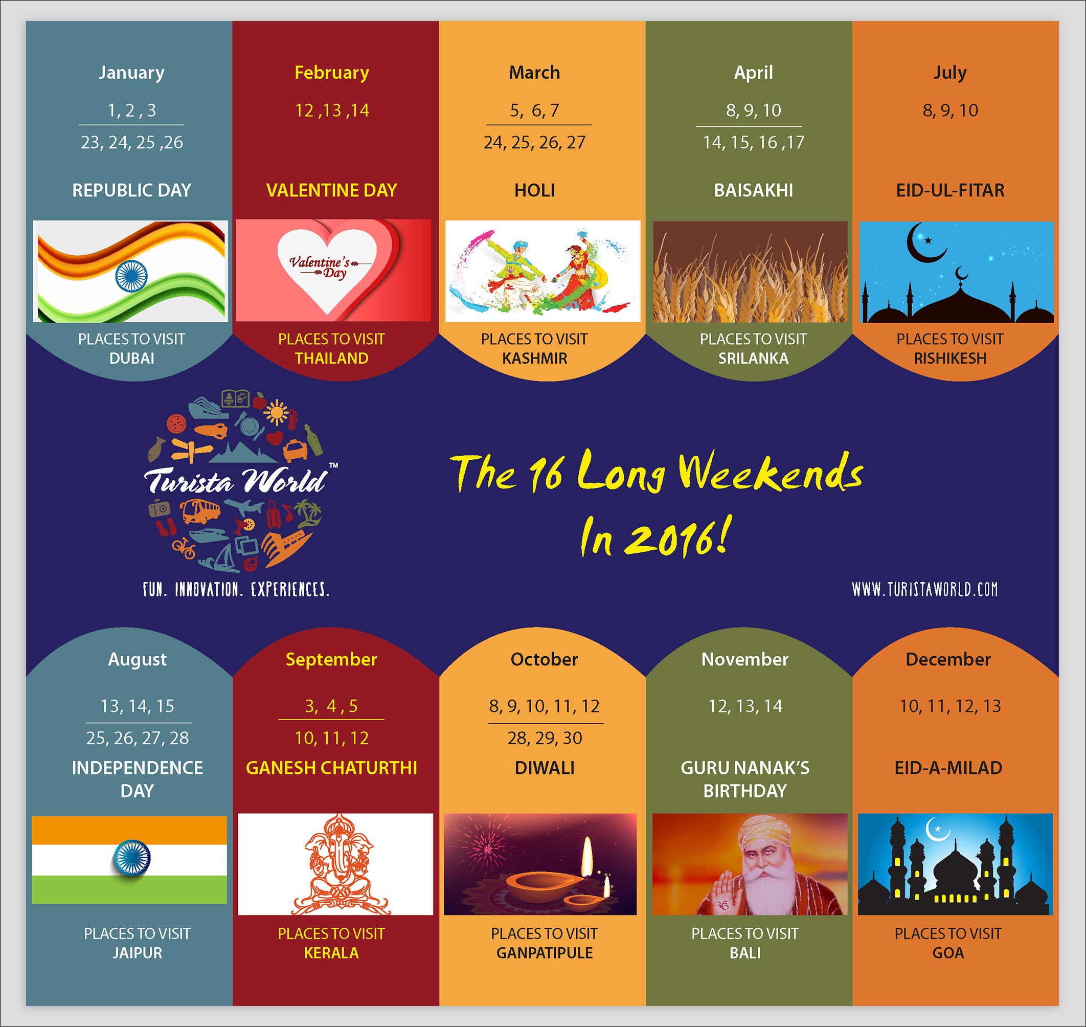
CASE STUDY 11 - TURISTA WORLD
Challenges:
- A travel brand that needed to look colourful among the clutter.
- And yet explain all the important aspects of travel put together in the most creative way.
- Also the brand was targeting world travel hence that idea of the world had to come in the logo.
- The brand had to look very casual.
Solution:
- We created a combination of multiple 28 icons combined in a logo.
- It made the logo achieve the idea of separating from clutter in the most creative way.
- The icons were arranged in a circular format to denote the world (globe).
- All the icons were rendered in 9 different colours creating a big impact—not too noisy an dnot too subtle. The brand got its feel of ‘being casual’ through it.
Identity Design

Elements of travel come together and form a very unique identity that stands apart in the competition.


Care was taken to construct every icon in its rightful place, so that the collection of icons does not become very crowded. The font used was very casual and gave a feel of joy and free flowing spirit of travel. Brand language allowed us a lot of freedom to use icons across collaterals, to make the brand look fresh every time we see it.

Icons became a very big part of the language for Turista World. We used the combination of Prussian Blue to reinforce a strong impact of the identity across the mediums.

Communication Design
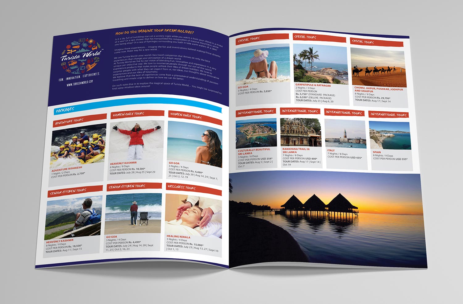
The company profile spoke in detail about the packages, carrying the same casual theme throughout the brochure.
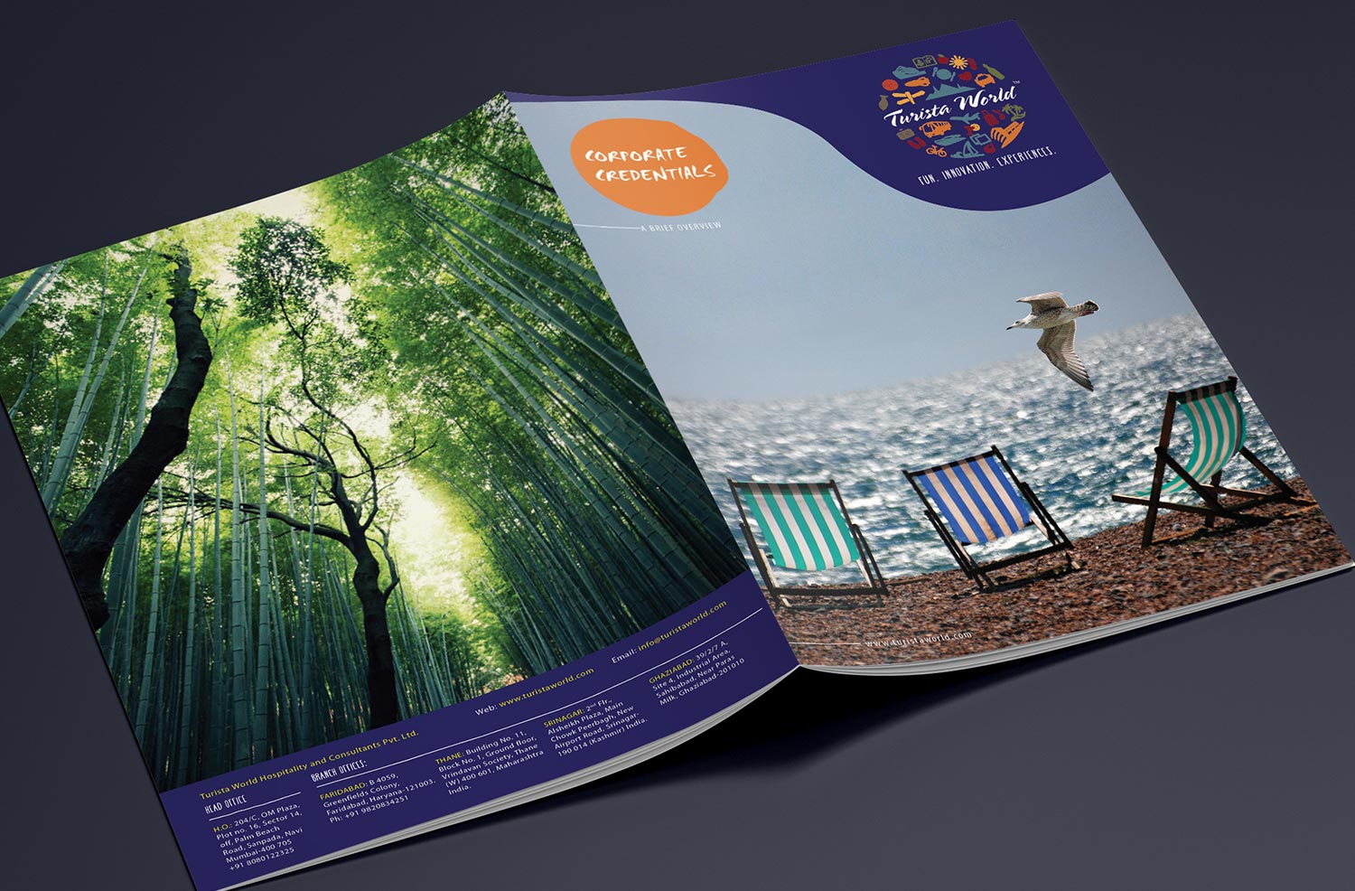
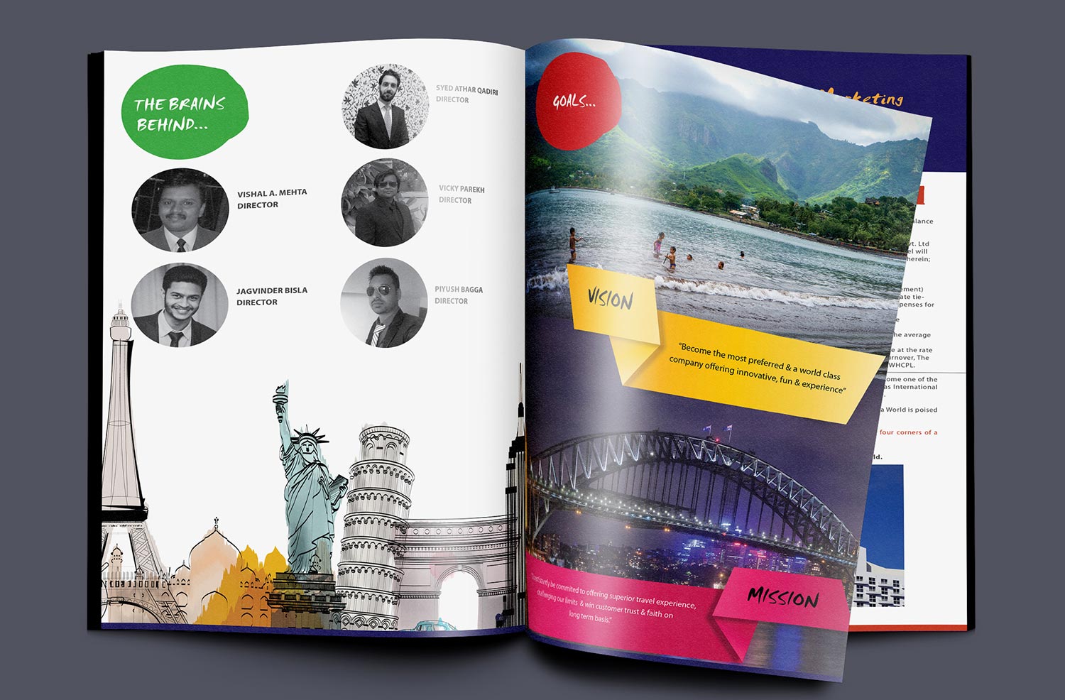
Brand credentials spoke about the details of the company such such as vision, goals, directors etc. in the same brand language which made the credentials seem very different.


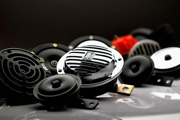
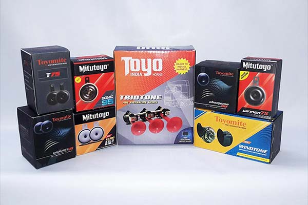
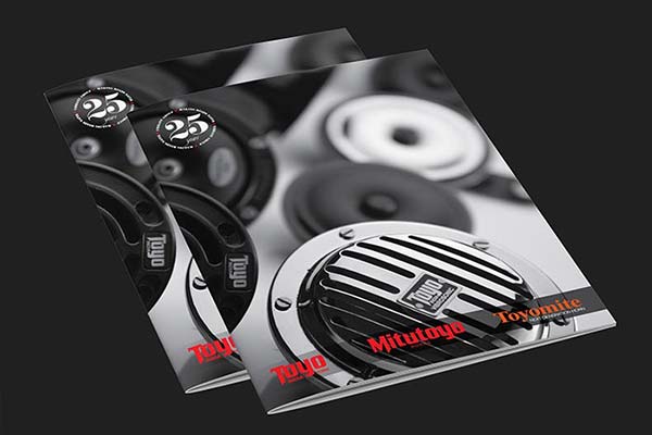
CASE STUDY 12 - VIBRANT INDUSTRIES
Challenges:
- Client was using old design for a long time, hence perception value of the brand was very weak.
- Fragmentation using any fonts for the logo was a big problem, hence consistency was lacking.
- The look of the packaging was oversimplified and did not present any fresh image of the brand.
- Company profile was not upto the mark. It lacked character.
- Product images were very weak and did not engross the user into buying the product.
Solution:
- We standardised the identity system by keeping the fonts consistent for all three brands—Toyomite, Mitutoyo and Toyo.
- We changed the look of the packaging keeping in mind the current trends and keeping design relevant to the concept of horn.
- We redid the photography of old as well as new products and improved the value each image projected. As a result, people started seeing the quality of products through fine imagery.
- Finally we improvised the literature used for the profile by keeping only relevant information and pictures that elevated the new company image is a very different way.
Identity Design

Construction of 3 logos and putting them in a systematic format brought in the required consistency.
Photography

Professional photoshoot improved the value every product.

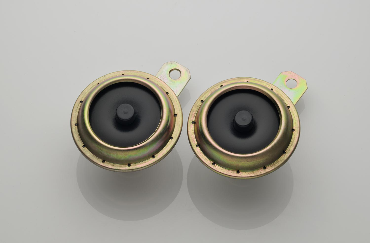


Communication Design


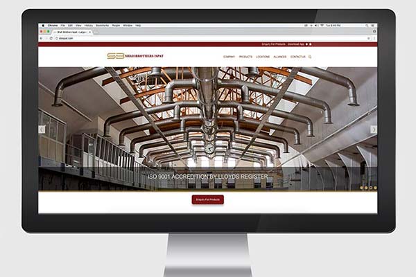
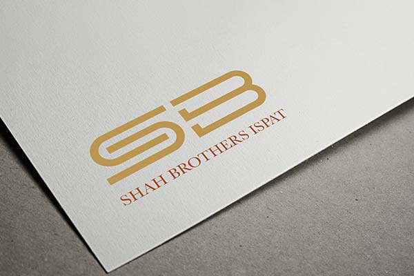
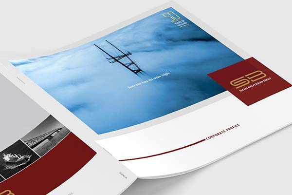
CASE STUDY 13 - SB ISPAT
Old Identity
Challenges:
- The initials of the existing logo, ‘SB’ were confusing. It needed to be made simpler. Since our scope was only logo reconstruction and website we stuck to the task.
- The old website was very outdated, static and had very little impression of how big the brand SB ispath was.
- Further, since the website was non-responsive, it became very difficult to see the website on mobile or a tablet.
Solution:
- We simplified the initials and arranged everything in a proportionate grid so that the brand may not face any technical difficulties in the future.
- We created initials in such a way that they we compatible to be placed on the website.
- We revamped and made the website responsive, easy, clean, fast, and current. We understood the brand perception and translated the same in the website.
New Identity
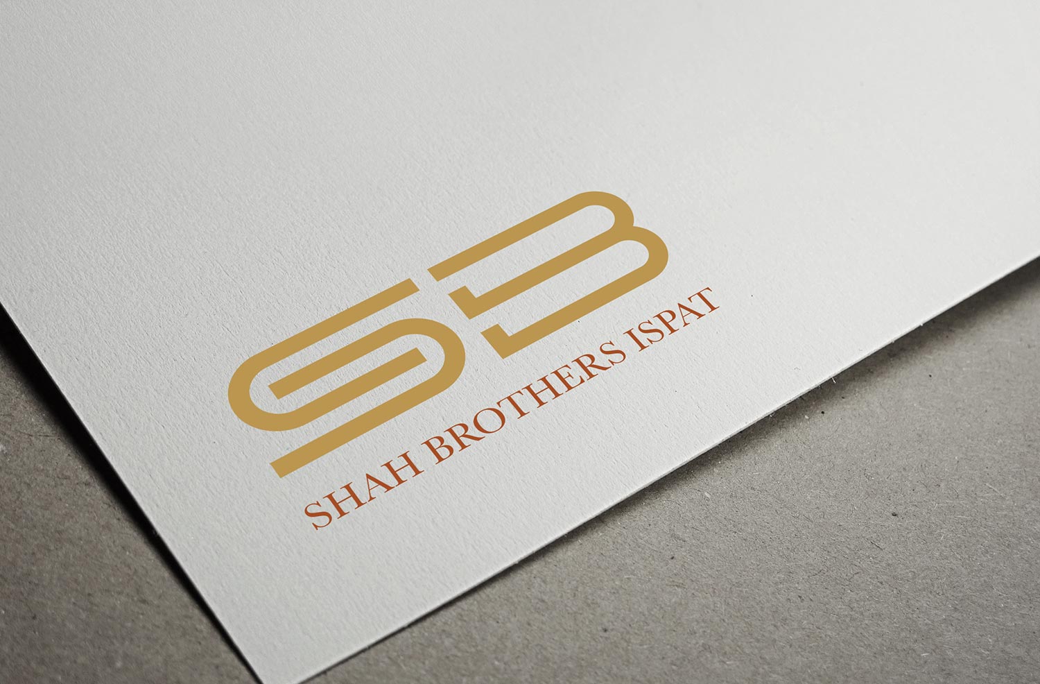
Simplification of initials of the logo, making it more legible to the audience.

Communication Design


Web Design
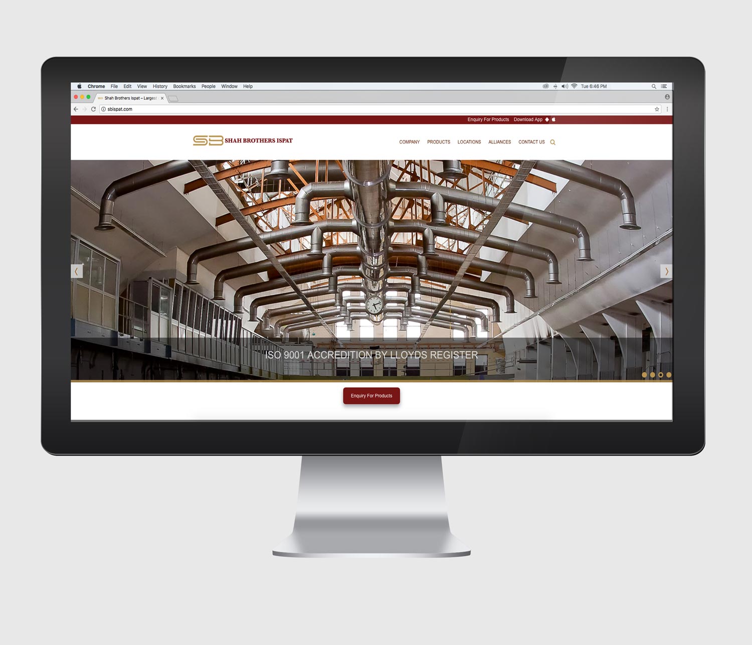
Revamping the website and making it responsive and compatible to all devices.
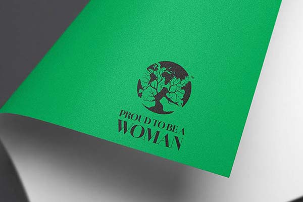
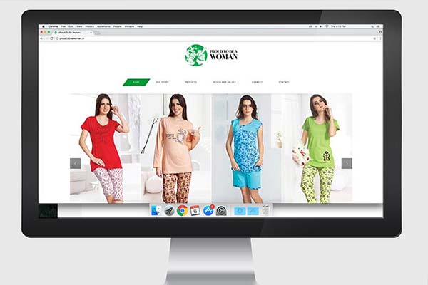
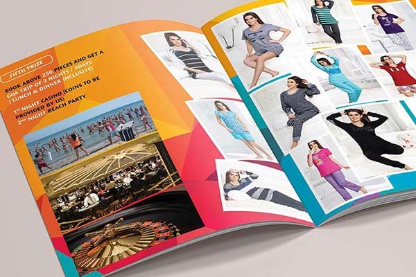
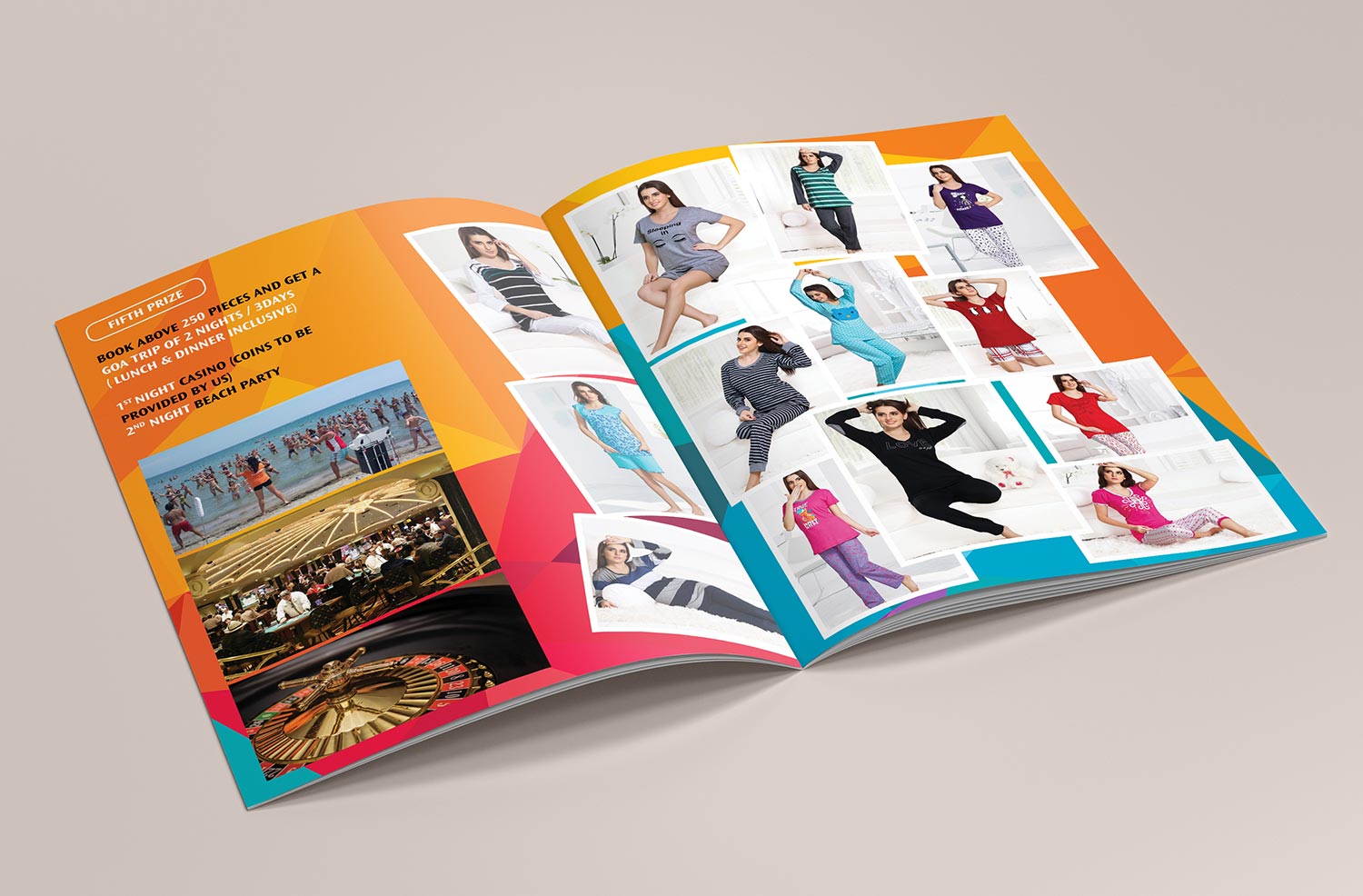
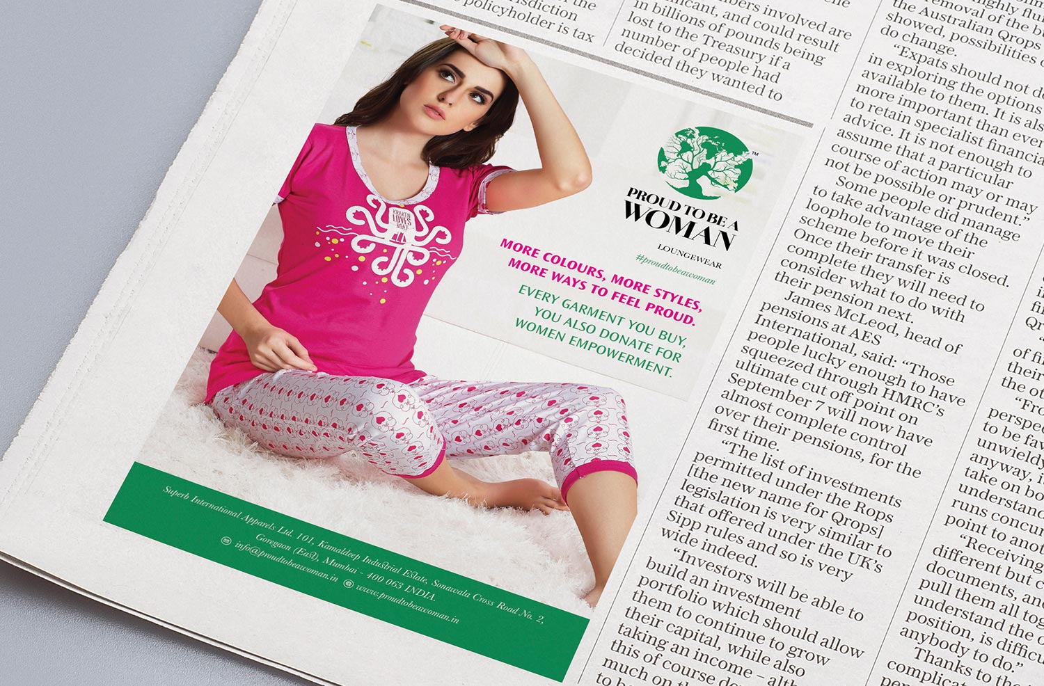
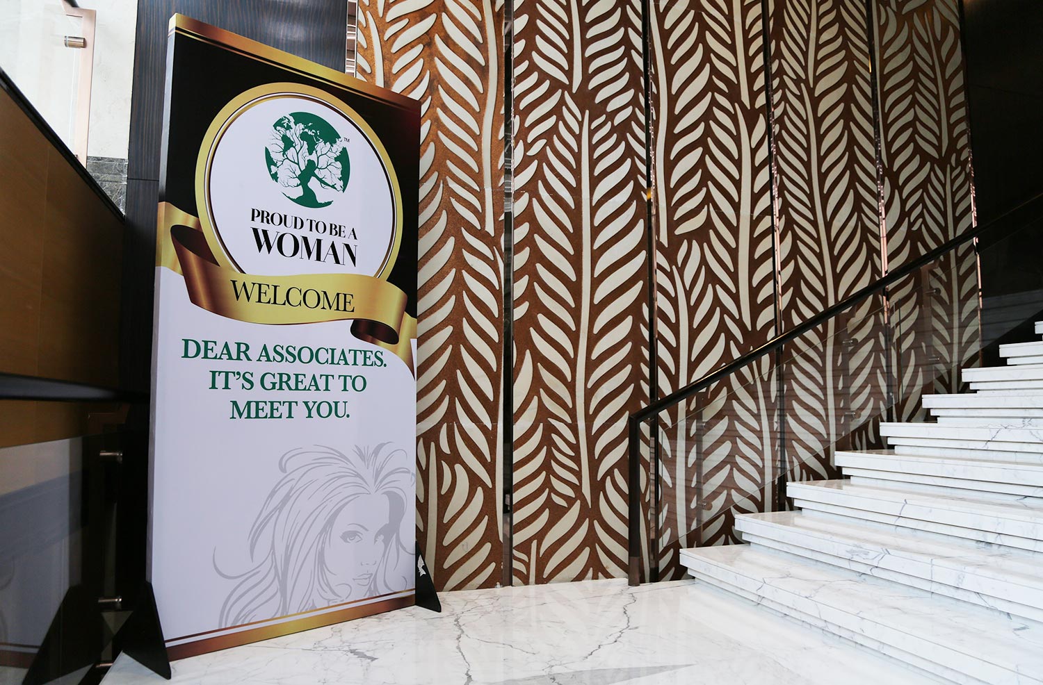
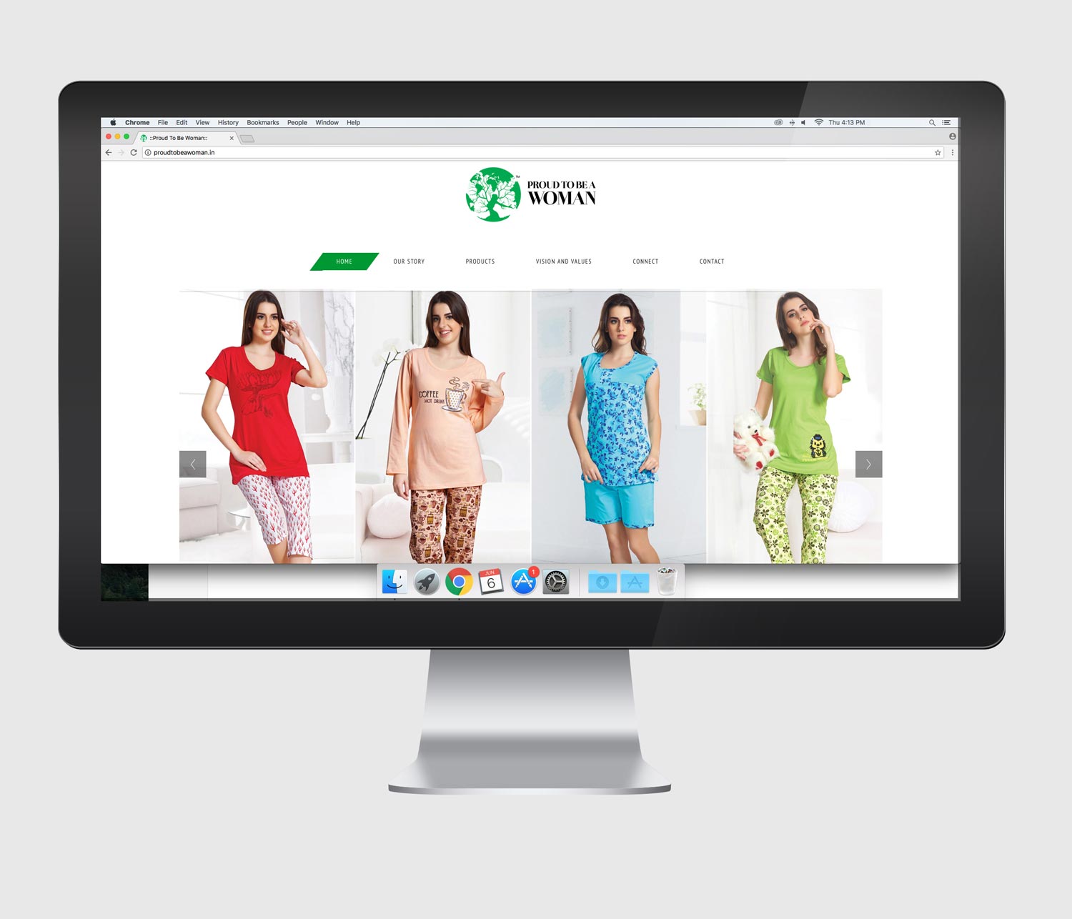
CASE STUDY 14 - PTBW
Challenges:
- 3 important fronts needed to be incorporated in the logo.
- Women Empowerment through social cause.
- Classic, feminine and elegance.
- Fashion.
- We had to work on three important principles together to create an identity which had to look fresh and inviting.
Solution:
- We created a combination of two images—A woman enjoying freedom + effect —a Woman can have on the world.
- It brought out woman empowerment aspect, social cause and feminine side wonderfully well.
- Classic, feminine and elegance.
- Brand launched in Bangalore with a hugely successful event.
- The brand has become synonymous with the pulse of feminism as well as fashion.
Identity Design
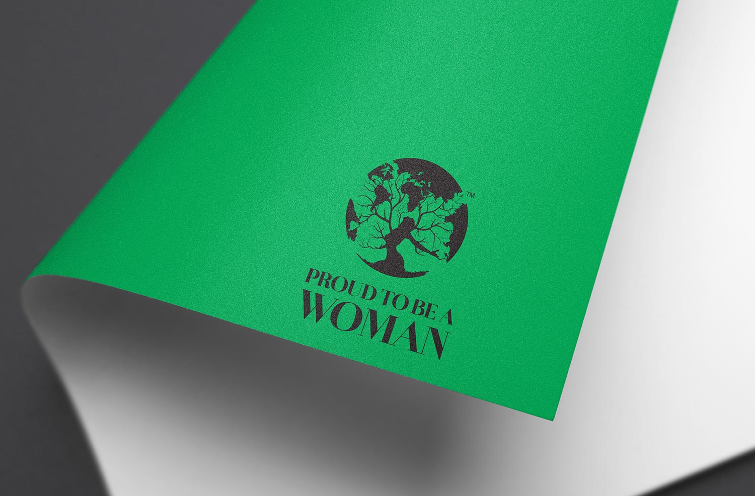
Women empowerment, feminism and fashion all came together to form a distinctive identity.
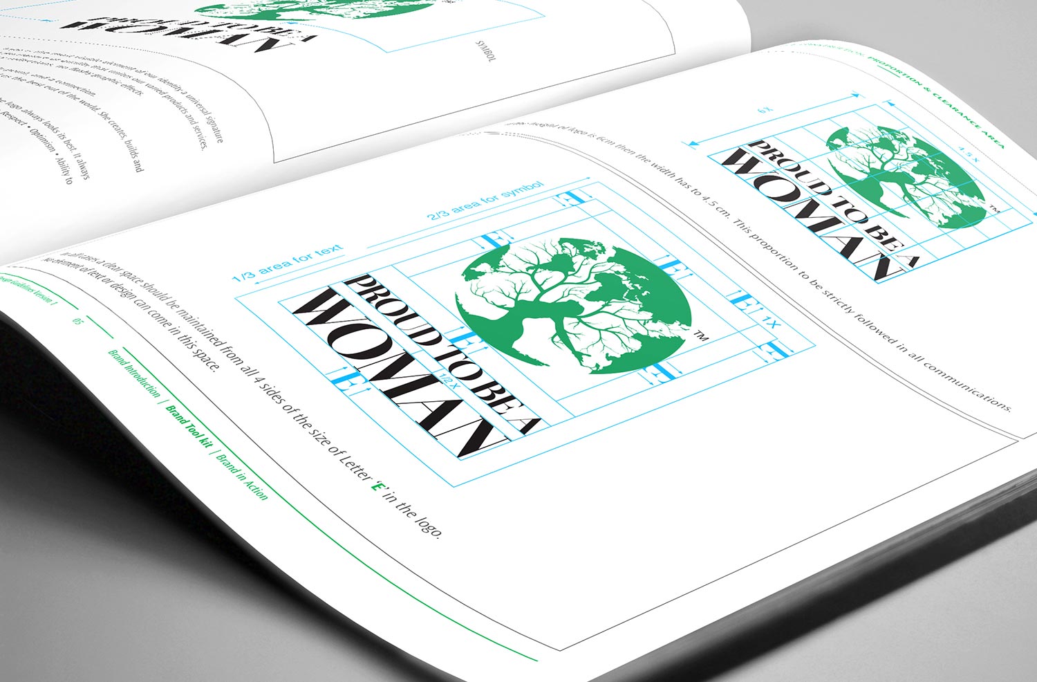
The identity was constructed precisely keeping in mind all the possible mediums where brand would be used. It was made in horizontal and vertical format too.
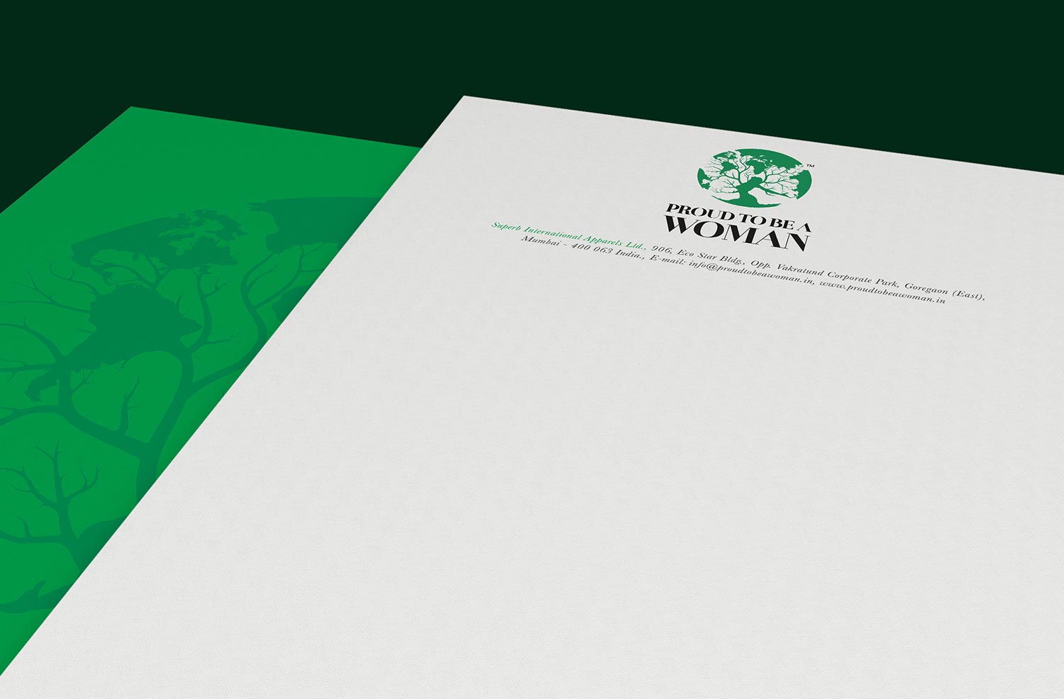
Brand logo was a powerful emblem. We used it and the green colour to define the language and take it forward.
Communication Design

Care was taken to present women (models) in their most beautiful form when we devised the concept of women empowerment. Our core message in the Advertisements carried the same idea.
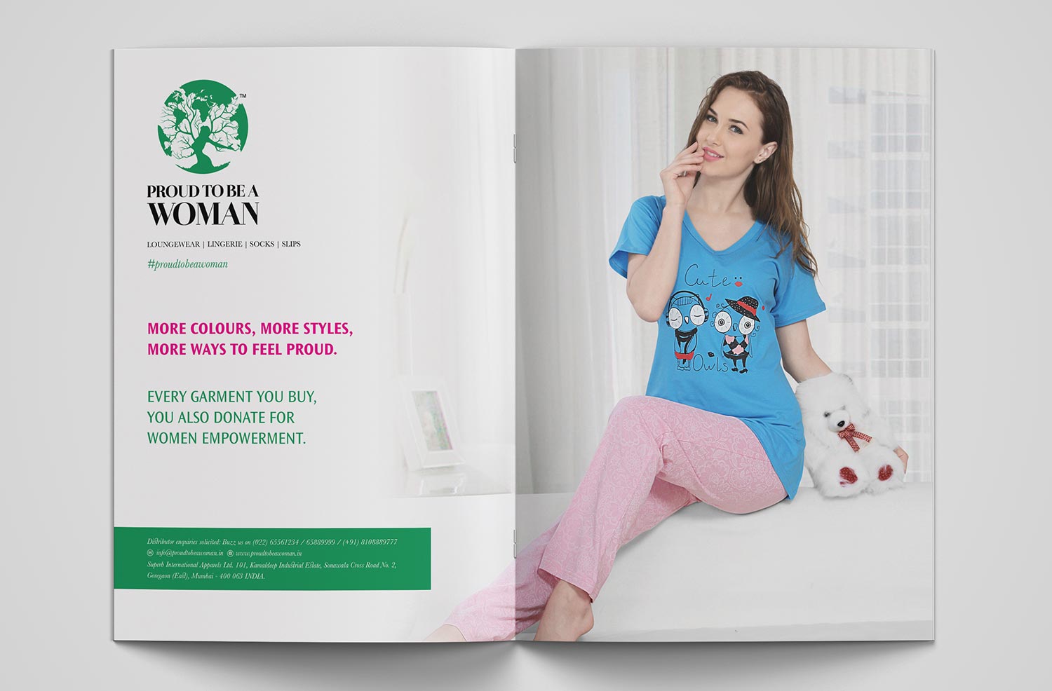
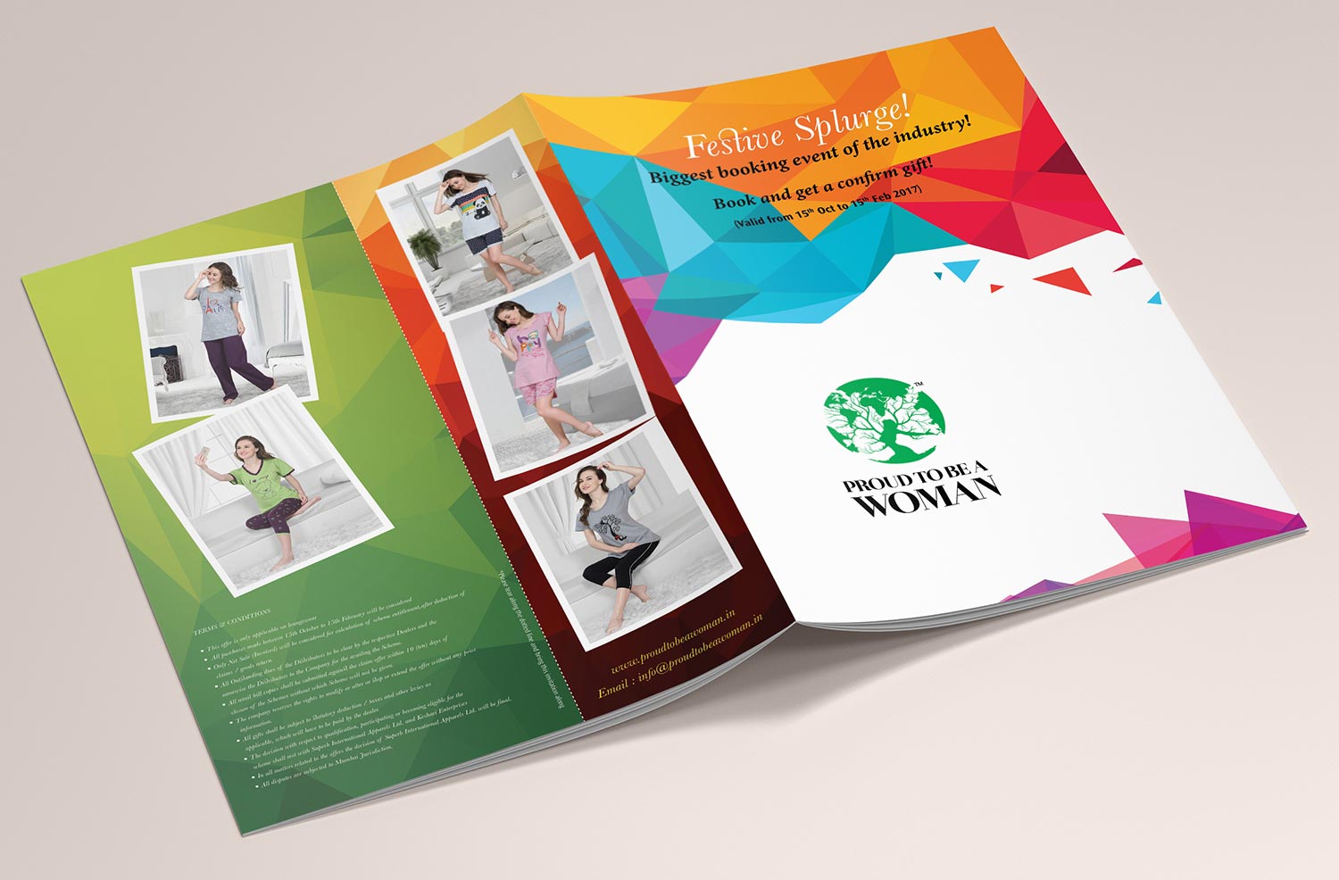

We build a launch Event for the brand where we invited dealers to introduce them to a new brand coming into the market. The orders for the brand were flooded and the brand got its due recognition.


Web Design
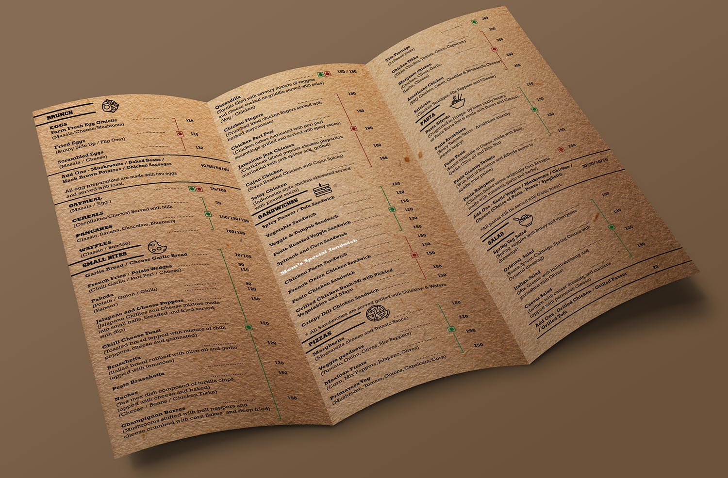
CASE STUDY 15 - CAFE KLATCH
Challenges:
- To create an identity of a cafe which is very very formal in nature.
- The identity should not be very loud and colourful.
- It should be very subtle and corporate.
- The identity needs to be registered in the minds of people as a hangout place.
Solution:
- We devised a positioning ‘ Let’s Klatch Up’ and worked around the same to deliver the core message. ‘Hangout Place’. We designed the identity like a coffee cup and we established varied connections between the letters to denote a hangout connection.
- We created a brand language pattern from the logo and used it a most interesting way across the mediums like stationery and menu card.
- The pattern became a very likeable element in the Cafe Klatch design. The term, ‘let’s Klatch up became popular very fast and brand was instantly recognised differently from the competition.
Identity Design

The connection lines, the cup shape all added up to a very unique identity.

Brand Language pattern was replicated in the most beautiful form along with the positioning, “Let’s Klatch up” which was an instant hit.

Communication Design
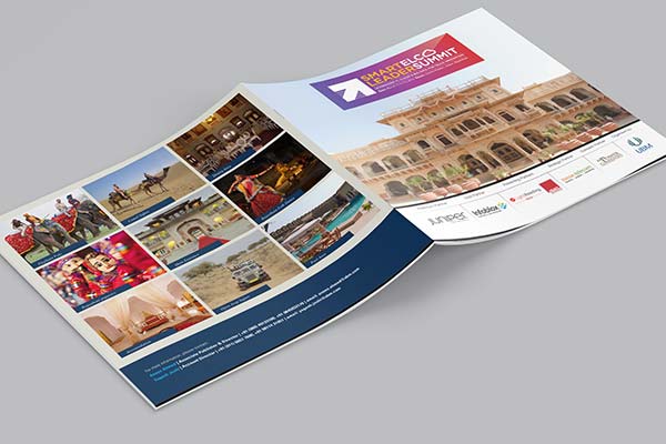
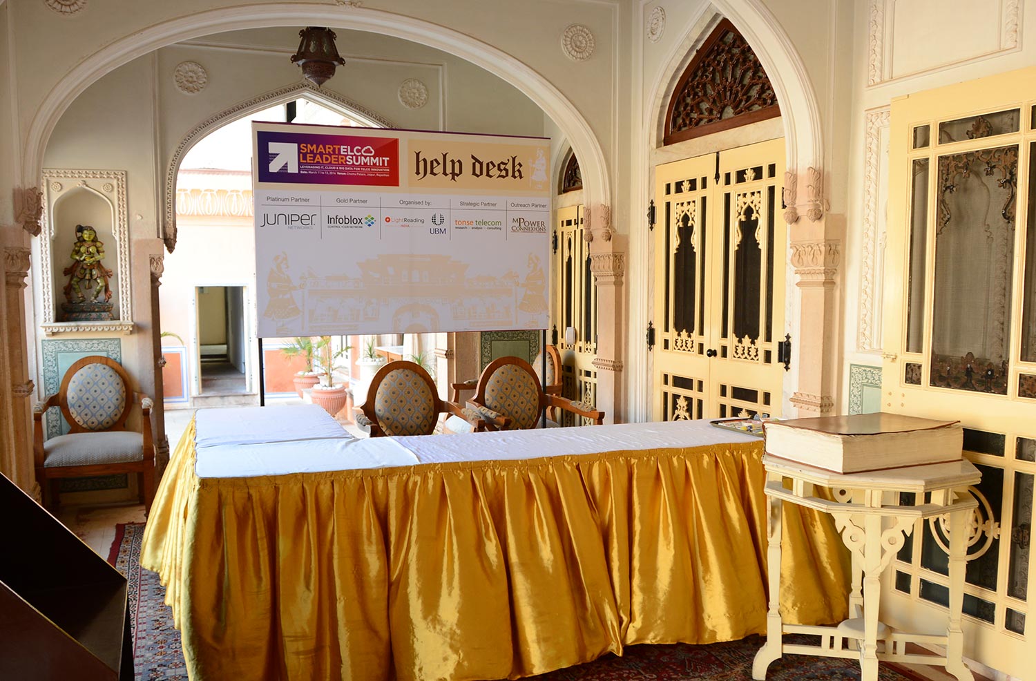
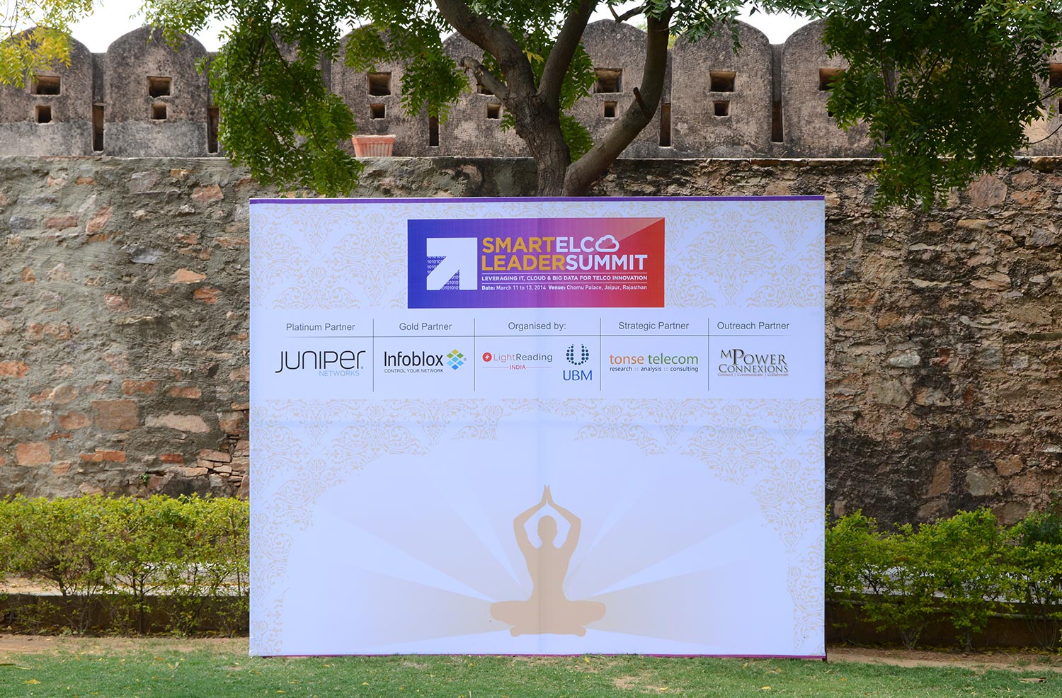
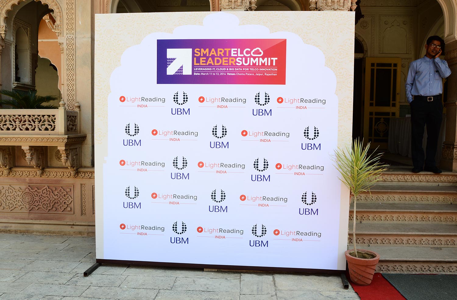
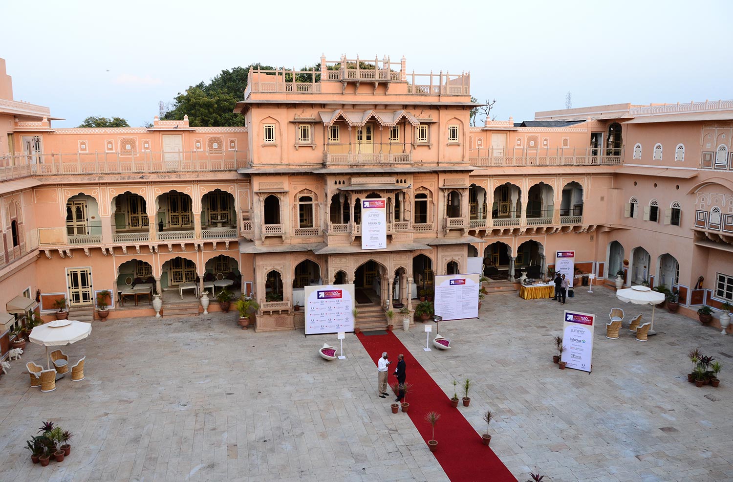
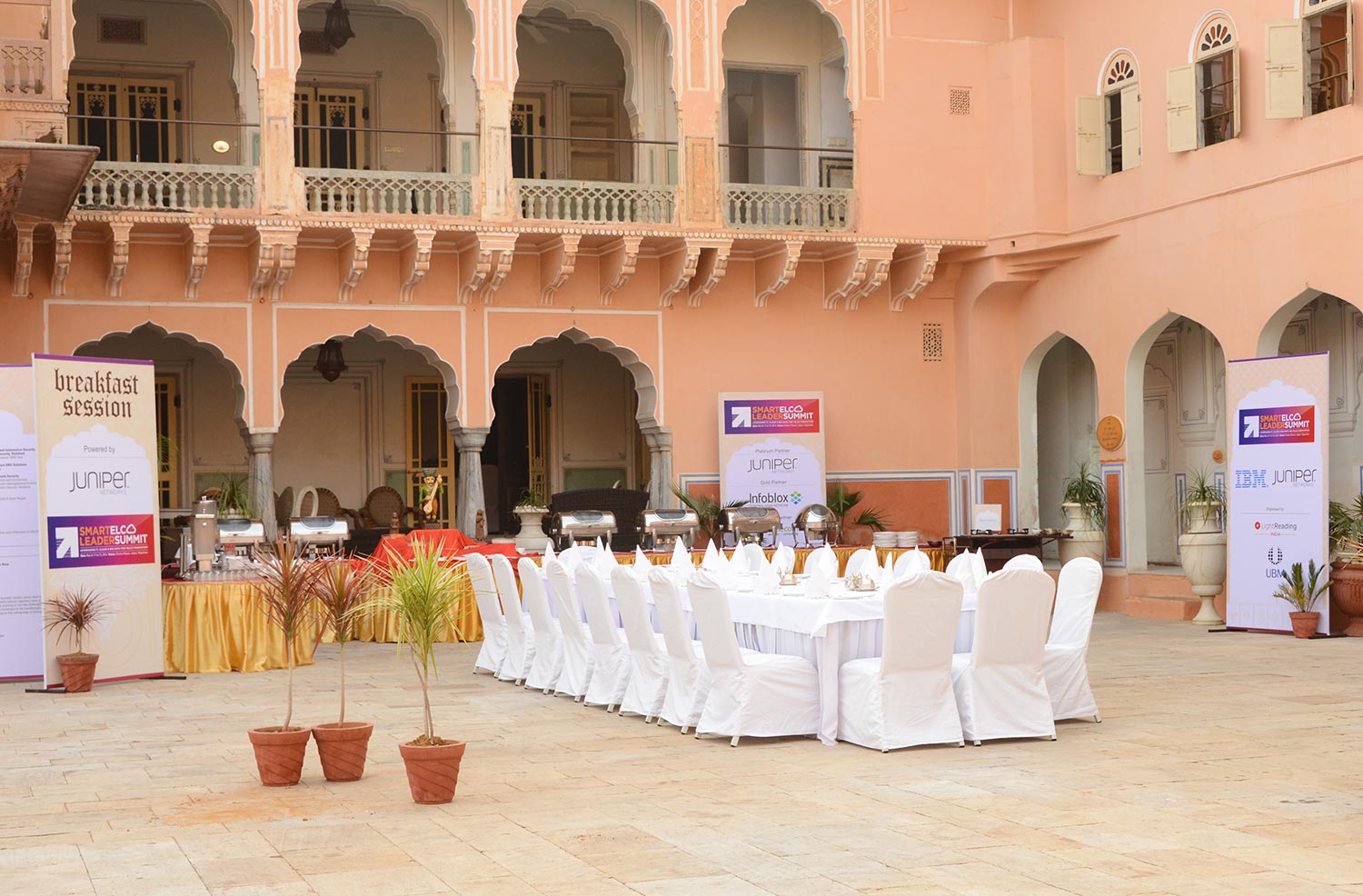
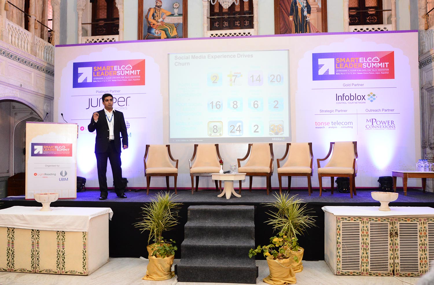
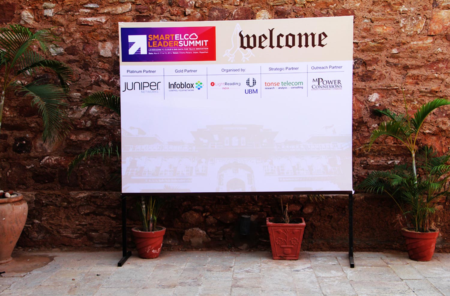
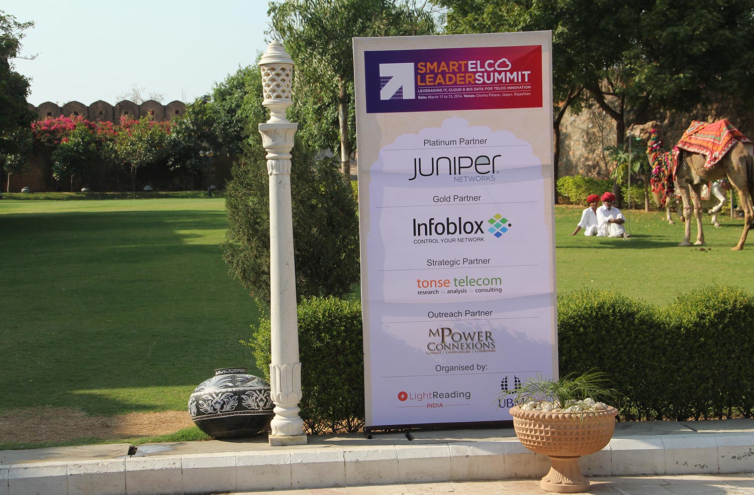
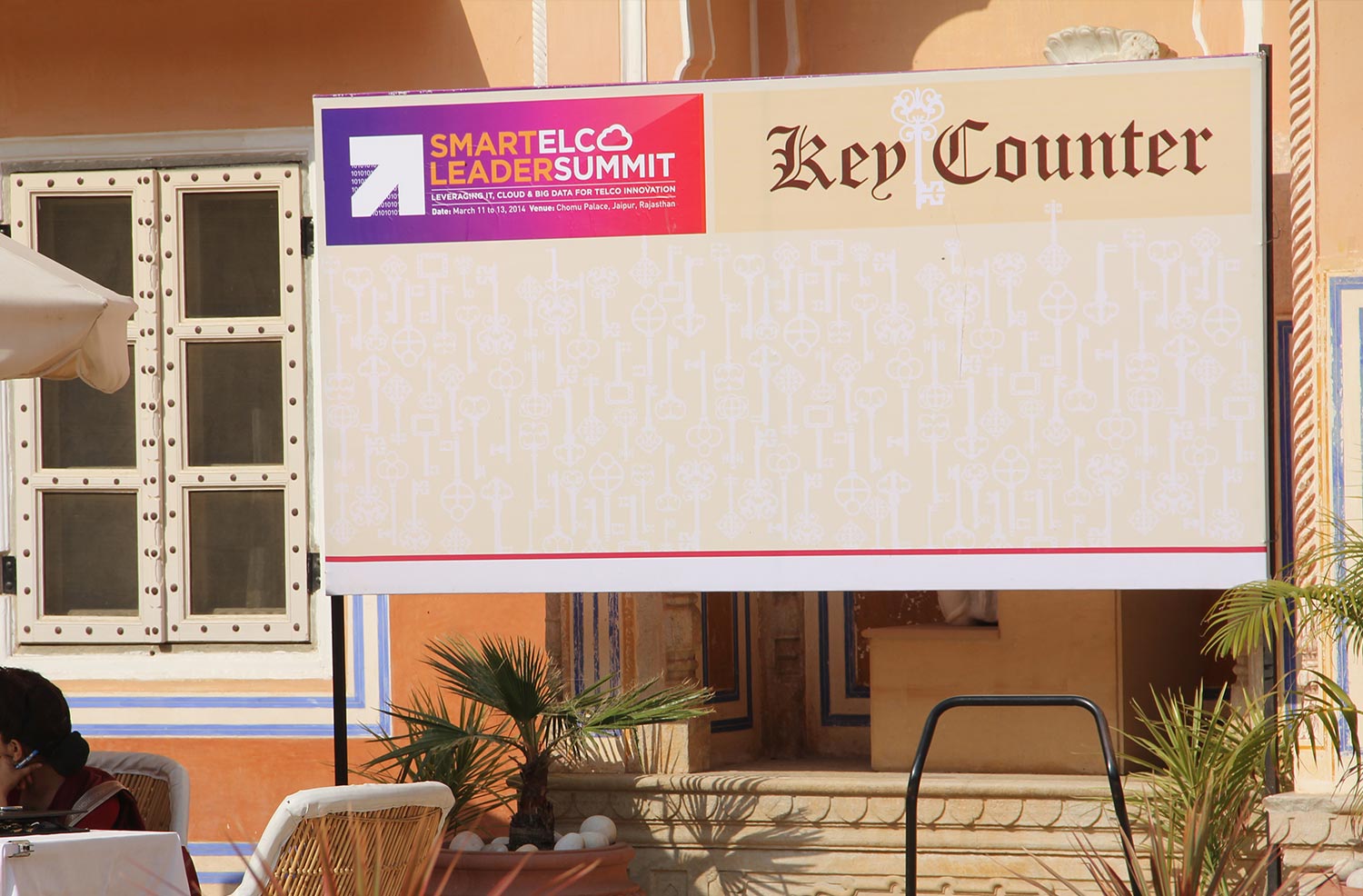
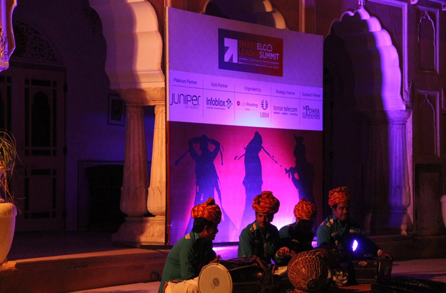
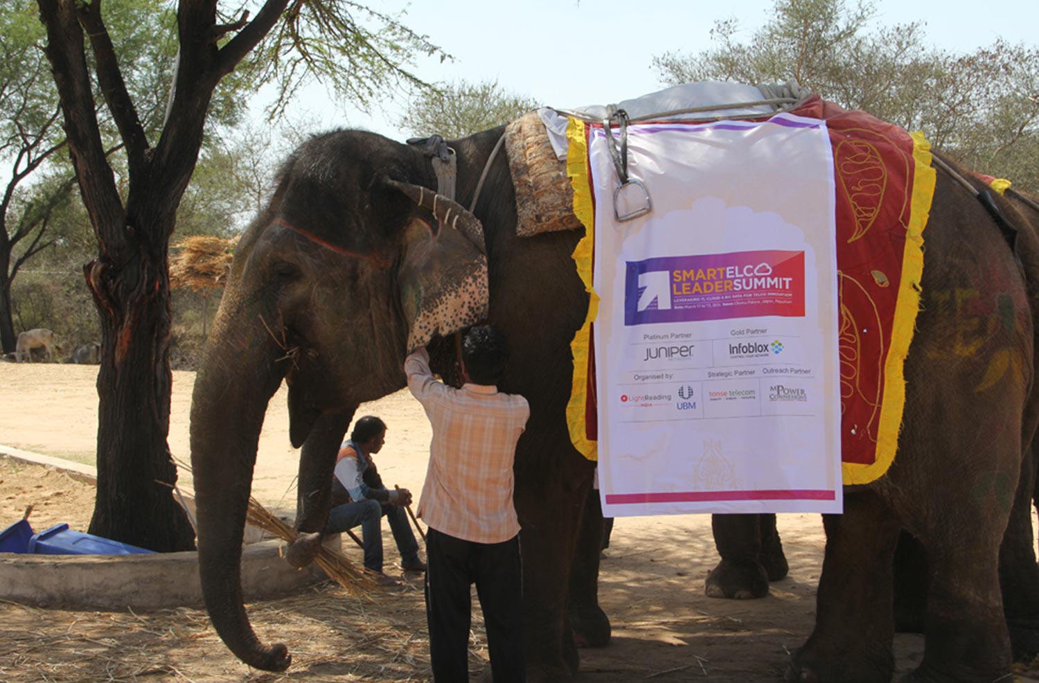
CASE STUDY 16 - SMARTELCO
Challenges:
- To design an event which does not feel overpowered with information and learnings in the environs of five star properties.
- Making the CEO’s and CFO’s of telecom industry, experience a different culture as well as helping them learn in a most lighthearted and ‘Fun’ way.
Solution:
- We understood that the environment of the event venue is going to make a huge difference to the event and that itself is a great way to market the event.
- We chose beautiful environs of Rajasthan, a place called ‘Chomu Palace’ for the event. This place had an aura of living like a Maharaja in a Haveli and gave out a very heritage look to the whole event.
- We designed a colourful logo in the reddish magenta palette of Rajasthan culture complimenting our design with the venue.
- We then used heritage shapes to design all the collaterals of the event adding to the flavour and ultimately making the event a huge success.
Event Design
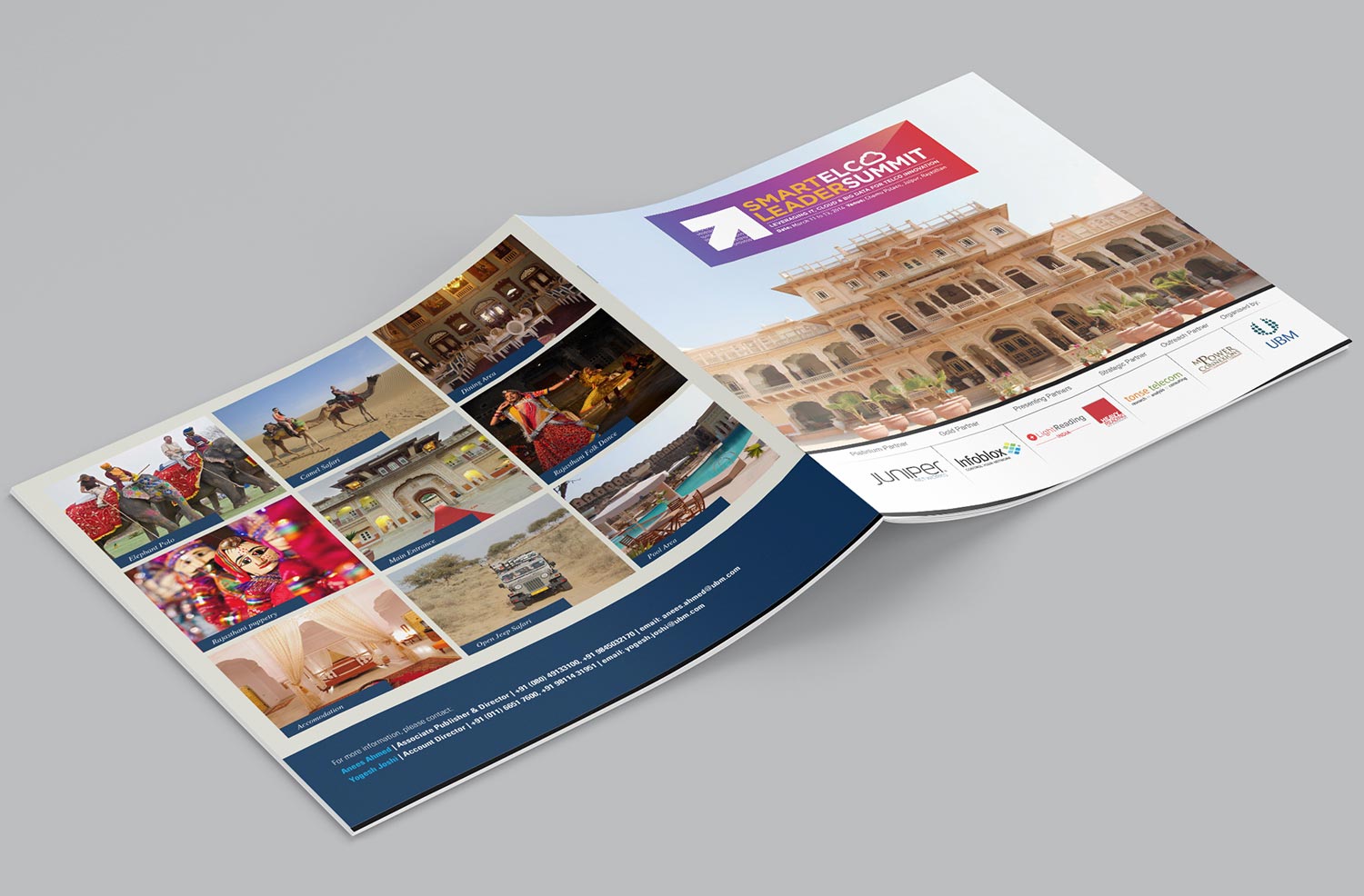
The logo was designed keeping in mind the environment of the place the event was held. The logo complemented very well to the place.
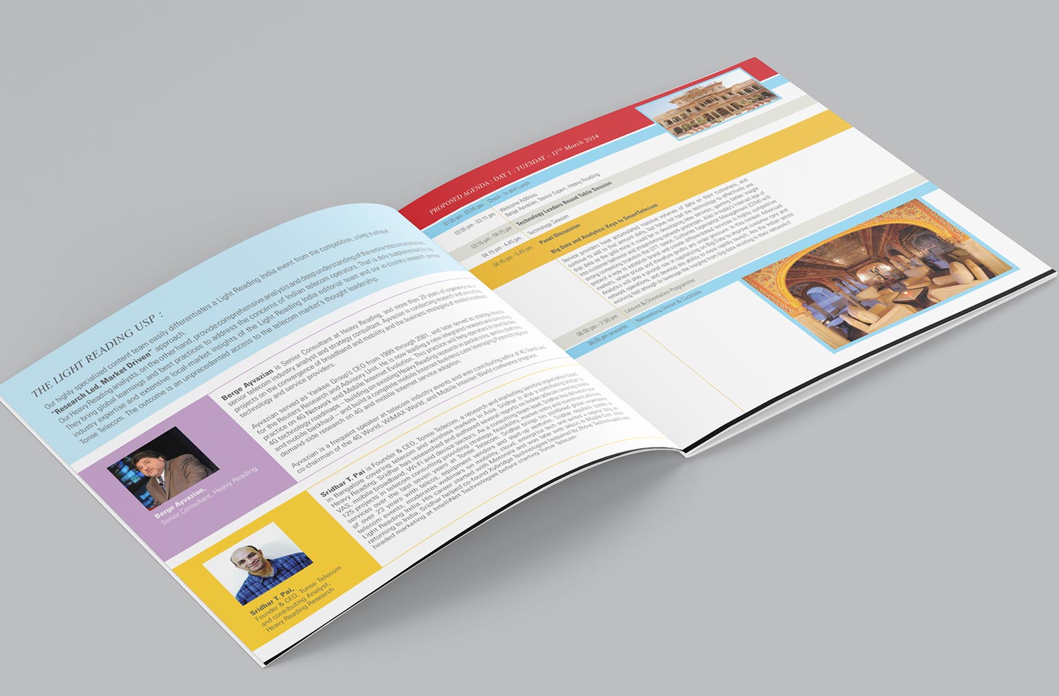
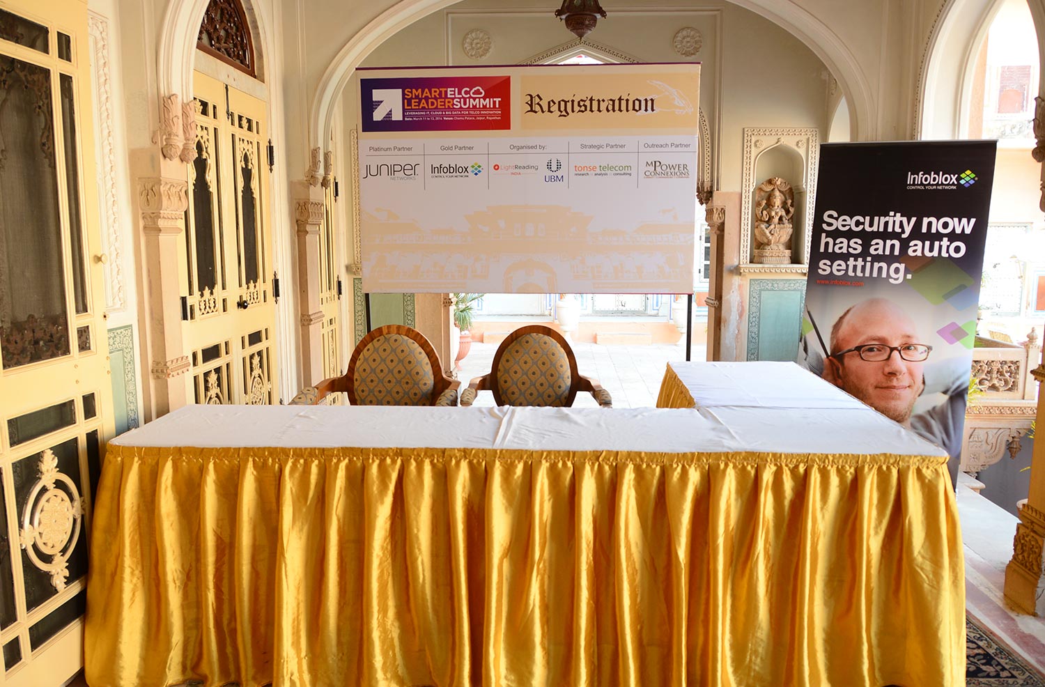
The design of all the collaterals worked well with the flavour of Chomu Palace, making the event, a grand success.

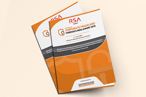
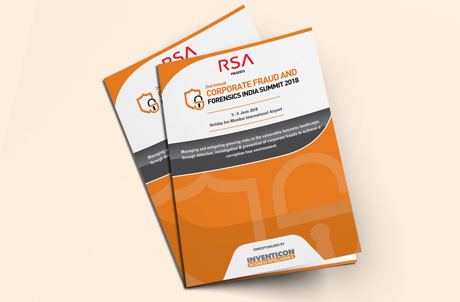
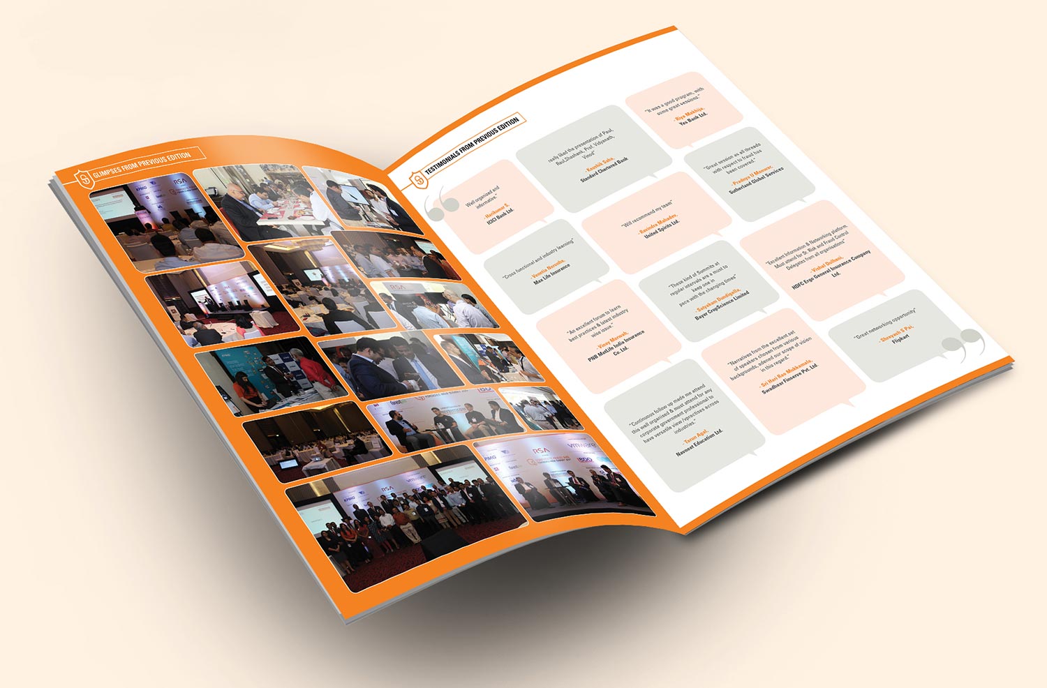
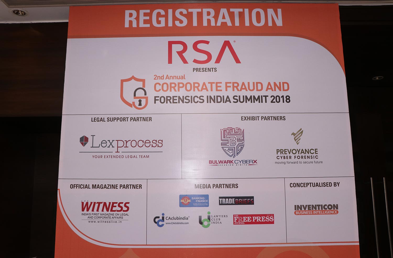
2nd Annual Corporate Fraud and Forensic India Summit 2018
Event Design

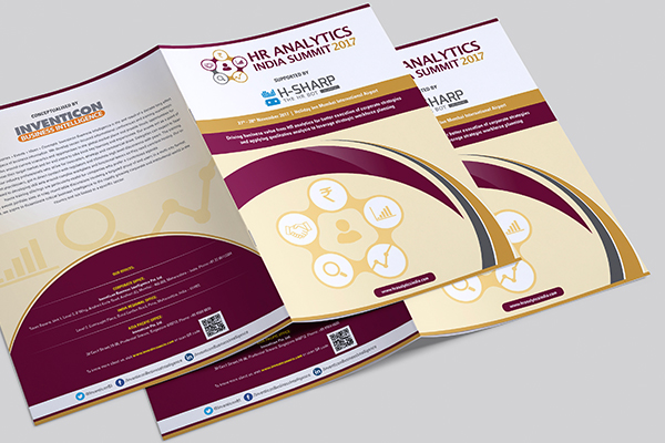
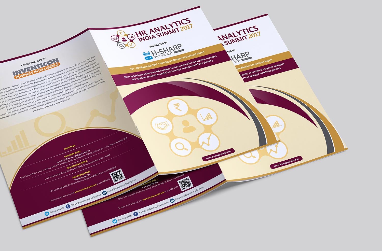
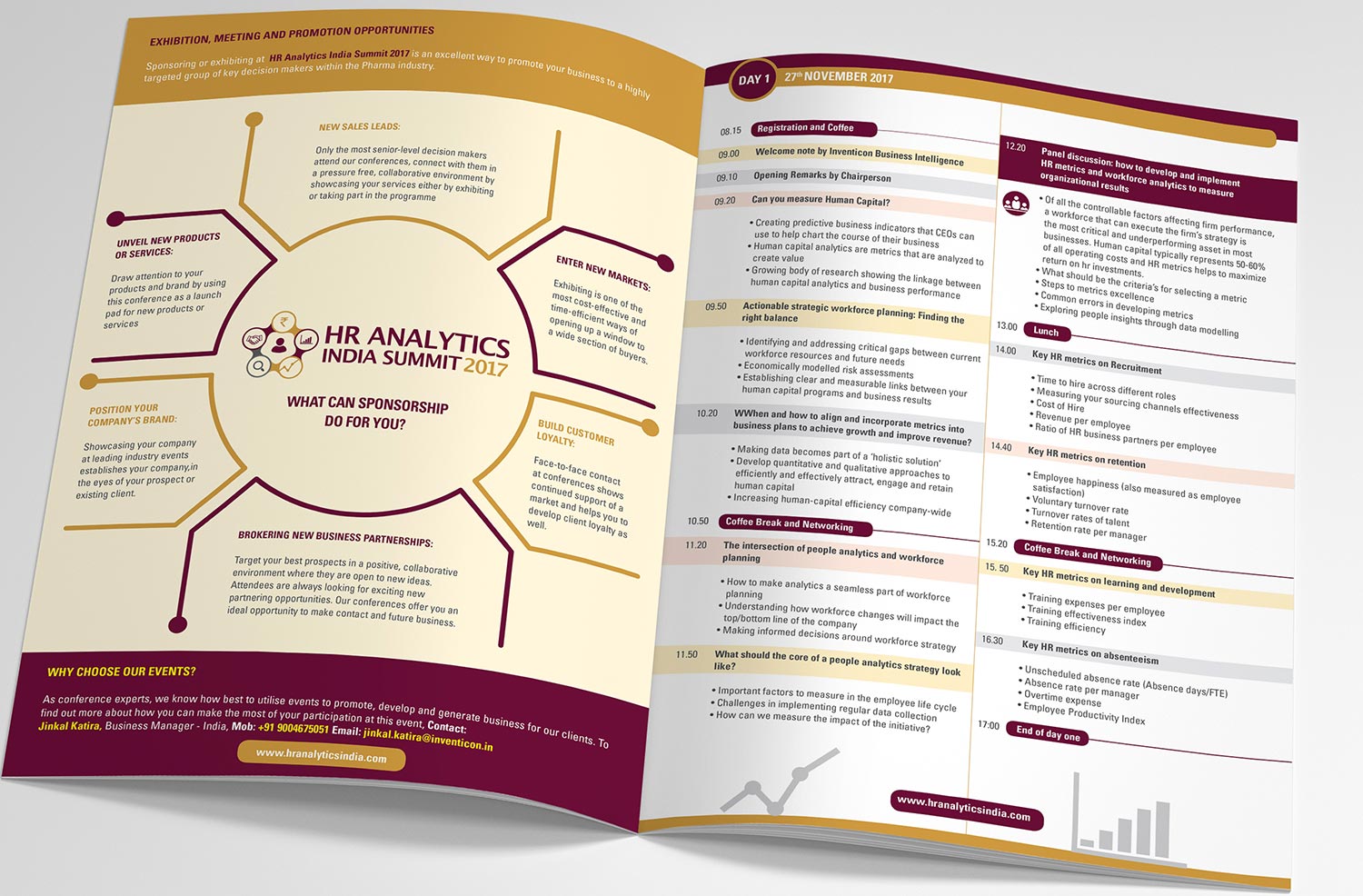
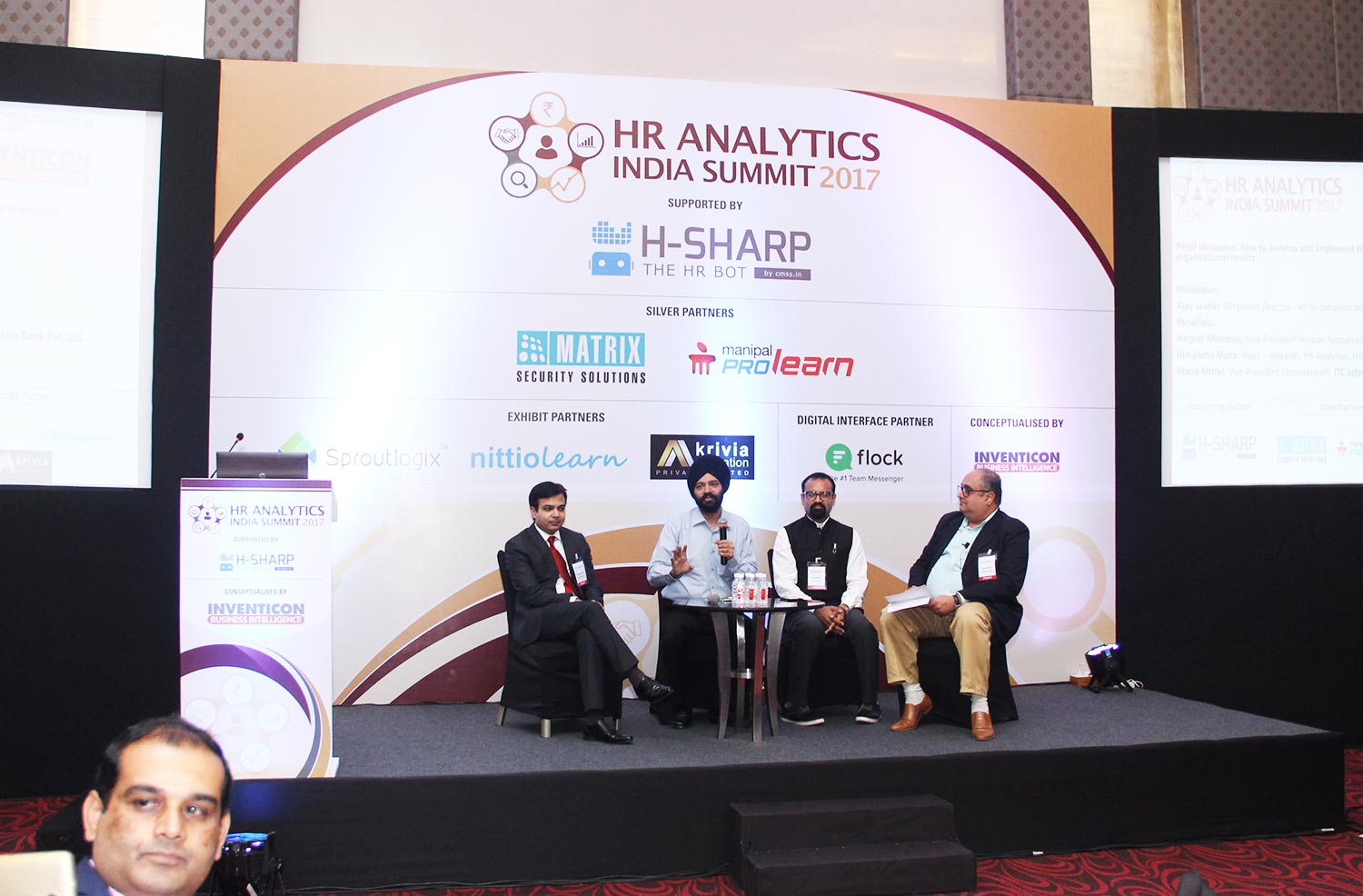
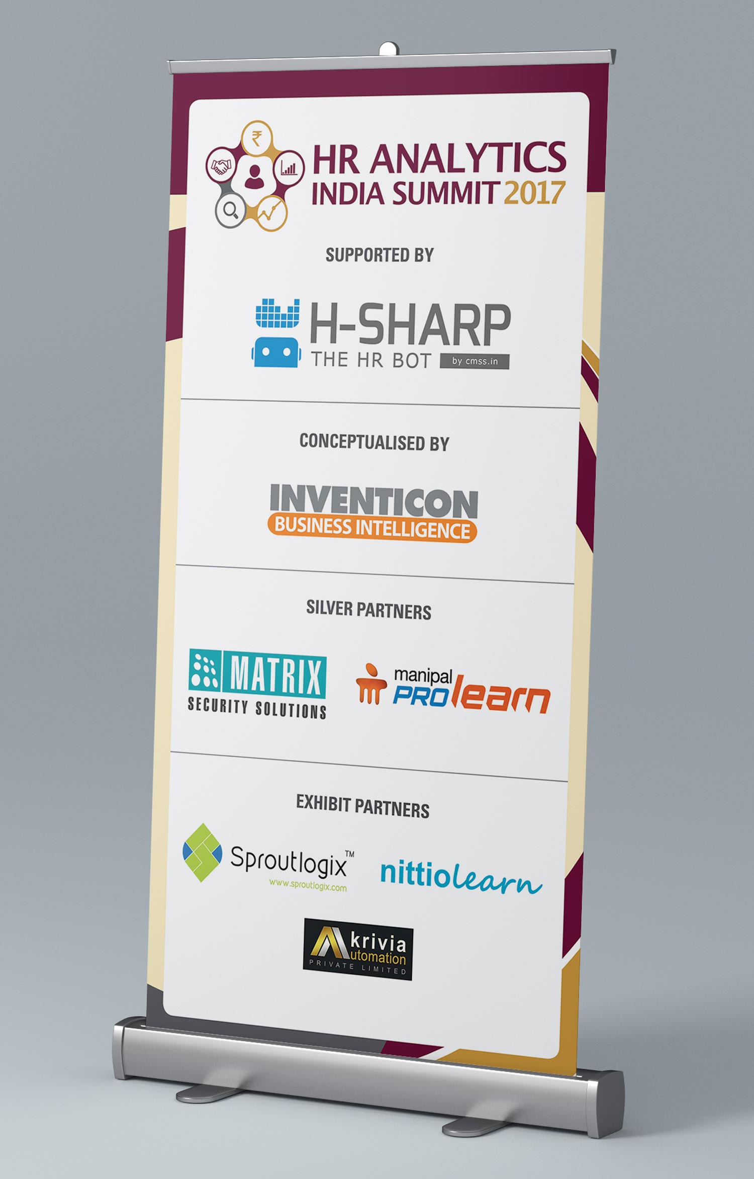
HR Analytics India Summit 2017
Event Design

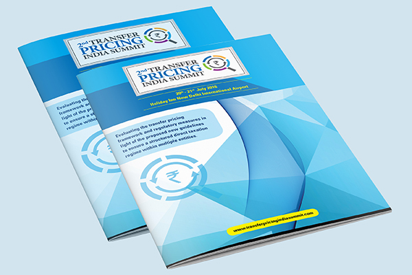
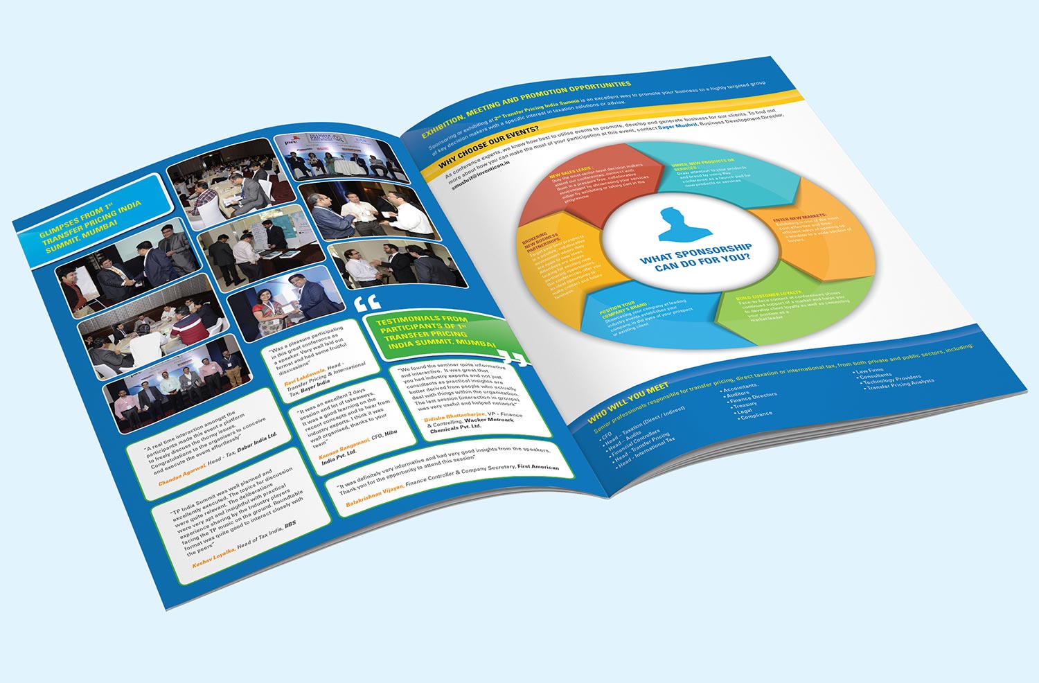
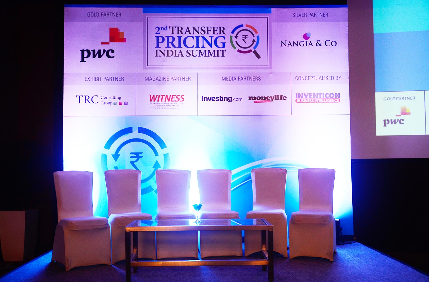
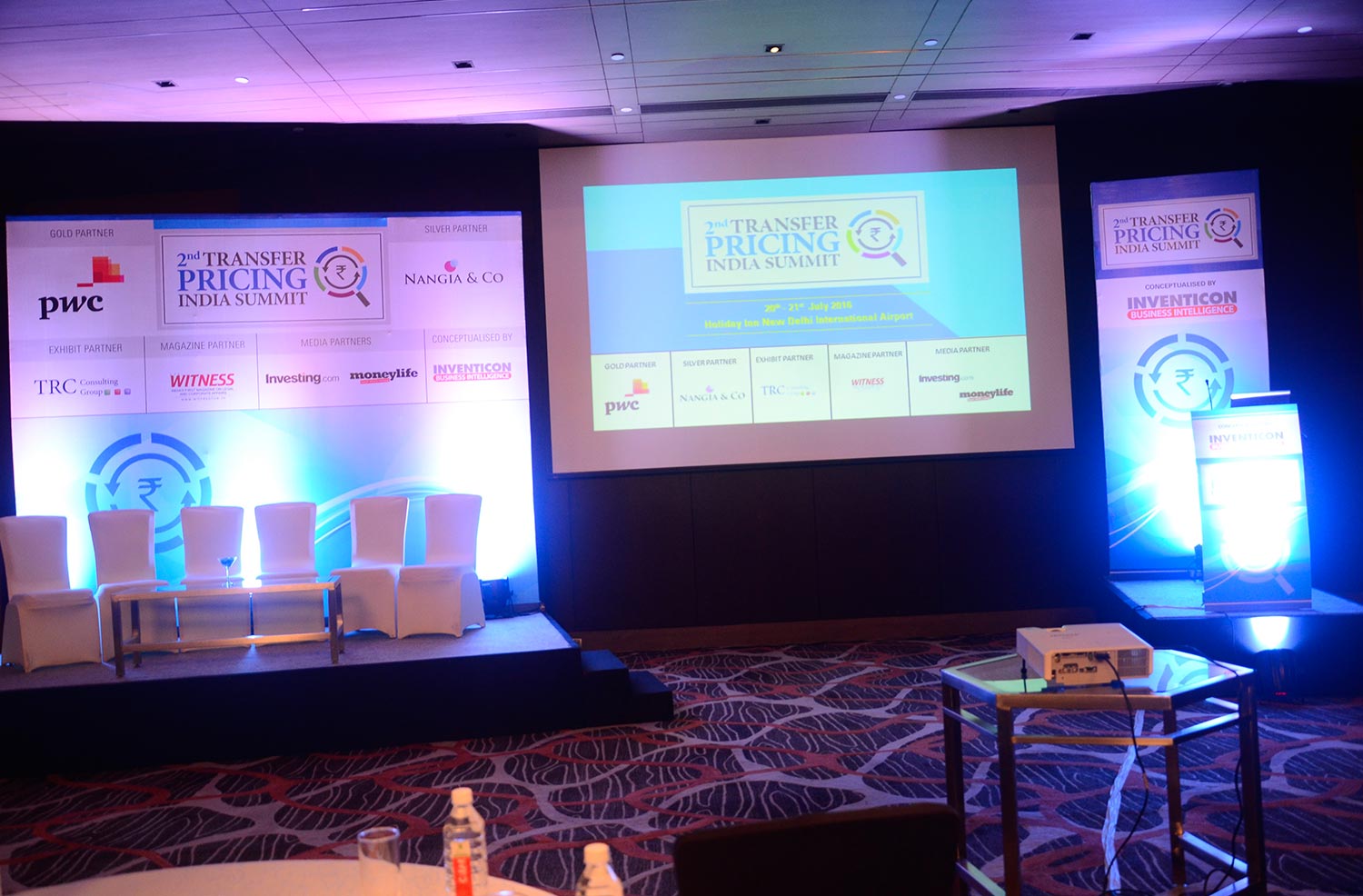
2nd Transfer Pricing India Summit
Event Design


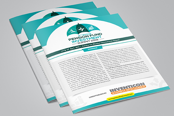
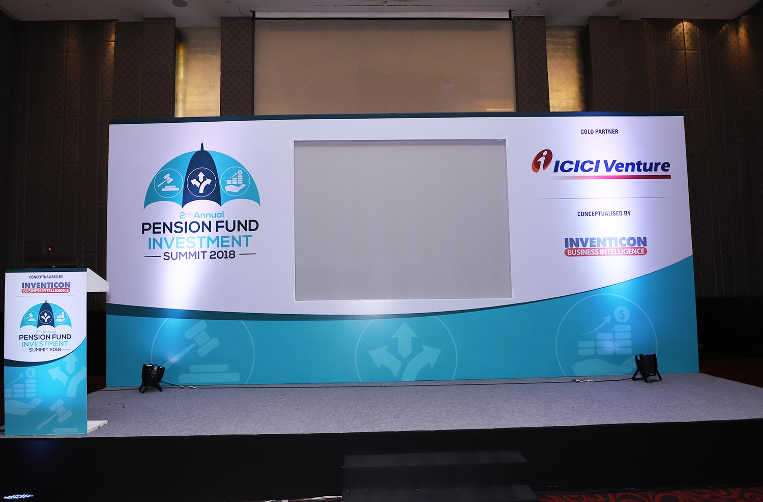
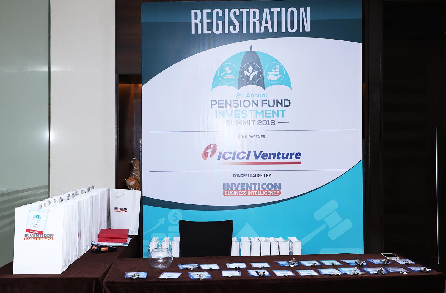
2nd Annual Pension Fund Investment Summit
Event Design


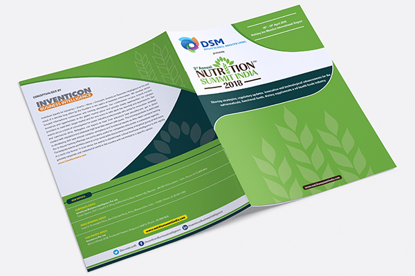
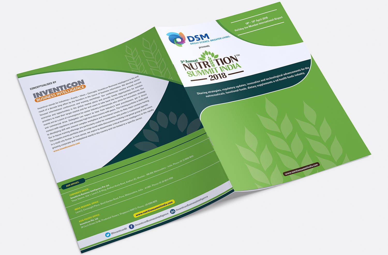
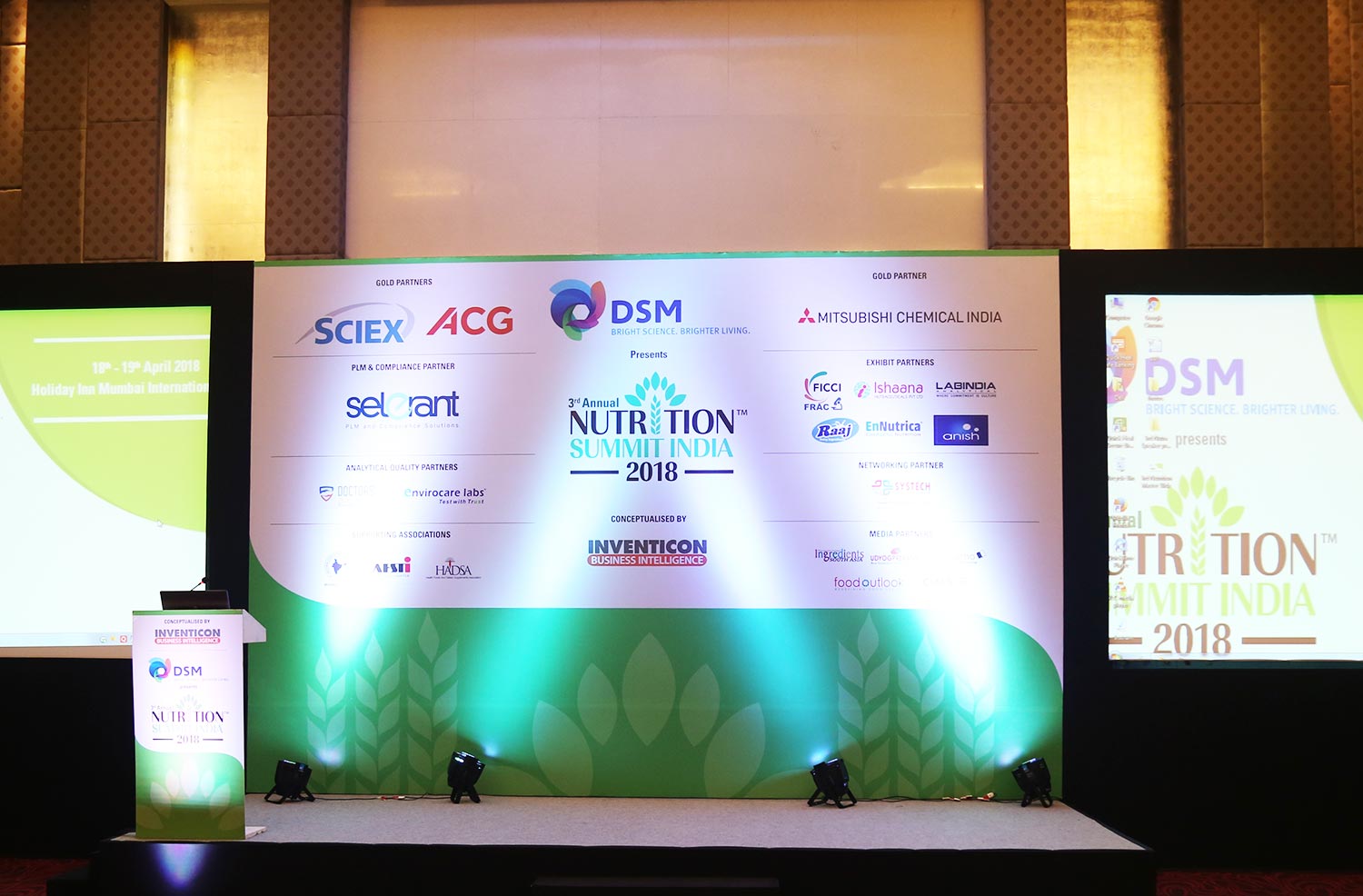
3rd Annual Nutrition Summit India 2018
Event Design

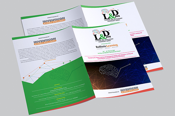
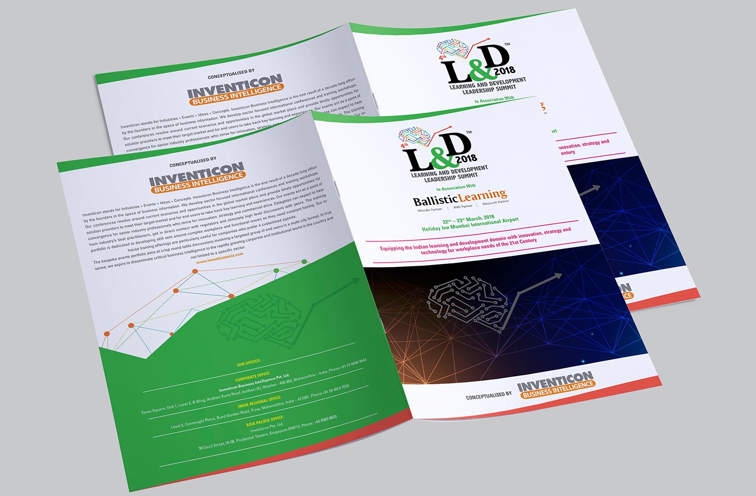
4th L&D Summit
Event Design


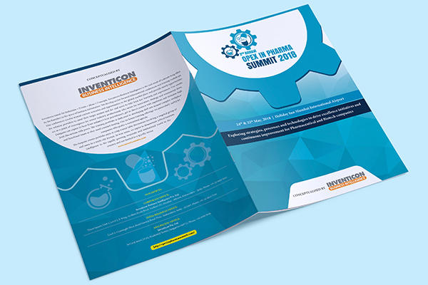
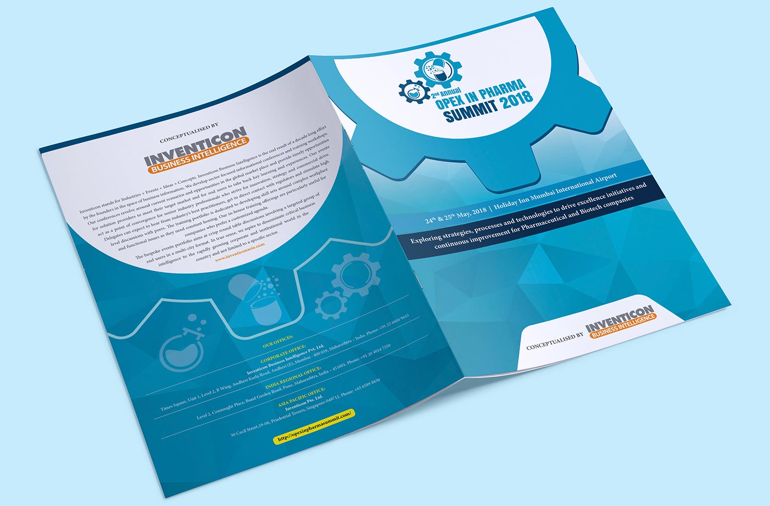
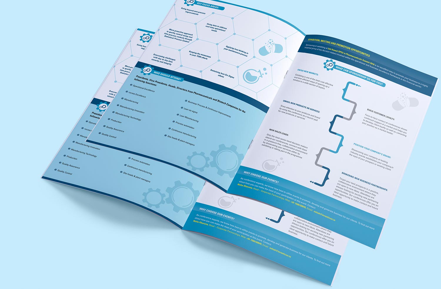
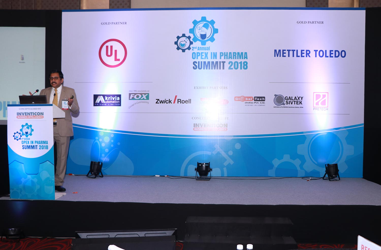
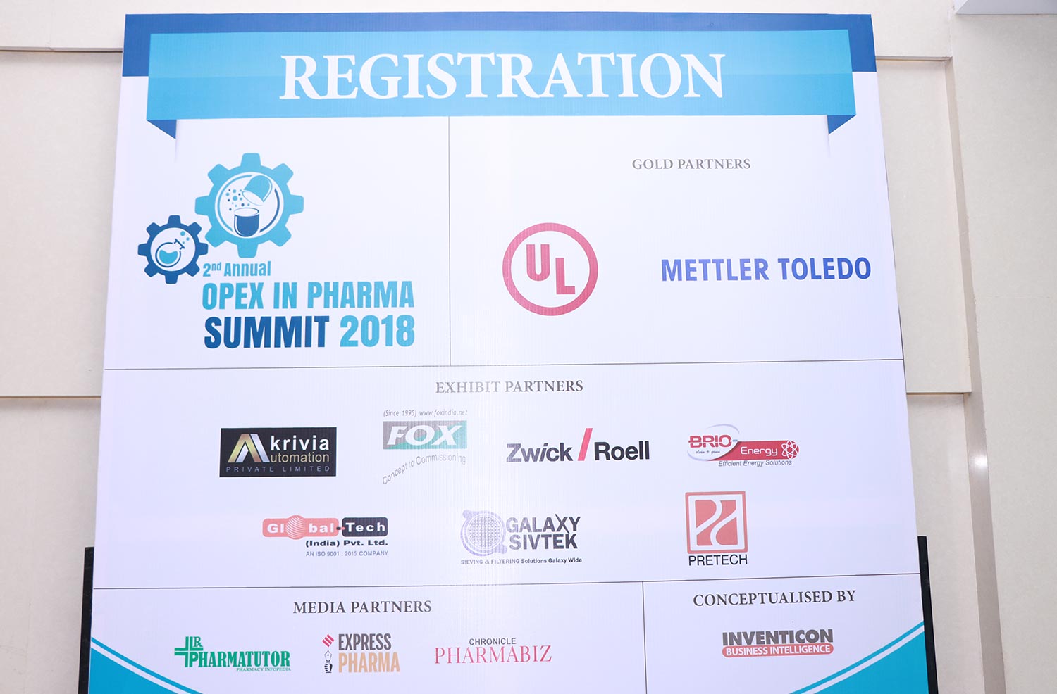
2nd Annual Opex In Pharma Summit 2018
Event Design
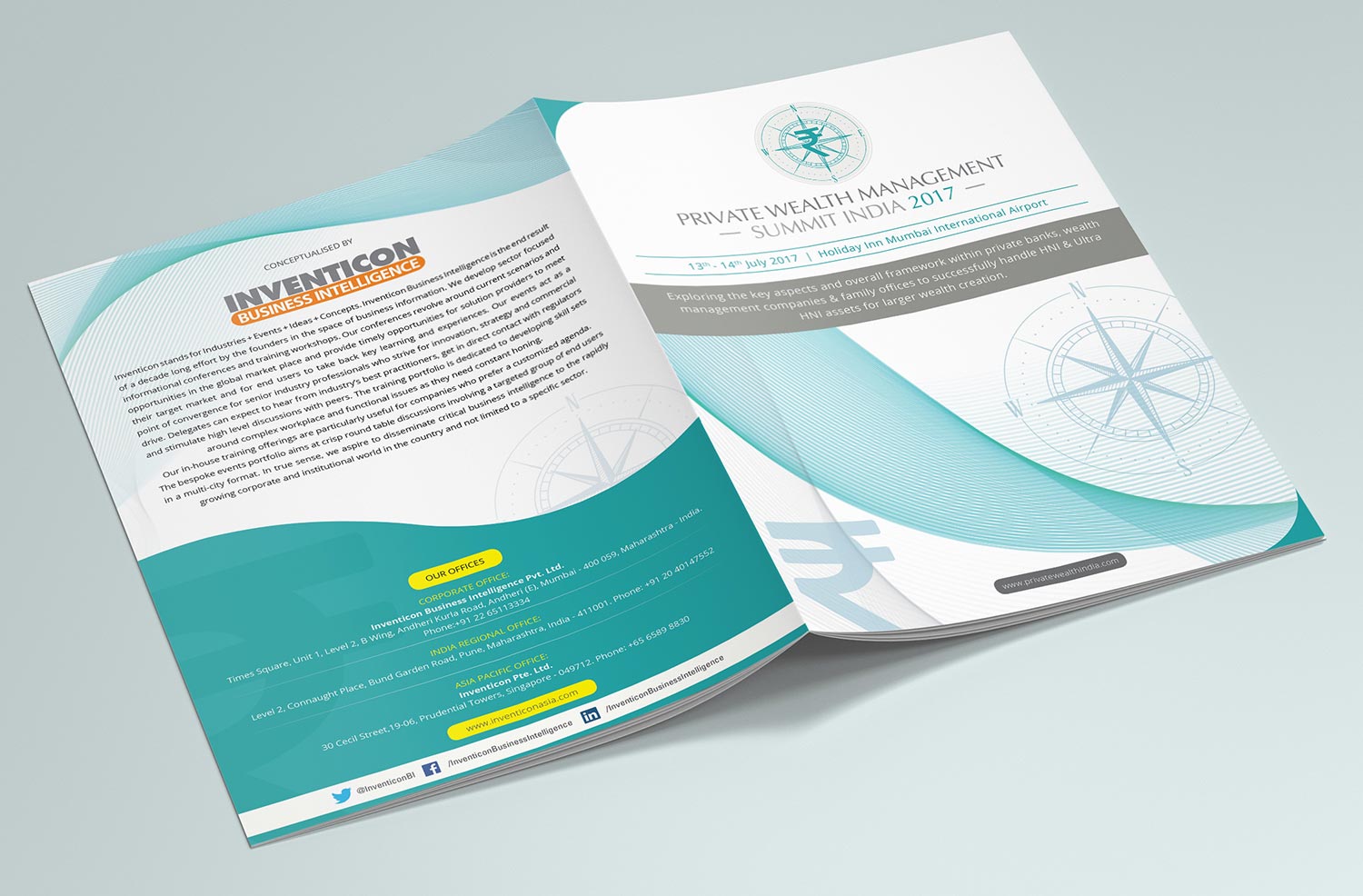
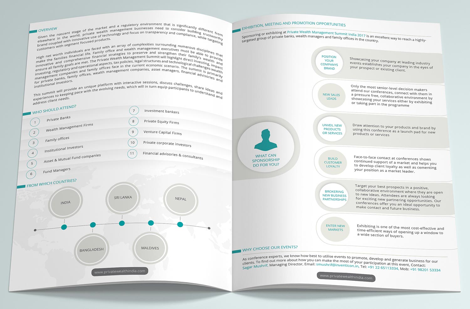
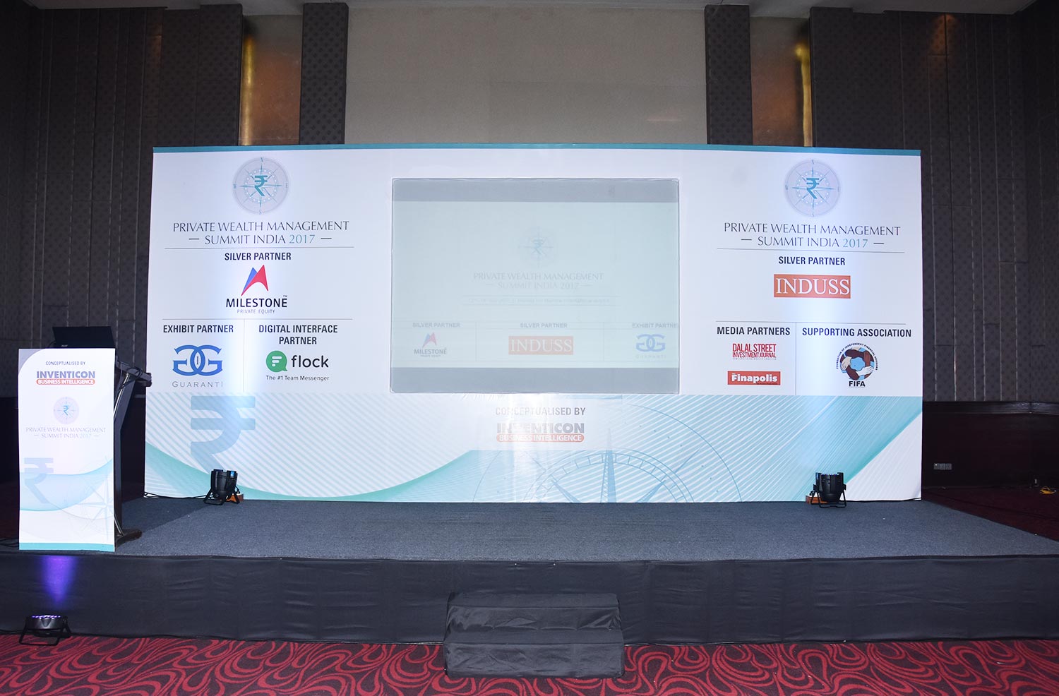
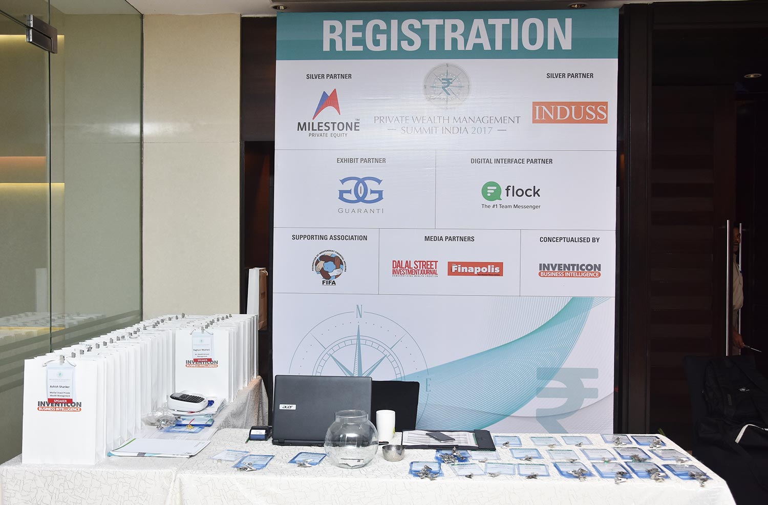
Private Wealth Management Summit India 2017
Event Design