Hence we designed the identity by collating the initials 'C' for Country and 'S' for Side in such a way that the image looks like a hand locked in a hand depicting Trust. Identity was simplified to be able to replicate on corporate materials, solving the brand problem. CountrySide symbol used as a brand language across corporate materials.
Challenges
Old identity was very complicated and difficult to replicate on various corporate materials.
The brand was unable to communicate what brand stood for.
We were commissioned to do the whole identity system of the brand.
Solutions
We formulated the brand vision on two fronts.
People trusted CountrySide for its immaculate service.
Customers loved CountrySide people for their warmth and hospitality.
New Identity
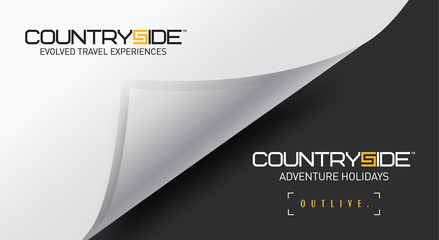
The identity was designed keeping in mind the trust and bonding Countryside had with its customers for 23 years. We had a broader positioning for the brand to accompany their wider array of products collated under one unified voice, ‘Evolved Travel Experiences’
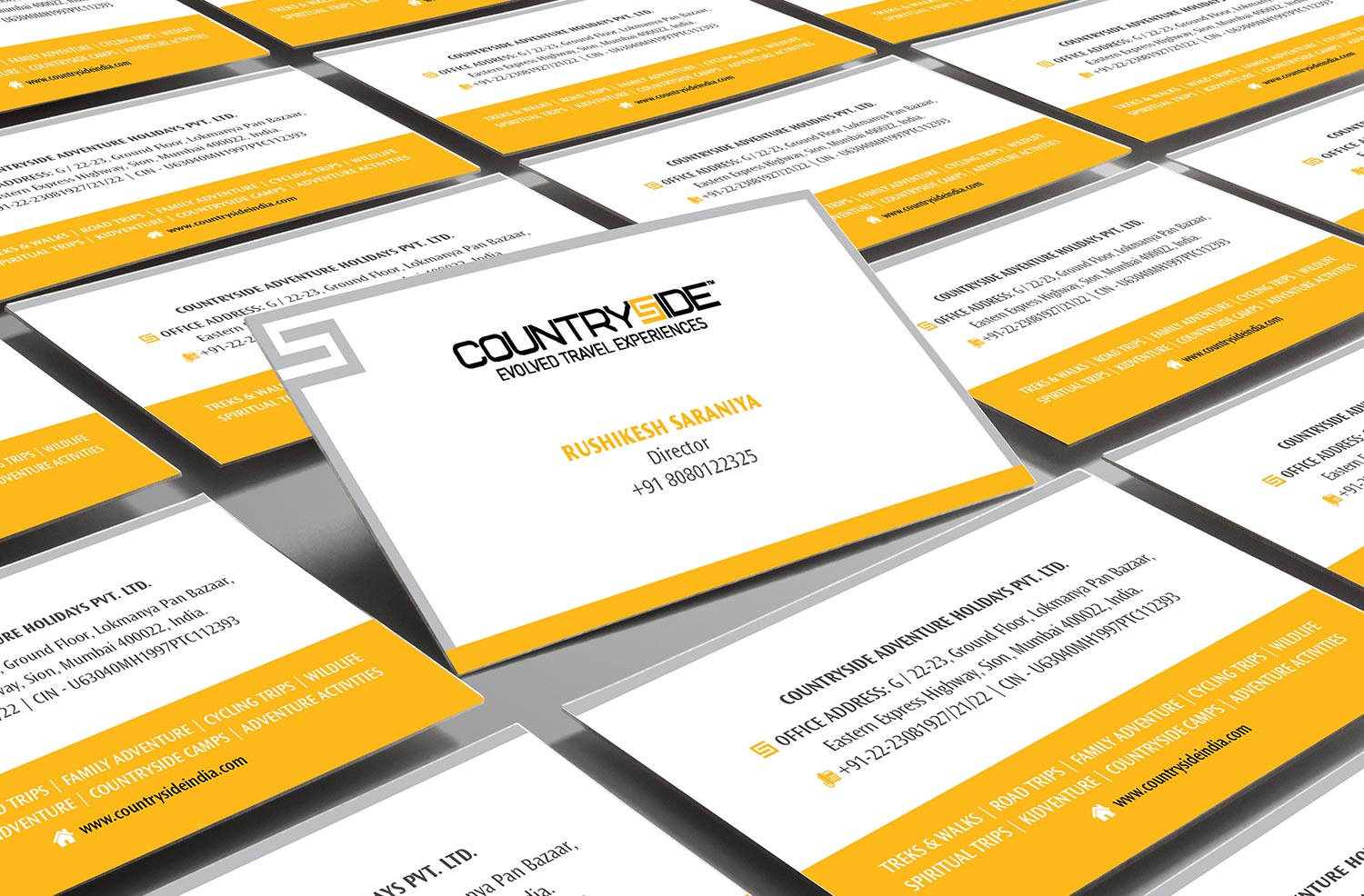
Stationery
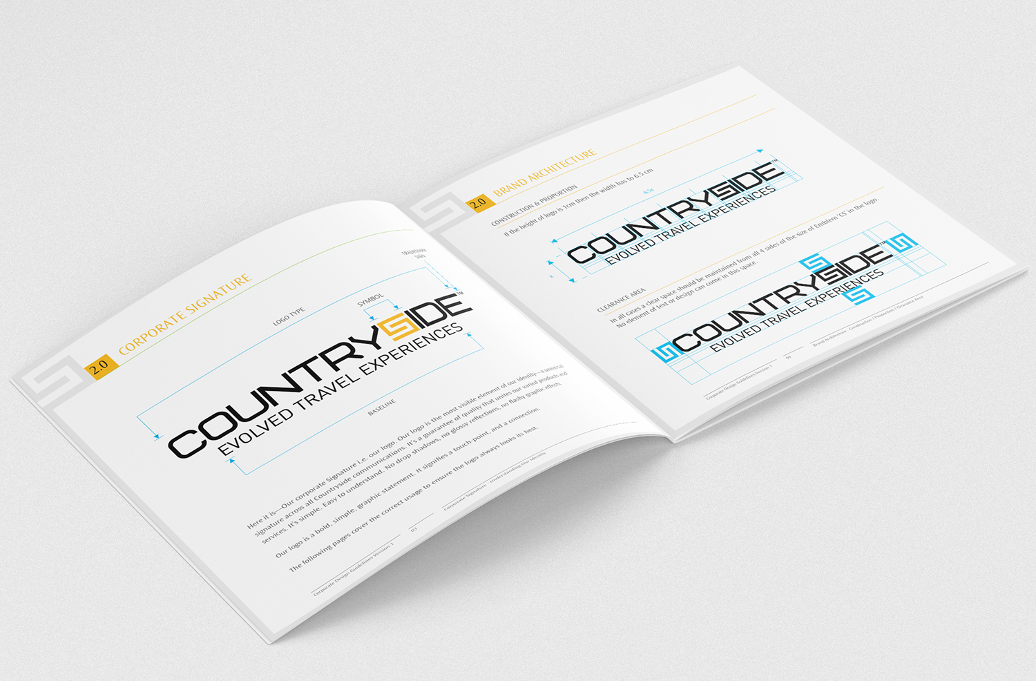
Brand Guideline
The components of brand identity were precisely measured and built keeping in mind brand touch points and their usage.
We developed a brand language ‘CS (symbol) based on uniqueness and relevance to Countryside identity. And we continued the same language across the spectrum.
Brand language worked well as a result of which, its customers started recognising Countryside through its language and not just its identity.
Communication Design
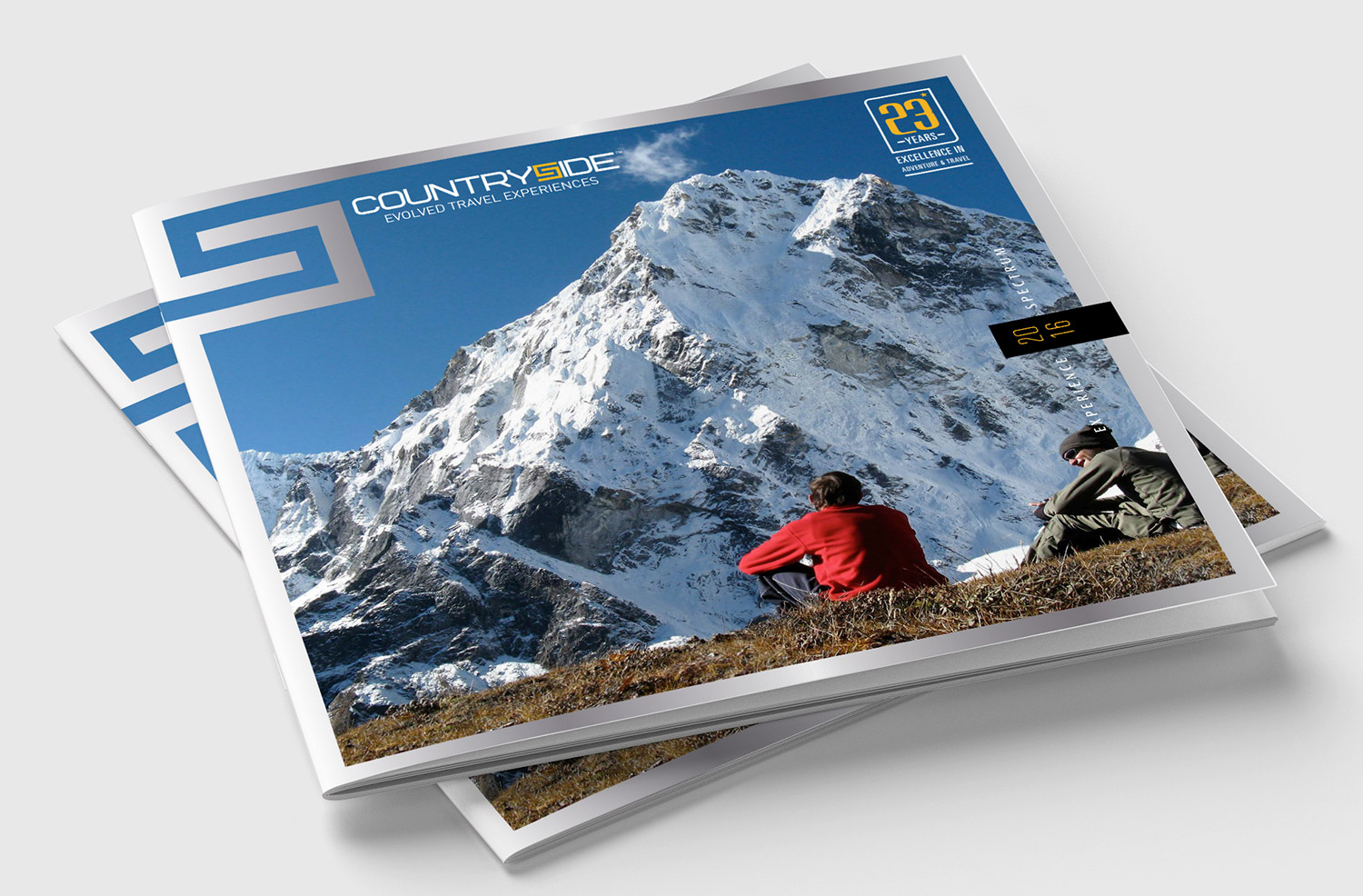
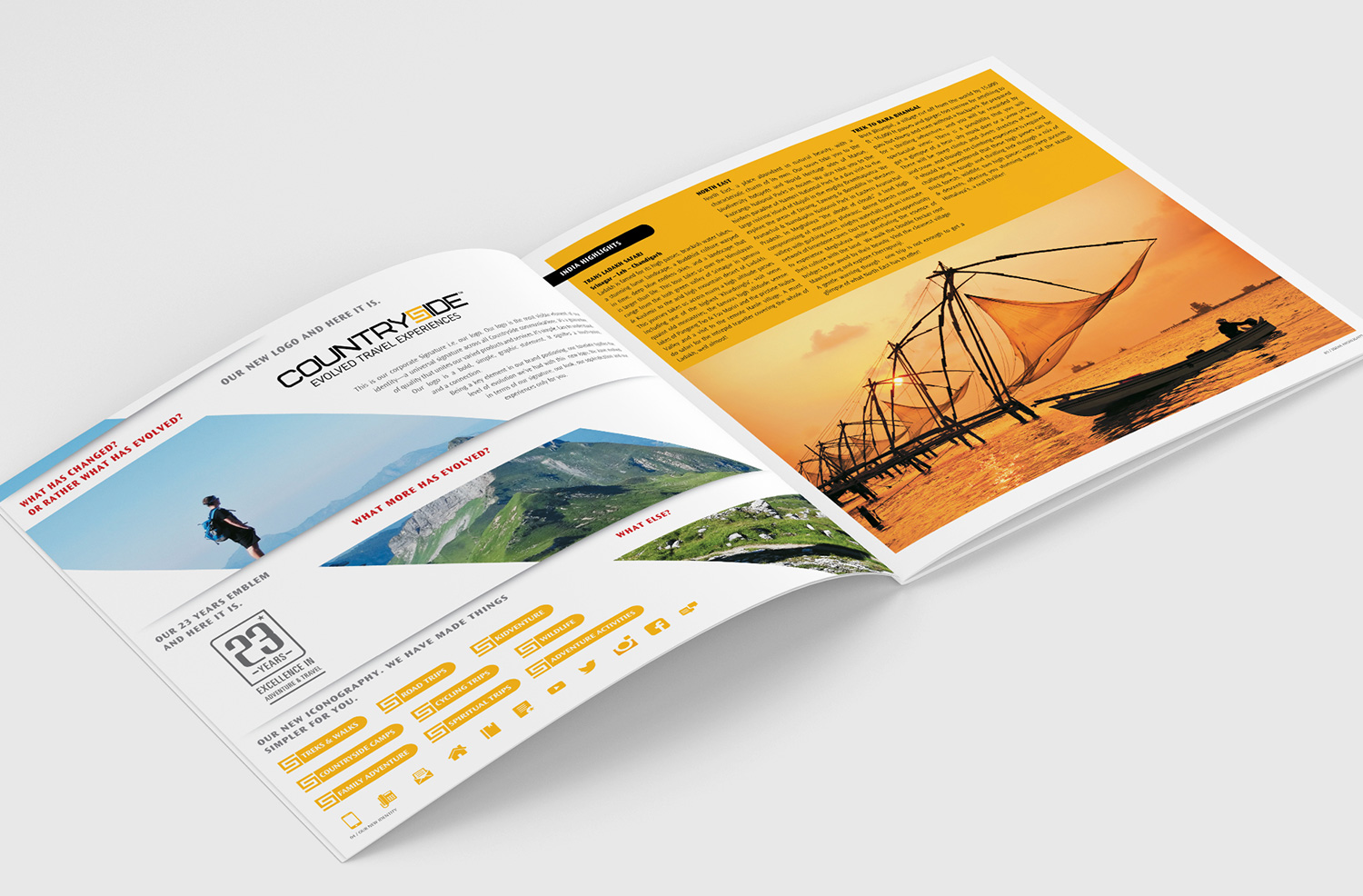
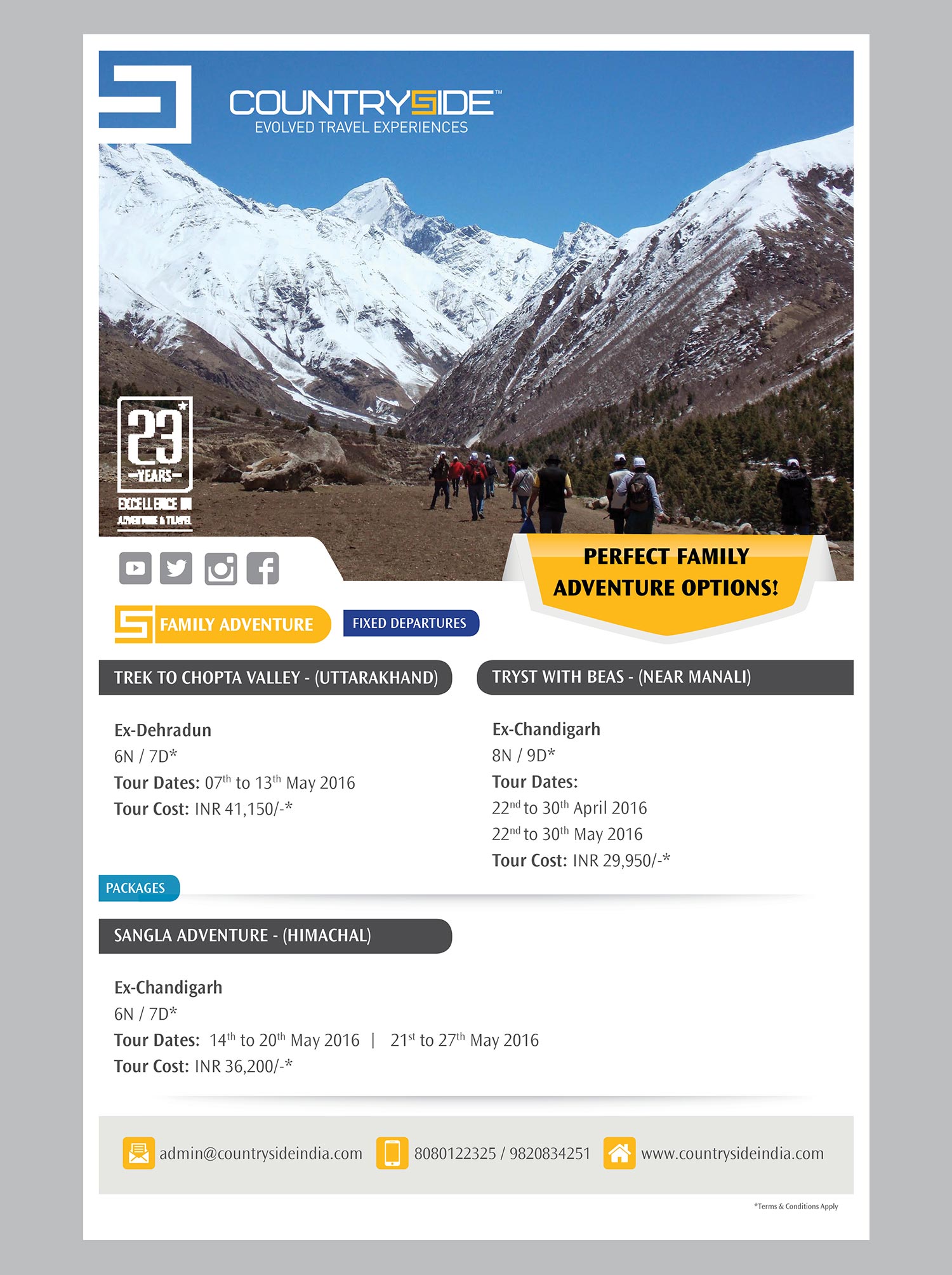
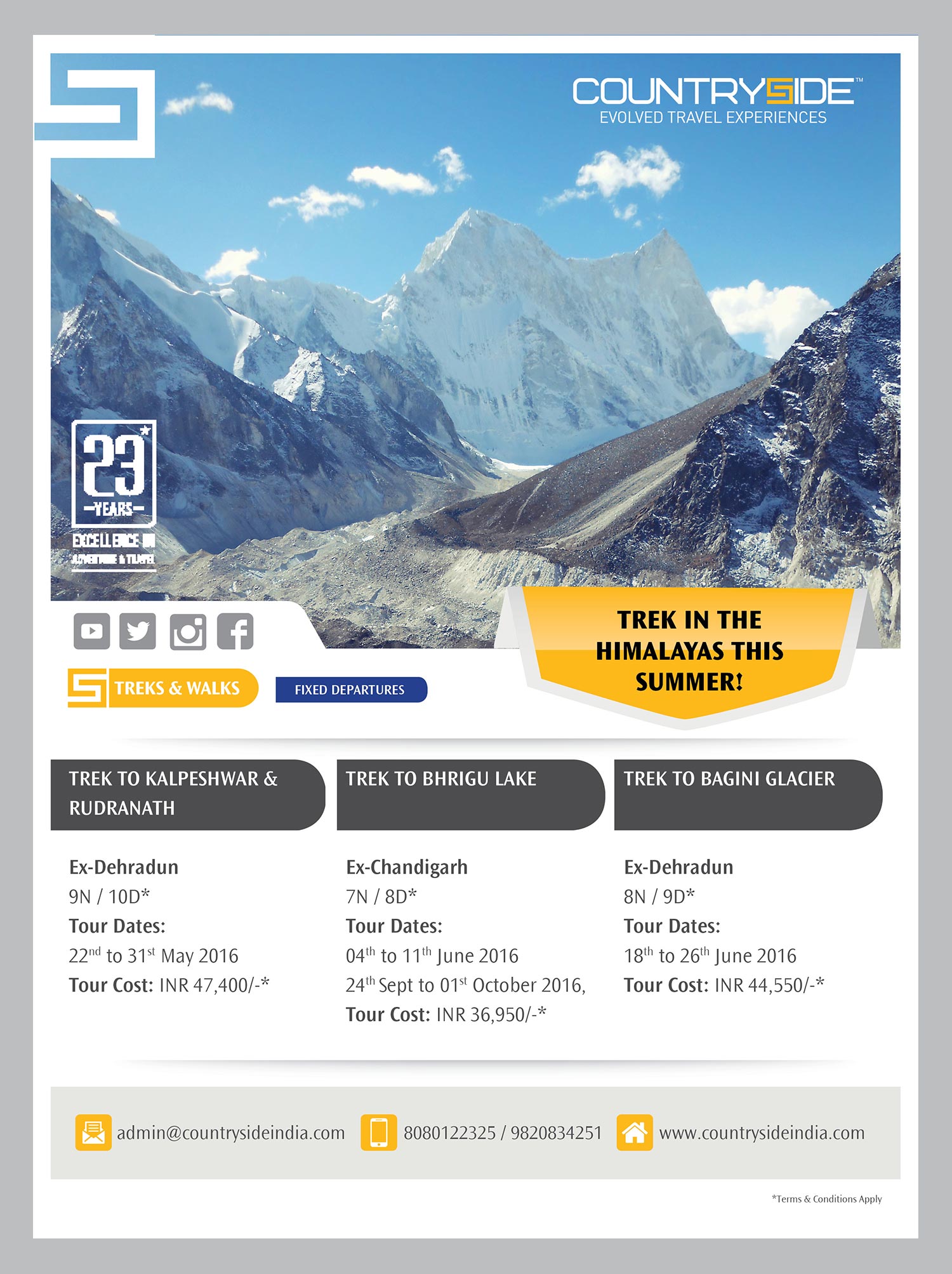
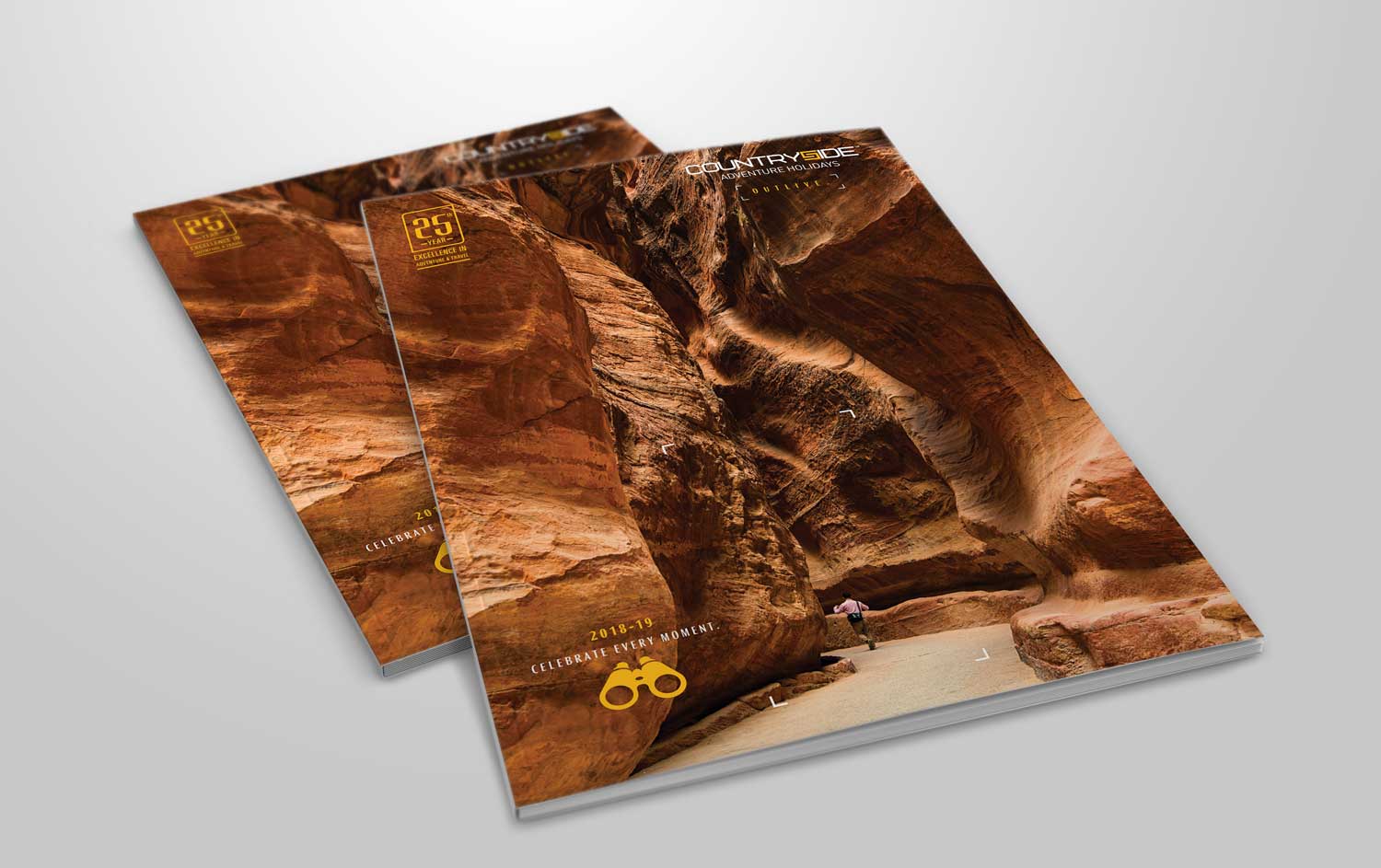
We bettered the brand image and made the brochure more relevant and interesting. The result was a lot of compliments and enquiries from customers.
Social Media Posts
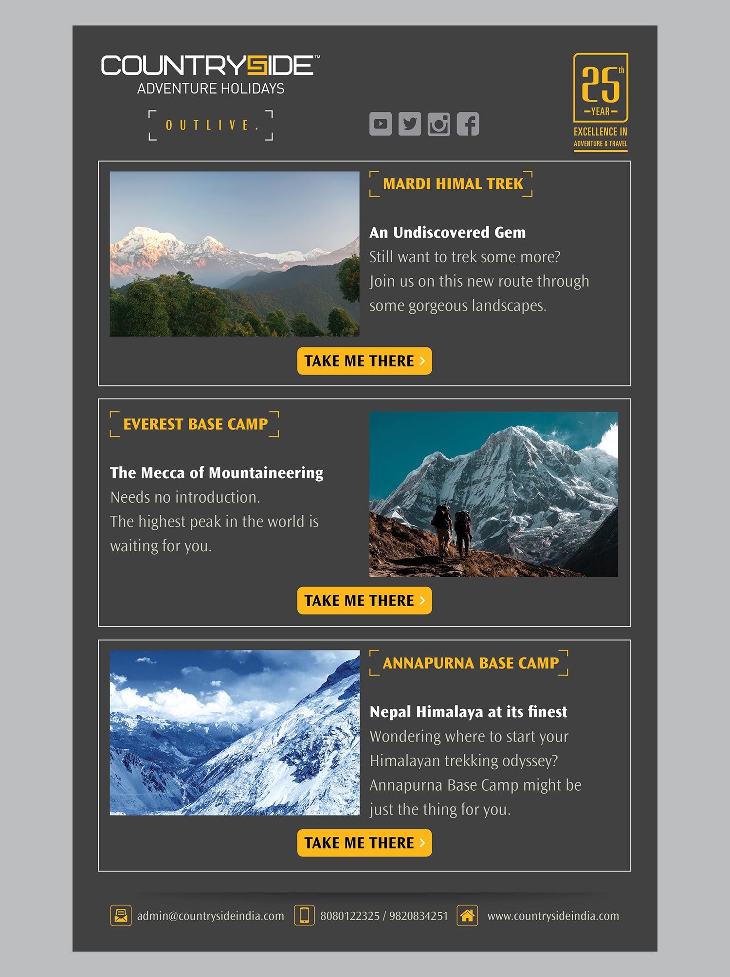
For the second-year brochure, we took customer experiences and testimonials and connected them to the brochure, making it more relevant and communicative.
Social Media Post Stats
The brand language made an impact across all collaterals of Countryside, achieving consistency yet coherence, which was much needed by the brand.
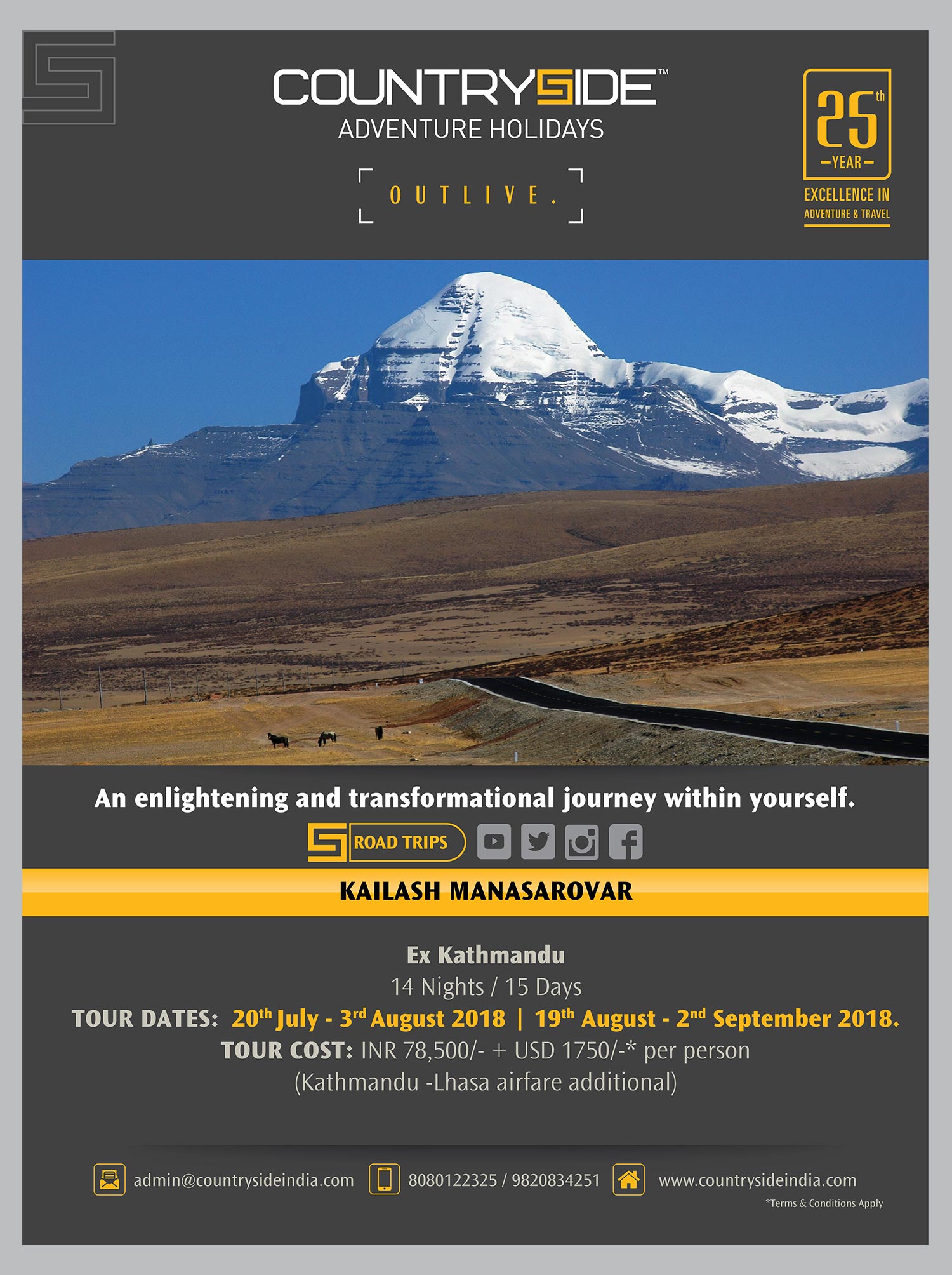
More and more international products were getting added to the brand’s kitty. As a result, the brand positioning was elevated to ‘Outlive’ and the entire line of communication was channelised towards it.
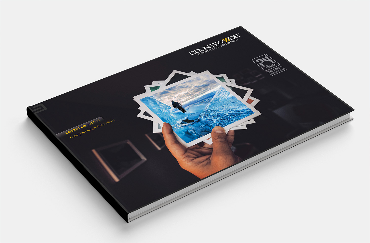
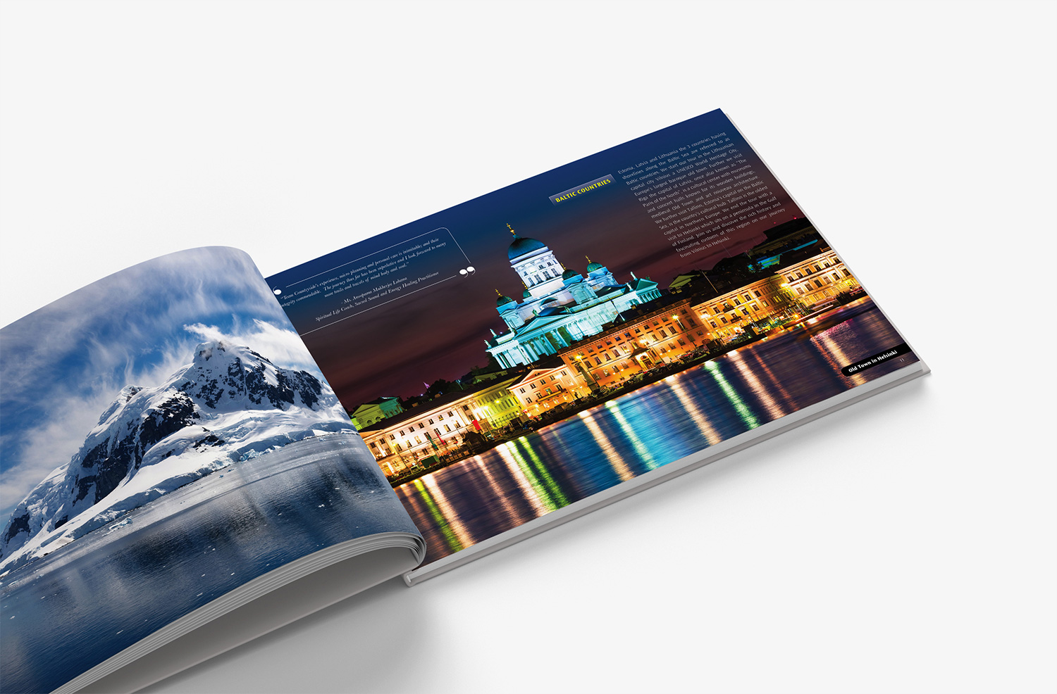
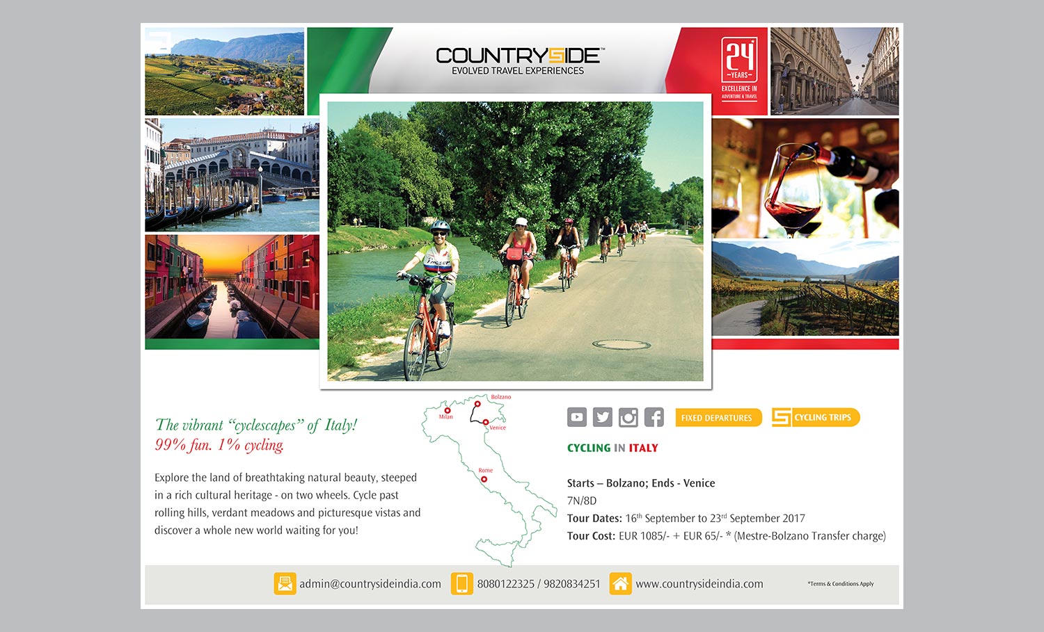
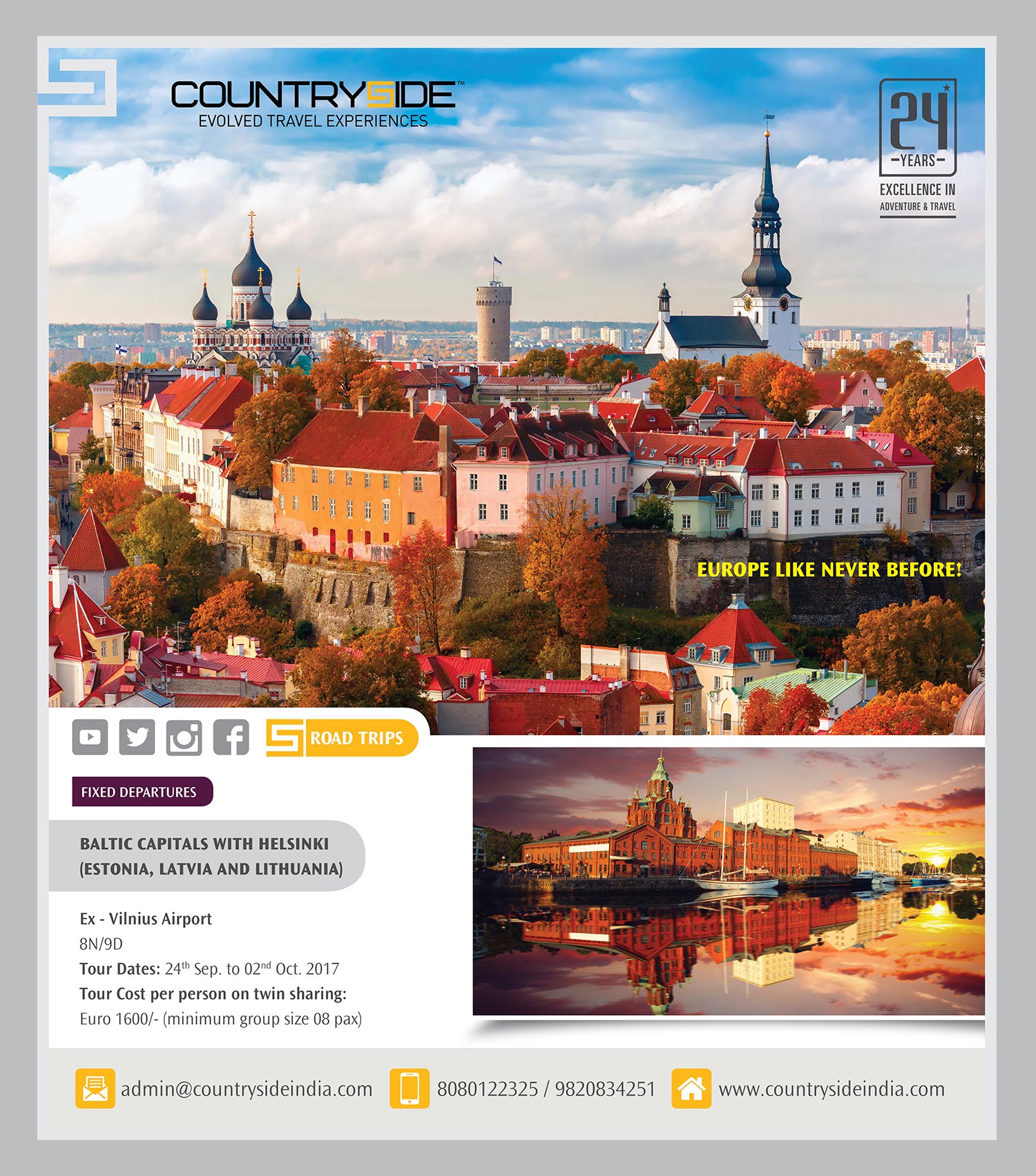
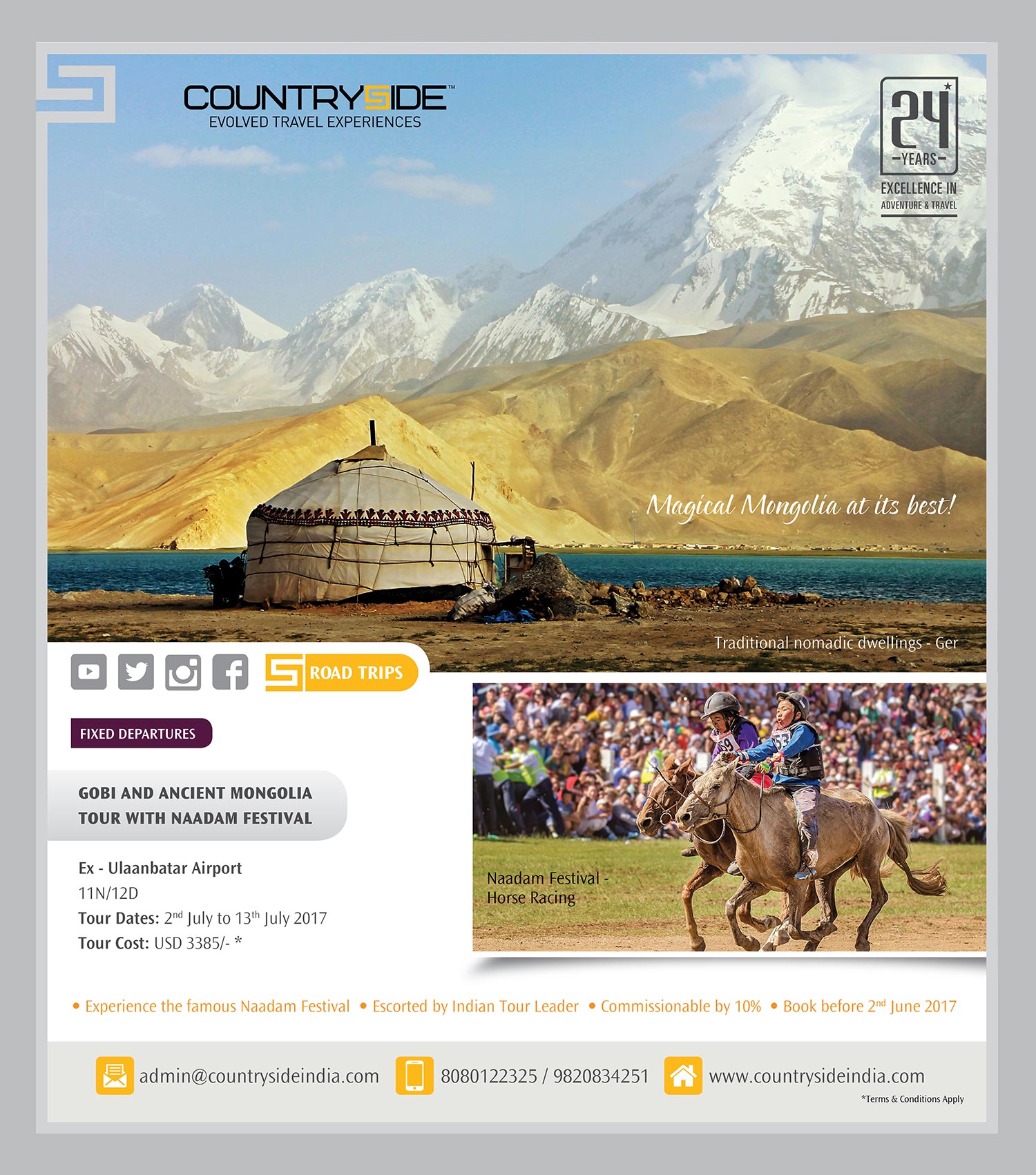
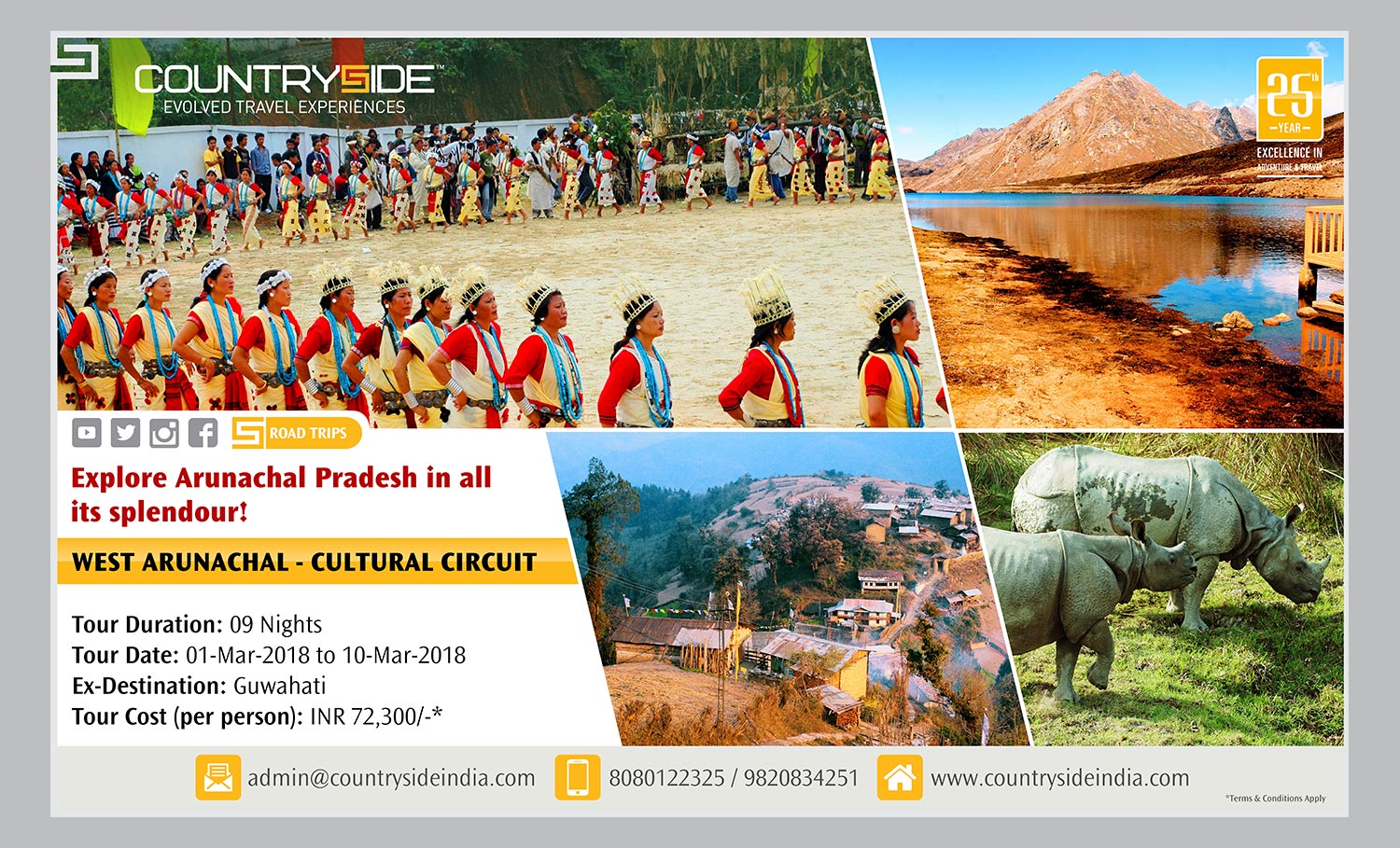
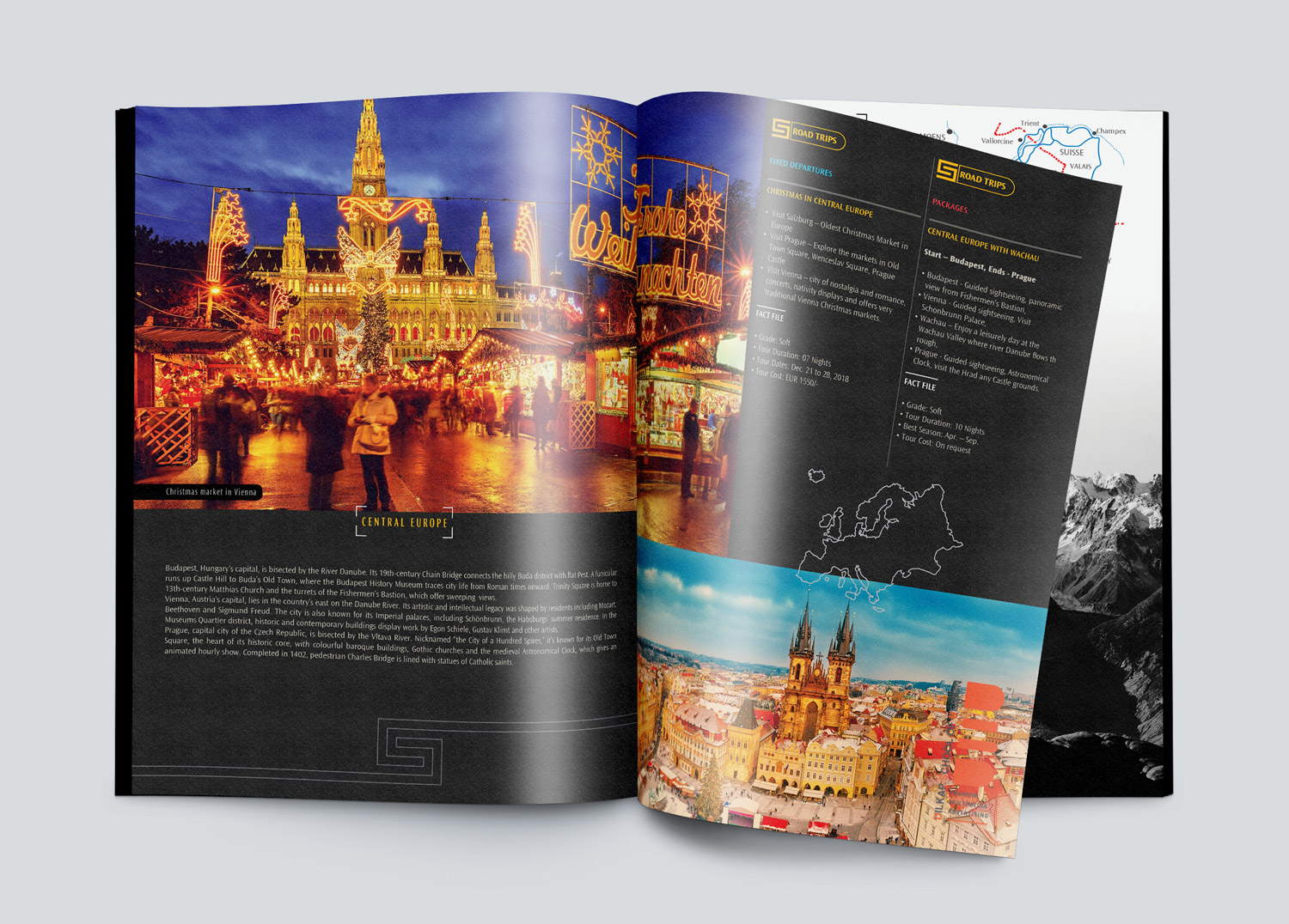
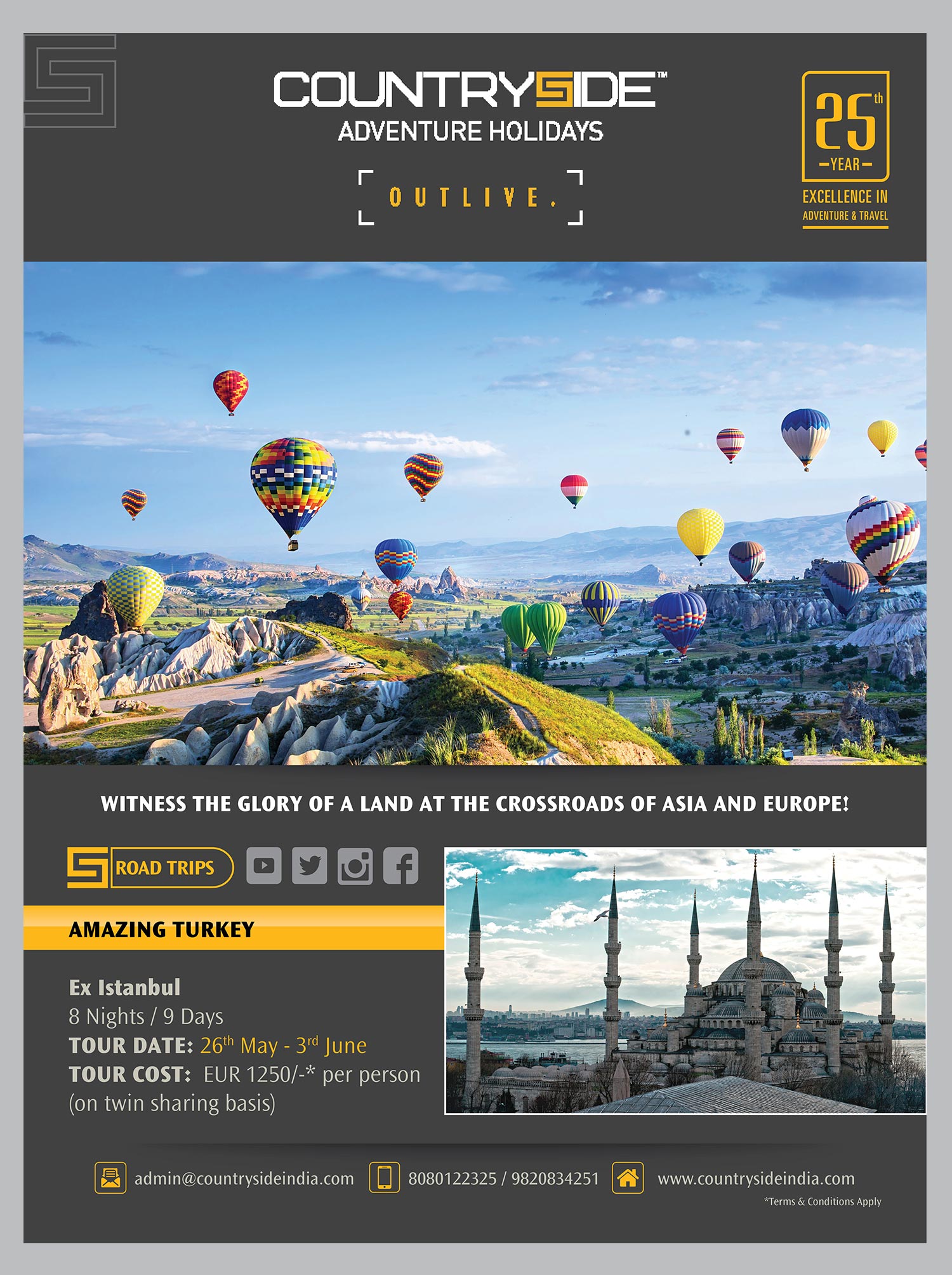
The look of the brochure was elevated, and we focused more on impactful images of international destinations that could interest the audience through their sheer image value
We added more value to the emailers through refined insights that countryside had in its 20+ years of expertise.
The three-year ongoing work with Countryside has changed the perception value of the brand. The brand got featured in various media and TV interviews, achieving high mileage and better sales value.
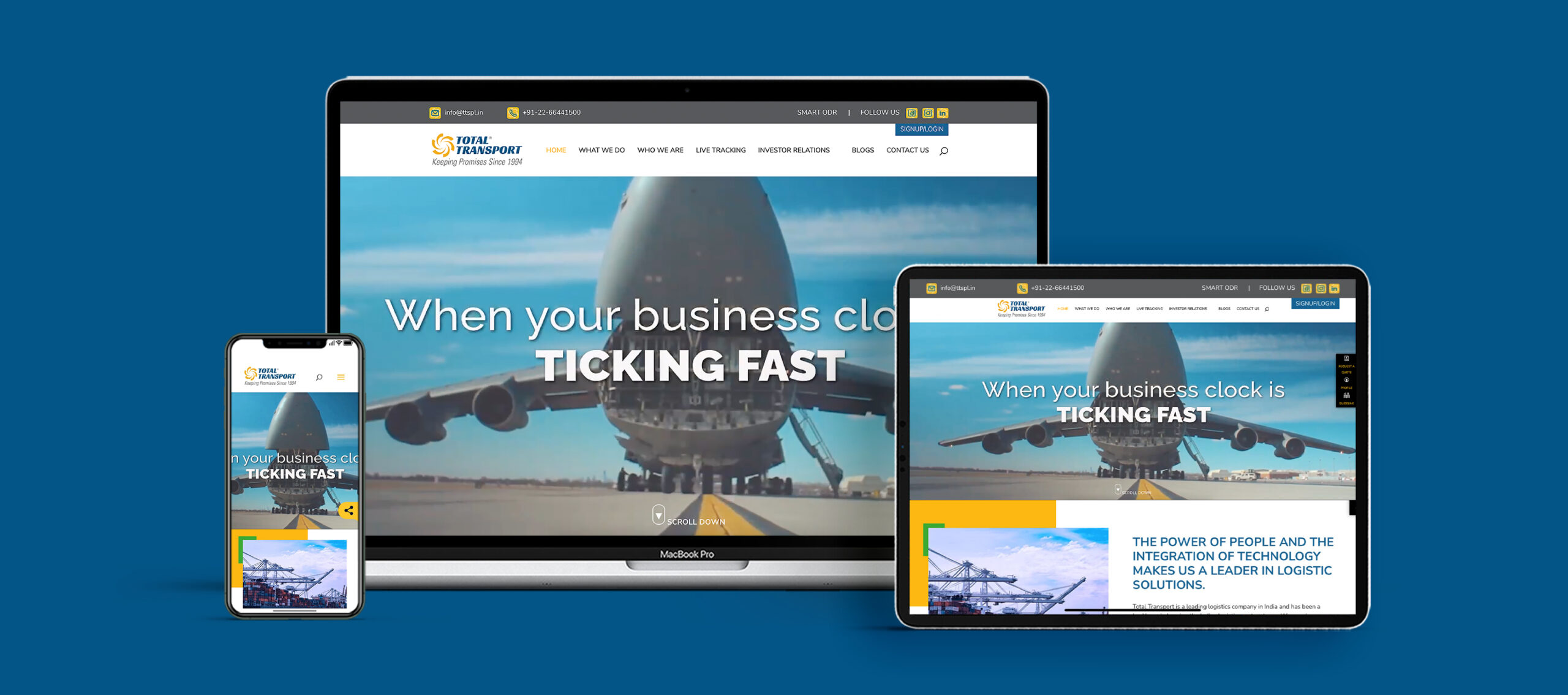
Web Design
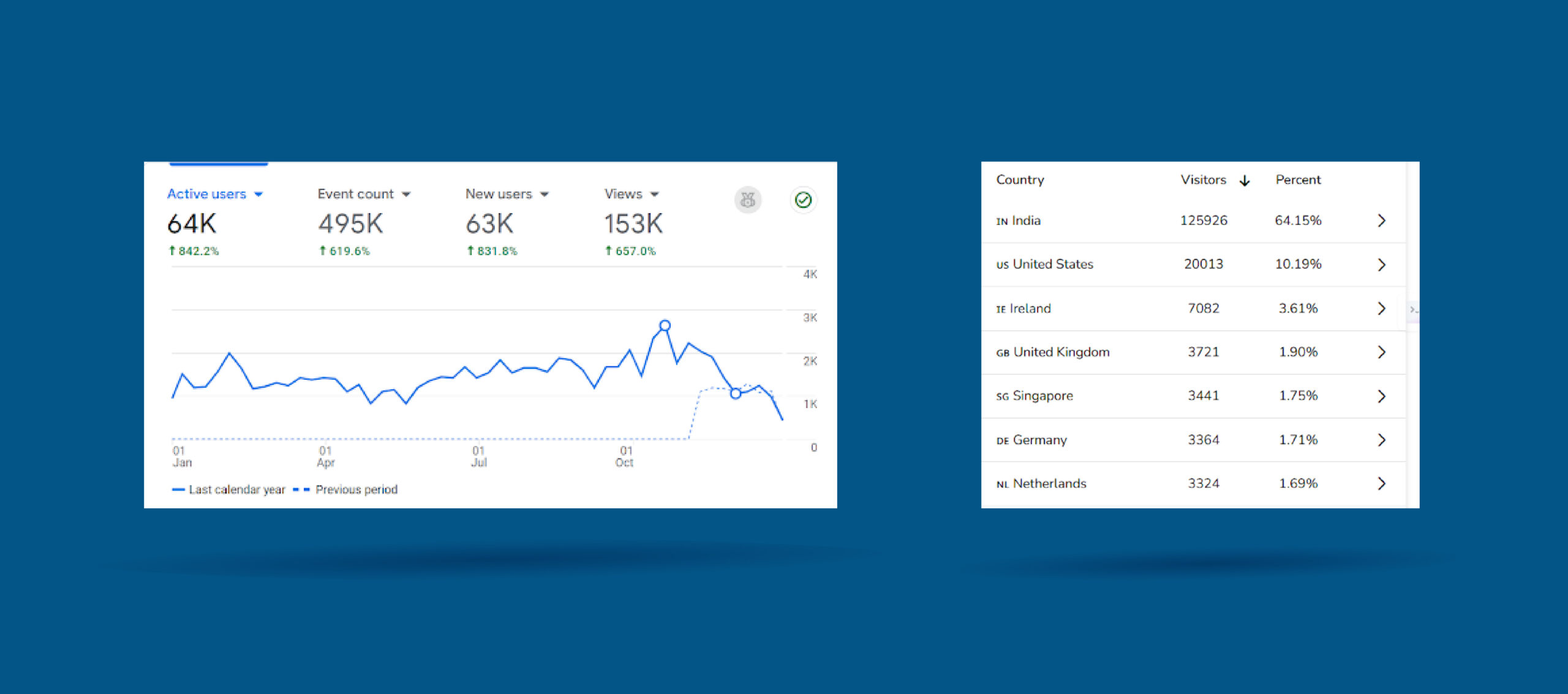
Website Stats
Visit Website
153K Visitors on Website | 10K Monthly Visitors |
Consistently attracting a loyal and expanding audience online."
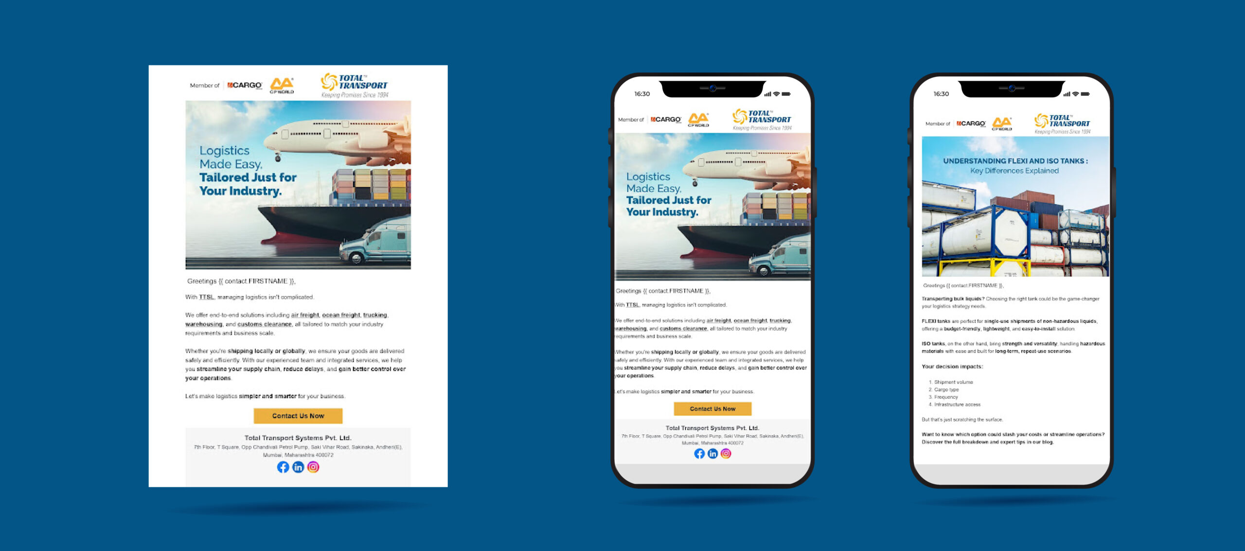
Emailer
A personalised email strategy that not only gets opened, but also clicked—and converts.
100+ Personalised Mailers Design and Executed | Open Rate 18-25% | Click-Through Rate (CTR) 2-5% | Conversion Rate 1-3%
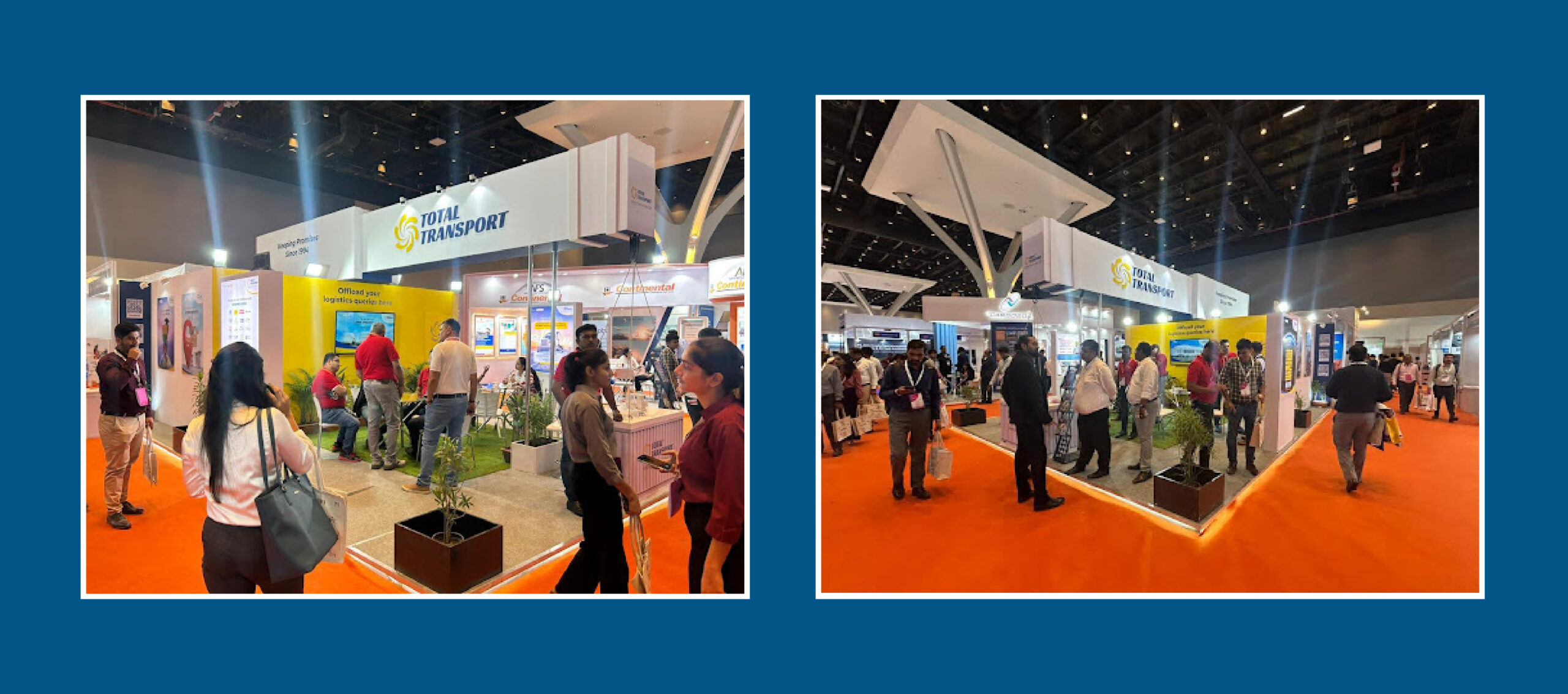
At Expo, TTSL marks yet another step in strengthening its presence — growing bigger, bolder, and grander every day.
Corporate AV
Progress isn’t loud. It’s the small daily steps, the quiet improvements, and the consistent effort to do better.
Coffee WithClay?
At Clay Inc., we believe great conversations brew great ideas. Share your details with us, and let’s bring your vision to life with purposeful branding and thoughtful digital marketing strategies that deliver results.
Edit Template
Start Your Growth Journey with
Clay Inc.
Share a few details and our experts will get in touch with you shortly.
Start Your Growth Journey with
Clay Inc.
Share a few details and our experts will get in touch with you shortly.