The old identity lacked a modern appeal and didn’t reflect the true potential of the brand. Without a clear communication approach, the company found it difficult to convey its offerings effectively. The branding was scattered across platforms, leading to a weak and unclear brand image.
Challenges
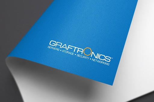
The overall look of the logo and brand identity felt outdated.
Without a clear brand and communication strategy, the company struggled to explain what it offered.
Branding was inconsistent across different platforms, which affected how the brand was seen.
Solutions
We defined the brand vision as ‘Everything under one roof’ to highlight the wide range of offerings with a more professional identity.
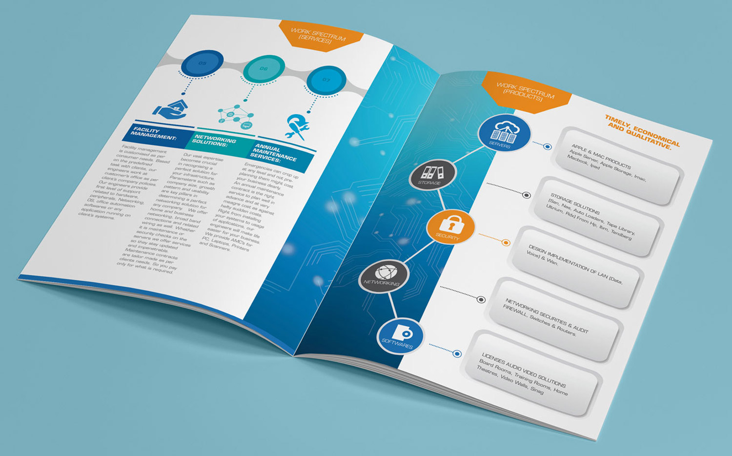
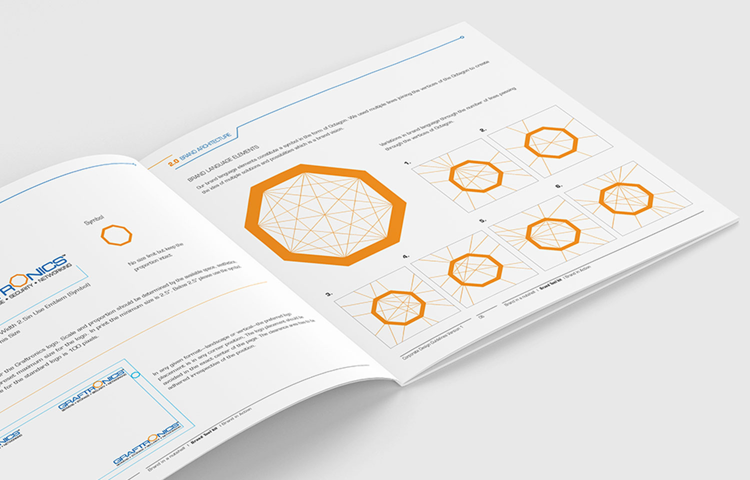
Brand guidelines were developed to ensure consistency across all platforms.
These guidelines were applied to create a fresh and unified tone of communication.
New Identity
The new identity was built around the idea of offering everything under one roof, showcasing the brand’s wide range in a clear and professional way. A consistent look and feel was brought in through well-defined brand guidelines, helping the brand speak in one strong, unified voice across all platforms.
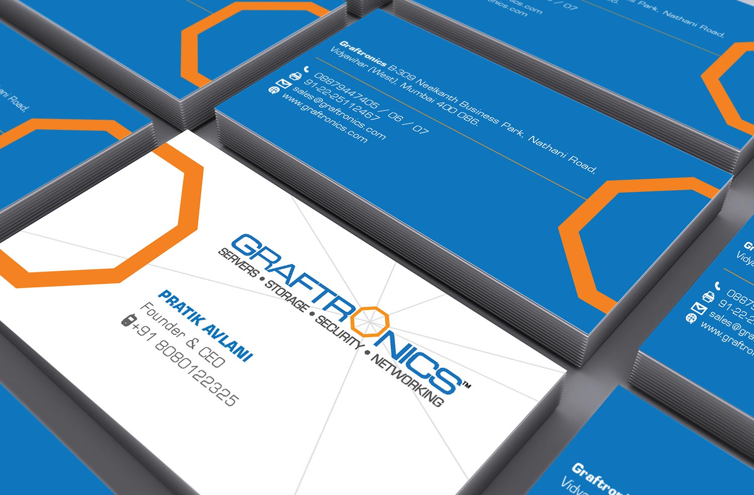
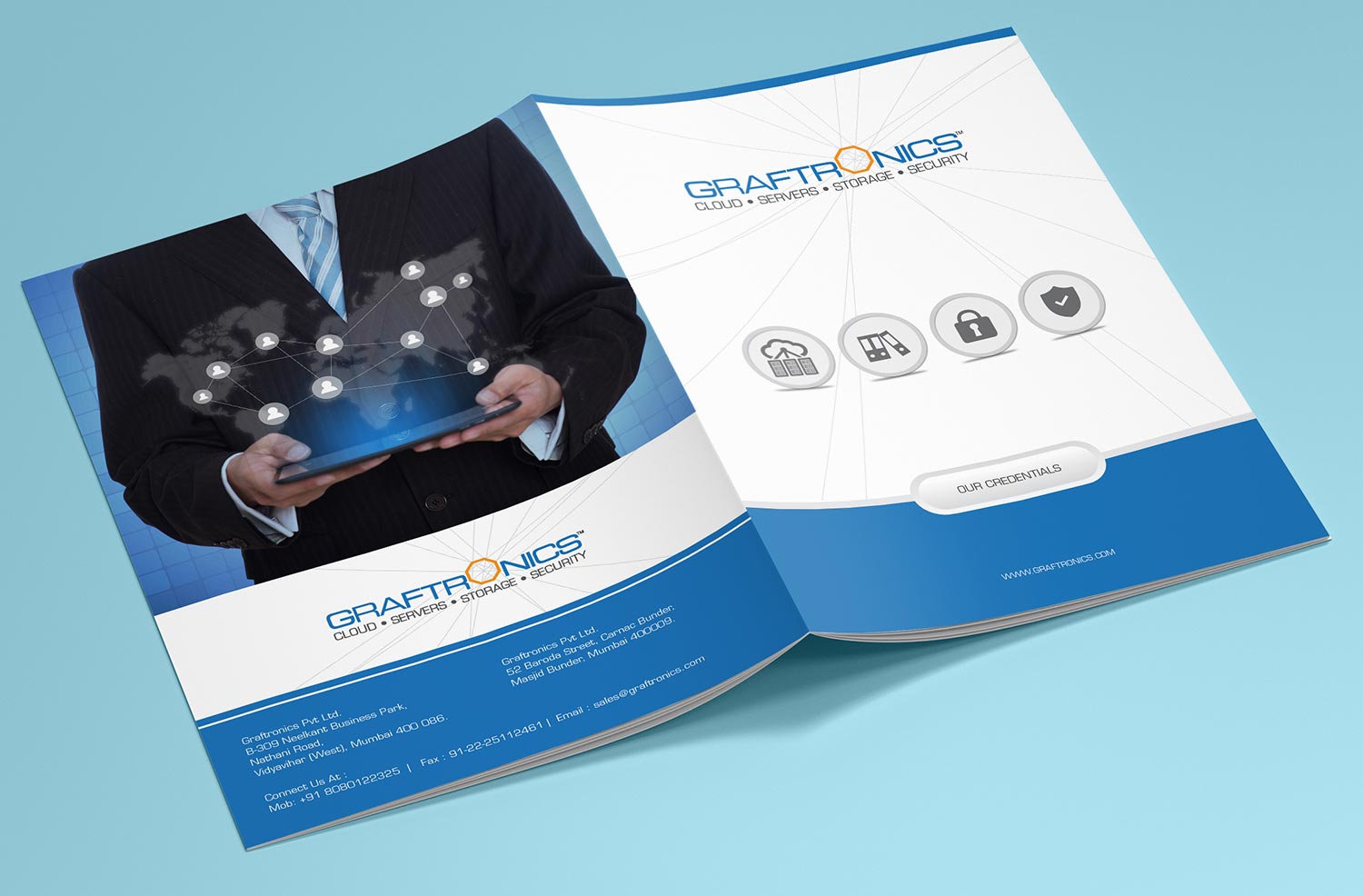
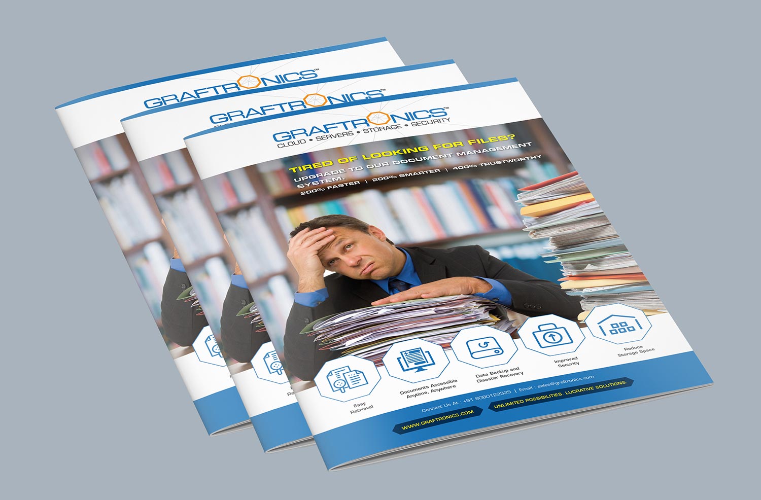
Stationary
The brand language used in the stationery is clear and consistent. Even though each item has its own design, they all feel connected and clearly belong to the Graftronics family.
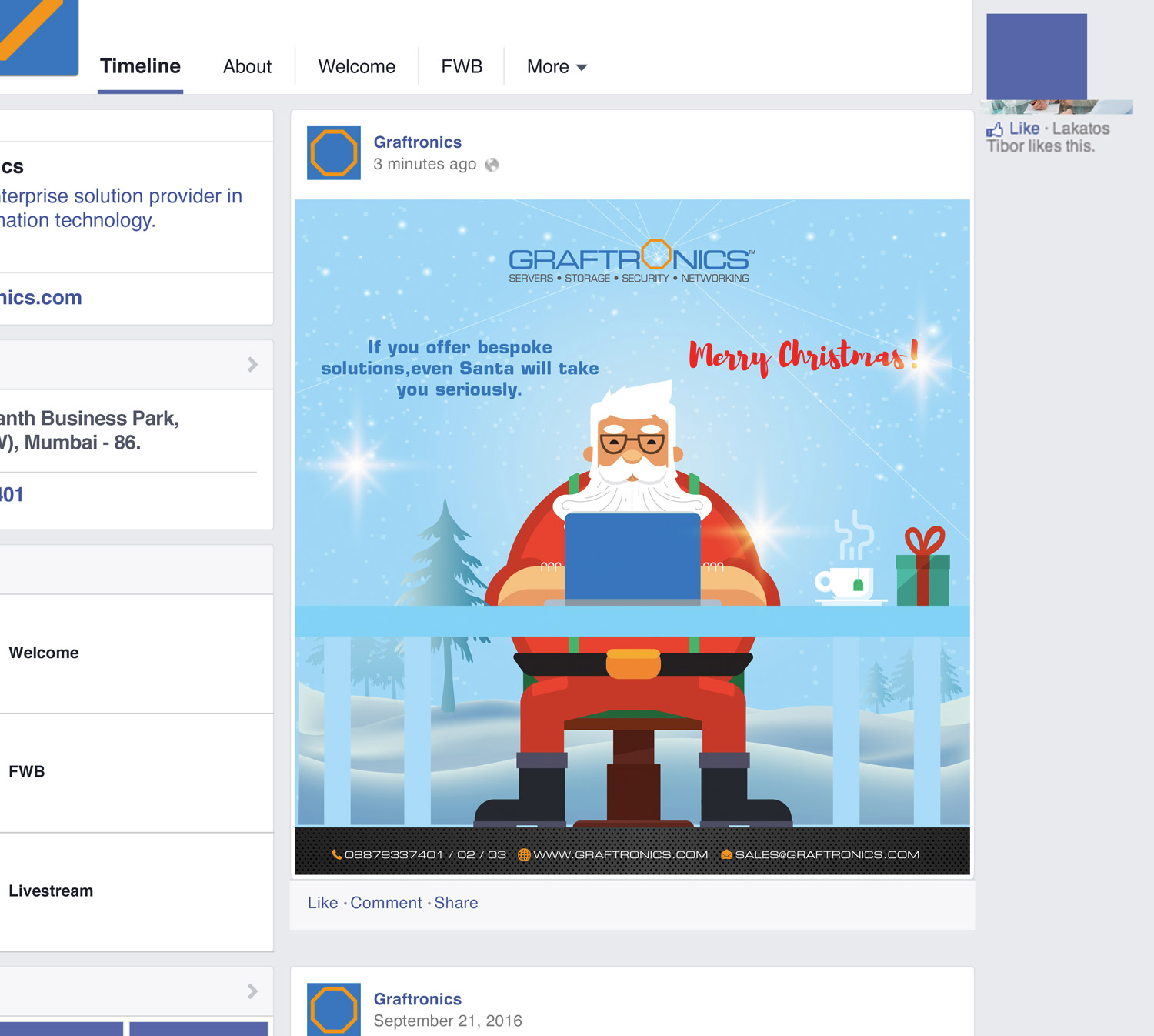
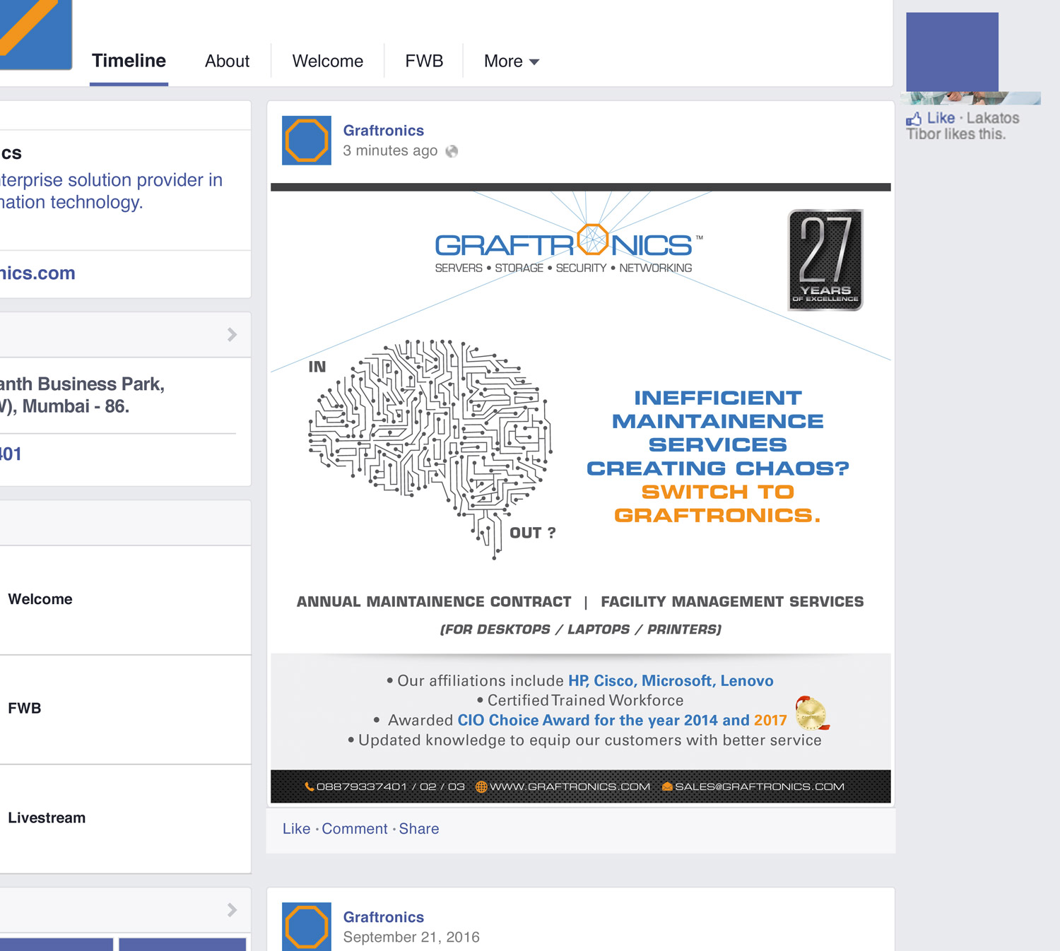
Social Media Posts
Creative and engaging social media content showcased their products effectively, leading to three successful deals soon after the campaign launch.
Coffee WithClay?
At Clay Inc., we believe great conversations brew great ideas. Let’s talk design, strategy, and the secret ingredient that will make your brand unforgettable and
turn your perception into value.